46+ Years of Hacking History

I just finished re-reading my copy1 of The Cuckoo’s Egg, Cliff Stoll’s detailed account of the German hacker that waltzed through the academic and military proto-Internet back in the Eighties. Reading this stuff brings me back in time, the way world events and other touchstones do for normal people. Almost a half-century of hacking history! Insane.

Disclaimer: While the culture has been extremely formative to my life, I was never a serious hacker. There were a lot of kids like me — fascinated by technology, curious, and a little drawn to the idea that adults didn’t like what we were doing. I certainly don’t recommend breaking any laws; there’s more than enough cool stuff in today’s world to explore without having to be a bad guy.

1978: It begins

My folks got me a TRS-80 Model I for my ninth birthday. My own computer, in my own room — it was absolutely unheard of, and while my parents were pretty great in a lot of ways, it’s not much of an exaggeration to say that this was one of the most consequential things they ever did for me. It was really mine — when I wanted to wire up a snooze button for the alarm program I wrote, I cracked that sucker open and soldered a switch right onto the board (with 16-gauge speaker wire no less). I can’t believe they let me do that stuff.

I learned to write BASIC programs by transcribing code out of magazines and finding my typos. I was unbeatable at whatever that car racing game was called. I tried (unsuccessfully) to sell my own game “Arrow Attack” by placing a tiny ad in Creative Computing. It Was The Best.

Unfortunately, the Model I was discontinued pretty quickly because it emitted an illegal and possibly dangerous level of radio interference. Even this was kind of awesome — I had a few games that manipulated the signals to broadcast sound effects to a nearby AM radio (they sounded like this, try harder 5G).

The 80s: Phreaking and WarDialing

I continued to write code through middle school and high school, but was really more enamored with networks and modems. Back then the phone company still “owned” every piece of equipment connected to the network, and it was illegal to use a modem without getting authorization. They claimed it was protect their lines from damage, but really they were just monopolistic a**holes, so we ignored that. The AT&T breakup in 1984 paved the way for all kinds of awesome stuff, not the least of which was the Sports Illustrated Football Phone.

Anyways. “Phone phreaking” — using tech to control telephone lines and billing — had already been around for years when I learned about it, and some of the exploits were already being patched by the Baby Bells. But enough were still active to make things fun. For example, most payphones “told” the main office about events like coin insertions by playing specific audible tones — so if you (theoretically of course) had a machine to generate those tones, you could connect calls without using actual coins.

Phreakers maintained a huge list of “boxes” that could perform various feats. The only one I ever built was a “black box” — really just a resistor activated in-line with the phone. When mechanical switching equipment connected a call to start the phone ringing, voltage on the line was pretty high. Picking up the phone dropped that voltage, which was detected at the substation and used to start billing. Deploying a black box would reduce the voltage just a bit — enough to stop the ringing but not enough to trigger the billing event. Since the line was already connected, you could talk away and never get charged.

The only trick about a black box was that it worked on the receiving end of a call — so it was primarily used by folks hosting “BBS” software, enabling users to connect inbound for free. I spent a lot of time connecting our computer (by then a Compaq Luggable my Dad used for work) to these “Bulletin Board Systems,” messaging with folks around the country and world.

Unlike today’s always-on social media, a BBS was more like a drop box. Users would dial directly into the BBS via receiving modems connected to one or more dedicated phone lines. You’d read and respond to messages, upload and download files, then disconnect so somebody else could use the system. There were hundreds of these online in the mid 80s; I’d sit at the computer into the wee hours of the morning, listening to WAAF and bopping from one to another.

The currency of BBS users was typically software or “text files.” I was a fan of text — thousands of people (of widely varying intent and ability) wrote about everything: science fiction, sex, hacking and phreaking, anarchy, radio, survival … everything. Seriously, check out textfiles.com, they’ve created a huge archive and you can get lost in there for years. So much garbage, but also an amazing repository of decentralized, censor-free, citizen-created knowledge at a time when there Was No Internet. Intoxicating, especially for a young teen in the boring suburbs.

Small homebrew BBS’s gave way to commercial services like The Well that used subscription fees to support more phone lines — enough for real-time conversations between users. And those in turn gave way to the big boys like Compuserve and AOL. But man, those early days were fantastic.

In parallel with all of this, the Internet was quietly being built at academic and military computing centers around the world. Most of these systems could be accessed through modem connections as well, and from there a user could connect around the world.

This was the world of The Cuckoo’s Egg, and a ton of popular culture and media-driven fear about espionage and all the worries that come with every new technology. The anthem of my personal circle was WarGames; there was nobody — nobody — as cool as David Lightman.

Modems connected to the ARPANET/MILNET were a hot commodity, and (thanks to WarGames) we knew that the way to find them was a WarDialer. I wrote my own (in BASIC of course) which scanned every phone number in the local calling area around Lexington, MA — special because it searched numbers out of sequence, an attempt to evade detection by the phone company. Hello, Route 128.

Early 90s: First Winter

I really learned to code during the tail end of the 80s and early 90s. Despite a bunch of time writing in BASIC, I didn’t really have a clue about the craft that is software development until I got to Dartmouth. A computer science department small enough to know everyone but big enough to go deep, a Mac for every student, and fully-networked dorm rooms! And after that, my early career at Microsoft kept me pretty heads-down for a few years …

… which was a good thing, because it was a pretty lousy time to be a curious hacker. There were some interesting trends for sure — buffer overruns, viruses and worms all involve neat technical problems. But mostly it was a time when the a**holes took the wheel.

Chaos seemed to be the point. Hackers vied to see how far their viruses could spread and made sure their names were attached. Sometimes they caused damage on purpose; more often they just wrote bugs and screwed up systems by mistake.

I’ve always been annoyed by the flak Microsoft took during this time. Windows always took the blame, but it was the preferred target because it was the most popular operating system in the world, and because it was a platform for thousands of independent developers building their own businesses. Sure the company could have reacted more quickly, but everybody was caught flat-footed at first. Ah well.

Anyways, after a pretty nasty arms race, the platforms figured out how to release patches quickly, users learned to be more careful, and things settled down a bit as we entered the second half of the 90s. Then along came the next twist.

Late 90s and Early 00s: The Internet Emerges

The Internet bubble was an incredible ride. All of a sudden, everything was a website. People were actually using the Internet to buy things — with real money! — but the technology was in its infancy and nothing was off-the-shelf.

At drugstore.com (a great example of the business plan “What if we took blank and put it online?”), we built one of the very first large-scale eCommerce experiences. Shopping carts, online promotions and coupons, affiliate programs, secure payments (you could even USMail us a personal check!), live inventory management, automated replenishment, prescription refills (admittedly mostly for Viagra and Propecia), contextual advertising … The list was long and fun and we were breaking new ground every day. What a rush.

And of course, all that brand new technology was fertile ground for new hacks. A few examples:

  • While almost nobody ever used this, the Windows NTFS file system actually allowed one file to contain multiple “streams” of data which were addressed by using the format FILENAME::STREAMNAME. The “default” stream was called $DATA, so by fetching a page like http://somesite.com/myexecutablescript.asp::$DATA, you could convince IIS to return source code. This code often contained passwords or other secrets helpful in digging into a site.
  • SQL Injection hacks were everywhere; almost nobody fully protected against them in the early days.
  • Silly and simple, for some reason we thought that hidden urls named things like /test and /admin would actually stay hidden. Search crawlers also found documents nobody ever meant to be public; to this day searches like passwords filetype:xls routinely return sensitive data.
  • Identifiers like order numbers and user identifiers were often issued sequentially, very helpful in accessing information beyond your “allowed” scope.

Most of these were notable because they came and went so quickly; everything was moving so fast that open discussion truly was a public service. And of course the pace of innovation slowed when the money evaporated, which gave the second wave of sites time to catch up.

10s and 20s: Second Winter

During the last decade criminal hacking activity has gone nuclear — organized crime and state actors have figured out just how cheap and powerful hacks can be. Sadly, they’re not generally even very interesting — mostly phishing-initiated attacks that convince somebody to disclose credentials or other sensitive information, used for data ransom and identity theft. There’s nothing clever about social engineering; it’s just ugly and wrong.

In the less-purely-evil arena, the “Internet of Things” has been having its day in the hacking sun. It’s the same old pattern — rapid innovation around digital smarts in our appliances, cars, healthcare devices and homes has outpaced effective security. The good news is that we know how to catch up, and the ecosystem is doing so pretty reasonably.

Radio-based devices are being exploited as well. One of the most interesting (but unfortunately cheap and lucrative) hacks is the keyless entry amplifier. Many cars now automatically unlock as you approach with your key fob. There are a few ways the unlock can be initiated, but the basic idea is that your fob emits a low-power radio signal with a unique security code2. The signal is only strong enough to reach a few feet, so your car “hears” it when you get close and can respond by unlocking the doors. If a hacker can get physically near to your fob (say outside a window near your home office, or next to your purse at a coffee shop), they can amplify the fob signal to a receiver near the car. This amplifier doesn’t need to understand the codes, it just needs to relay the signal from the fob to the car and … poof!

So what’s the verdict?

For better or worse, new technology goes hand in hand with ways to break it — and there are always bad guys ready to take advantage. The world of “white hat” hacking can be sketchy and fraught, but I think it’s proven itself to be an essential part of the innovation cycle — pretending the holes don’t exist is not a recipe for success.

Lots of folks disagree with this — to paraphrase Stoll, we don’t thank a burglar who takes advantage of an open door. That’s a super-legitimate perspective, and there’ve been many instances where “ethical” hackers accidently wrote their own bugs that went disastrously wrong (e.g., the 1988 RMS worm). So where’s the line?

It’s hard to say, and certainly not one easily parsed by hormone-addled teenage brains! But there’s no question that the discoveries, problems and solutions behind almost a half-century of hacks turned me into the developer that I am today, so it ain’t all bad. I try to break my own stuff, and count coup on my friends when I find flaws in theirs. The coolest stuff rarely sits in the middle of the road.


1. Back in the early 1990s I built a little toy for the Macintosh called Mouse Odometer, a background app that measured mouse travel in miles. MO was shareware with a requested donation of $5; sometimes folks would send other stuff instead. Cliff Stoll sent me a copy of his book!

2. The back and forth here is usually more complicated; constantly broadcasting a signal drains a fob battery pretty quickly. Instead, usually the car is constantly broadcasting a low-power “wakeup” signal that causes any of the fobs in the vicinity to start doing their thing. Passive RFID technology and the transfer of power by radio is basically magic.

explain my notes

TLDR, drag this link to your bookmarks bar: explain. If you select medical-related text on any page and then click the link, it will open up an “explain” window with an AI-driven translation. Alternatively, you can just visit the site at https://explainmynotes.azurewebsites.net/.

Every day I seem to get just a little bit older. My folks too. Not a bad thing, but it does inevitably mean more time spent trying to navigate the clown show that is American Healthcare. Sometimes things are simple, and sometimes they’re little mystery dramas with House or Doc Martin trying to figure out what’s going on.

By now, most of us have gotten used to using patient portals like MyChart to keep track of our care at various providers. Lab results and clinical notes show up in near real time and — thanks to years of policy pressure — are quite comprehensive. (to wit: when I had appendicitis earlier this year, my wife at home texted me the diagnosis before anybody in the ER came to let me know what was up.)

Access to these primary sources is invaluable. But clinical notes are also full of jargon, shorthand, codes and concepts that very few of us understand. Take for example this short snippet from the surgery notes of my appendicitis visit:

I attempted to bring omentum to sit over the anastomosis, but the omentum was fairly short and there was no easy reach.

I read this shortly after coming out of anesthesia — something she tried to do didn’t work. Is that bad? Should I be concerned? Luckly, Dr. M is pretty awesome; she explained that the omentum is a layer of fat that protects organs in the abdomen, and they like to “drape” it over surgical sites to aid healing by enhancing local blood flow. Somehow despite my notable beer belly I didn’t have enough fat to make this work, but it’s not a big deal. Case closed.

Unfortunately, not every provider is a great communicator like Dr. M. And even when they are, appointments are so short and far-between that there’s rarely a good opportunity for questions like this. That’s why I wrote explain my notes.

Clinical Notes, explained by AI

explain my notes takes advantage of two pretty neat technologies: SMART on FHIR for data access and ChatGPT for helping to interpret the notes. Currently it’s set up to connect to providers using Epic MyChart. In a nutshell, it works like this:

  1. Visit the site, read the terms of use and pick your provider.
  2. Log in at the provider’s patient portal and approve the connection.
  3. Pick an encounter to see a list of associated documents.
  4. Pick a document to view its contents.
  5. Select any text in the document and choose “Explain Selection” to pop up a window that shows the original and “explained” text side by side:

And that’s it! You’ll need to authorize the app each time you use it, because Epic doesn’t permit long-lived tokens for “automatic download” patient applications. Ah well.

Caveat 1: The ChatGPT API isn’t free — if I’m surprised and the app gets a lot of direct use, I may have to figure out how to offset those costs. For now I just hope folks try it and that it’s (a) helpful and (b) inspires others to build on the idea.

Caveat 2: As I mentioned, right now this is only hooked up to Epic MyChart sites. I’m happy to add Cerner or any other EHR that folks might be interested in, it just may take a minute. Let me know if there’s a particular provider you’d like to connect with.

Accessing the data: SMART on FHIR

From here out is just nerd stuff; feel free to exit if that’s not your vibe! All of the code for explain my notes is on github.

I’ve already written a bunch about SMART and why I think it’s so valuable, so I won’t repeat myself here. But this is the first time I’ve written a SMART app for patients, and there were a few interesting nuggets worth a mention:

Standalone Launch

explain my notes uses the “standalone launch” model. With a provider app, a huge part of the benefit comes from living within the context of the EHR — it gets you single sign-on and provider/patient context and feels seamless in an environment where providers are already spending much of their day. It’s not the same for patients; a dedicated site that can explain its function and then “connect to” the portal makes good sense.

Epic Automatic Download

The super-cool thing about patient-facing apps is that you don’t need to “register” them with each individual EHR. Instead, the EHR vendors maintain provider lists and automatically enable connections when authorized by the patient. It’s hard to overestimate just how great this is — back in the day, we had to arrange to connect HealthVault to each and every provider that wanted to work with us.

Careful, though! Automatic download comes with conditions, and they are not immediately obvious (Epic’s conditions are documented behind a free login). “Refresh” tokens aren’t allowed; only certain data types can be accessed; no “write” operations are permitted, etc. My first cut at the app didn’t meet the criteria exactly, and it took me awhile to figure out what was going on.

PDF and CCDA Content

Many notes are stored as HTML or text. Encounter summaries, though, are often stored in “CCDA” format — an old-school XML standard. XML needs to be translated into HTML for display in a browser, and while there is some solid open source code for doing that, the generated HTML doesn’t always display nicely within a larger web page. I was able to tweak it for my purposes; the altered stylesheet is available per the original’s open-source license terms.

PDF content was also a challenge to display so that it both (a) looks correct and (b) makes the selection available for sending to ChatGPT. I ended up doing a server-side translation using pdftohtml, an old standby that still works surprisingly well.

Explaining notes: ChatGPT

I think it’s clear that generative AI is going to be a seriously Big Deal — combustion engine and Internet big. But it’s still very early days, and it’s hard not to be annoyed by the seemingly endless garbage “applications” being churned out by hype-riding VC-funded bros. I get that — but bear with me.

Generative AI (specifically ChatGPT for us) is pretty amazing if you think about it as your well-read, smart, eager-to-please friend without any formal training and a fear of being wrong. People like this are super-useful, because they’ve probably come across information that you haven’t, and can be great “translators” of jargon and other specialty content. You just have to take what they say with a grain of salt — a little fact-checking goes a long way.

The ChatGPT “completions” API is pretty simple — it takes an array of input/questions and returns answers in markdown format. There are a few knobs you can turn, but that’s basically it. “Prompt engineering” is a weird concept, much closer to social engineering than code. The current “setup” prompt for explain my notes is this:

You are a medical professional that explains clinical notes and other medical text using terms and language that an average American adult without medical training will understand. Minimize the use of jargon. Your responses should not be notably longer than the original text. Also please include up to three Google search links targeting the key topics you find.

The “Google search links” part here is the most interesting. I initially asked the system to return “up to five links that would be helpful for further research,” but it turns out that ChatGPT is terrible at this, and is actually known for simply making up gibberish URLs. I’m not sure why this is the case; apologists claim they’re just stale links from old training data, but it’s way more than that. Restricting the links to Google searches seems to work pretty well.

And I guess that’s it for now! Please give the app a try — good test data is hard to come by and so I’d appreciate any and all feedback or bug reports. Until next time…

Always more than meets the eye

For reasons that are both complex and silly, I am now the proud owner of a twenty-foot shipping container. It’s a “one-trip” box, having made a single voyage across the Pacific, probably from China carrying Trump merch stamped “made in America.” In any case, it is now safely ensconced in my hillside, destined to be a storage shed and/or adjunct workshop. I’ve definitely outgrown the garage.

Outfitting a container turns out to be a super-fun project (not counting the second coat of “duckboat drab” paint I have to apply later today as phase one of Operation Camouflage). The company I bought it from blew a layer of foam insulation on the walls, so my first interior job was to build a wood frame onto which I could hang shelves, hooks, lights, pegboards and whatnot.

Non-structural framing is fun work; it moves quickly and delivers big, solid walls in just a few hours. It’s also easy to learn, and can be done exclusively with relatively cheap 2×4 lumber. You can even do it solo, although moving wall sections on your own any distance is a bit dicey (thanks Connor). But like everything in this world, the details make all the difference.

I can’t say this enough: the details make all the difference. There is more to everything in this world than first appears, and that goes for simple framing jobs too. Take a look at your tape measure — do you know why every 16” interval is highlighted? It’s because 16” is the standard distance between wall studs — those highlights are great time-savers as you mark top and bottom plates.

Or consider the humble 2×4 joist hanger, a little metal bracket that makes it easier to attach joists to wall segments. “Joists” run in parallel along ceilings or floors to provide strength and rigidity — my internal structure isn’t attached to the container at all (except a few screws into the floor), so the joists keep the walls from falling down. At first glance it’s a pretty simple little widget:

  1. Four screws (or nails) attach the hanger to the wall.
  2. The joist slides vertically into the bracket.
  3. Two screws secure the joist to the bracket.

Easy peasy lemon squeezy, right? But wait, there’s more to learn. First of all, keeping the bracket correctly aligned as you screw it in can be an annoying challenge, especially if the wall is already standing and you’re on a ladder. See those little pointy tabs on either side of the bracket? Those are called “speed prongs,” and by hammering them down you can temporarily hold the bracket in place, exactly where you want it.

And take a closer look at the two screw holes that hold the joist in place. You’d think they’d be symmetrical, but they’re not — they’re just slightly staggered. This is because a 2×4 is pretty thin; if the holes were aligned the screws would run into each other.

This stuff is pretty obvious in retrospect, but the value is easy to miss at first glance. Without context these features might even seem kind of stupid — needless complexity that just makes the bracket more costly to manufacture and package for shipment.

Yeah, it’s another software analogy.

There is always a reason that things are the way they are. One of my biggest peeves is an engineering leader or manager who walks into an existing organization and decides that everything needs to be rebuilt from scratch. There are plenty of excuses: the existing code is spaghetti and hard to maintain, it’s built on obsolete technology, it didn’t keep up with the needs of the business, blah blah blah. All horsesh*t.

I mean OK, it’s not that these arguments might not have merit; it’s just that they aren’t really why people start from scratch. In truth,

  1. They are too lazy or incompetent to understand the current state, and/or
  2. They are trying to establish their own empire in their own image.

The reality is that even the “craziest” operational software is what it is for a reason. It has history. The company wasn’t populated by idiots doing stupid stuff for kicks. If you don’t understand the why — and often even if you do — your “reboot” is going to fall flat on its face.

The problem is that, just like speed prongs and offset screw holes, many crucial details don’t make sense or are simply lost when viewed without on-the-ground context. Everything looks simpler when you don’t get down and wallow in the (I know) details.

I just watched this happen again, in slow motion over (I kid you not) three and a half years. Within weeks of taking over, a new leader declared the company’s core operational systems not worth saving and started a reboot. Task forces were created, user interviews happened, vendors pitched their solutions head to head, much enthusiasm was expressed, and ….

… not only did the old systems carry the load successfully throughout the “transition,” they will continue to do so indefinitely because the reboot was just straight-up abandoned. All of it. Even worse, the other day I happened to be chatting with an executive who actually said (with a stunning lack of self-awareness), “of course we’ll have to figure out how to replace it somehow.” I mean come on people.

(Before you start telling my why your reboot was the right choice — I get that there are exceptions to every rule. I’ve had to start from scratch a few times myself. But take a long, hard look before you feel good about your choice; it was almost certainly a net loss.)

So what, just never do anything?

Of course not — needs change over time, and we’re always learning — our best design yesterday is almost certainly worse than our best today. It’s just that evolution, not revolution, is the way to go.

Software evolution (or more cleverly the tin-man paradigm) replaces a system in small bites, one step at a time. Eventually you’ll have rebuilt it all, and then it’s time to start the cycle again. In a well-functioning organization this process never ends — you’re always working on the next-most-important change.

Each update should be small enough that you can assess what the existing code is doing in the real world. All the edge cases, all the workarounds, all the accommodations. This is the really important bit — keep the scope small enough that important (yes) details don’t get lost in sweeping user stories.

If you’re starting with a monolithic system, breaking out little bites can seem super inefficient. You’ll probably have to build “throwaway” integration code, something that’s tough to swallow in a world of limited time and resources. But it’ll pay off in the end, I promise — and with the added benefit that if something goes wrong, you can retreat to the known quantity without too much fuss. It may even get you to that elusive “microservices” architecture everyone is so hot and bothered about.

None of this is rocket science — but again and again, the siren song of a clean slate sucks us in. Don’t let that happen! Just remember:

  1. Everything exists for a reason. It was built by people just as smart as you.
  2. Evolve systems in small bites. It’s the only way to understand what you’re improving.
  3. Sweat the details. True in everything, and certainly here.

And look, if you want to design a better joist hanger — go for it! Just don’t forget the speed prongs — thumbnails everywhere will thank you.

Sorting Big Stuff in the Real World

Way back in 1992, my first task as a new full-time Microsoft hire was to implement language-aware sorting in Works for DOS. It was a great introduction to professional software development at a time when we really had to care about memory and speed and the tradeoffs between them. That doesn’t happen much anymore, but it’s super-fun when it does.

Some ancient history

The earliest personal computers mostly relied on the ASCII standard, which uses seven bits to represent essentially the keys on a typewriter, plus a few “control” characters that encode newlines, tabs, stuff like that. A handy thing about ASCII is that the letters are in numerical order, so you can use simple math to sort things. For example, lowercase “a” through “z” are represented by the numbers 97-122 — bigger numbers sort after smaller ones.

Pretty quickly though, folks remembered that languages beyond English exist, and most of them need different or at least additional characters — e.g., the accented vowels in French, or completely distinct glyphs in Cyrillic. The good news was, most of our computers stored data in eight-bit units. Since ASCII only used seven bits, we could use that leftover bit to squish in another 128 characters. Woot!

Well, sort of woot. First of all, while the ISO-8859-1 standard managed to include most extended Latin characters, there wasn’t enough space to hold all the glyphs in the world. Instead you had to set up your computer with a specific “codepage” designed for your language of choice, and documents created in codepage X could look like gibberish when rendered by a computer running codepage Y. And don’t even get me started on double-byte encodings (the genesis of the once-ubiquitous “Kanji backspace” interview question).

Even worse for 1992 Sean, the letters in the upper ranges of these codepages were decidedly NOT in numerical sort order. My job was to create the smallest possible data structure that would enable Works to sort correctly and quickly using any supported codepage.

The specific implementation I created wasn’t actually that interesting — just a two-shot algorithm that used math for the lower register and a set of super-compressed lookup tables for the upper. What was memorable was how hard I worked to squeeze and shift and mask and torture that lookup data into the tiniest footprint possible.

And it really mattered! In those days the code for Works couldn’t all fit into memory at once. The program shipped on a set of about six or so floppy disks, and a dynamic loader would prompt the user to swap the disks in and out during execution. The more space your feature took up, the more swapping was required. And users hated those interruptions, so we tried really hard to avoid them.

Thanks to the exponential growth of cheap memory and CPU power, issues like this just don’t come up very much anymore. Characters generally take up sixteen big fat bits and nobody even blinks. The horror!

Developers of a certain age (ok, my age) (ok, me) love to talk about how kids today don’t really code, they just search Google for pre-built libraries and slap them together with a bit of Javascript glue. Of course that’s not true — today’s coding problems aren’t easier, they’re just different. But it does feel like we’re losing a bit of the craft of it all, so it’s rewarding when a problem comes along that demands some old school chops. That happened to me the other day, and it was indeed super-fun.

Back to the immune system

My last job before retiring was at Adaptive Biotechnologies, which uses next-generation sequencing to understand what’s going on with the adaptive immune system. The most immediate clinical use of the technology detects early recurrence (MRD) in blood cancers. Dr. Lanny Kirsch is “the guy” at Adaptive (and frankly the world) when it comes to deciphering complicated MRD results — my favorite Adaptive memories are of working with Lanny to help him dig into the biology of it all.

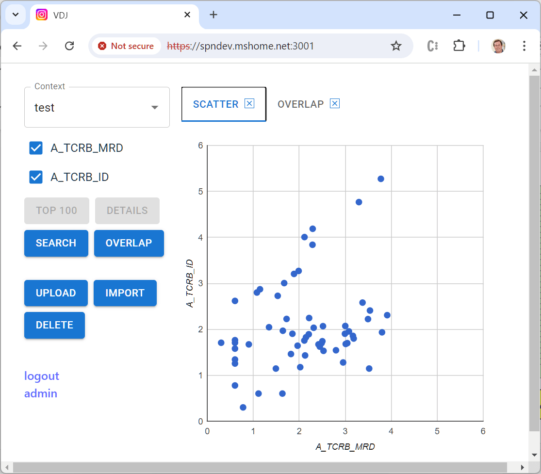
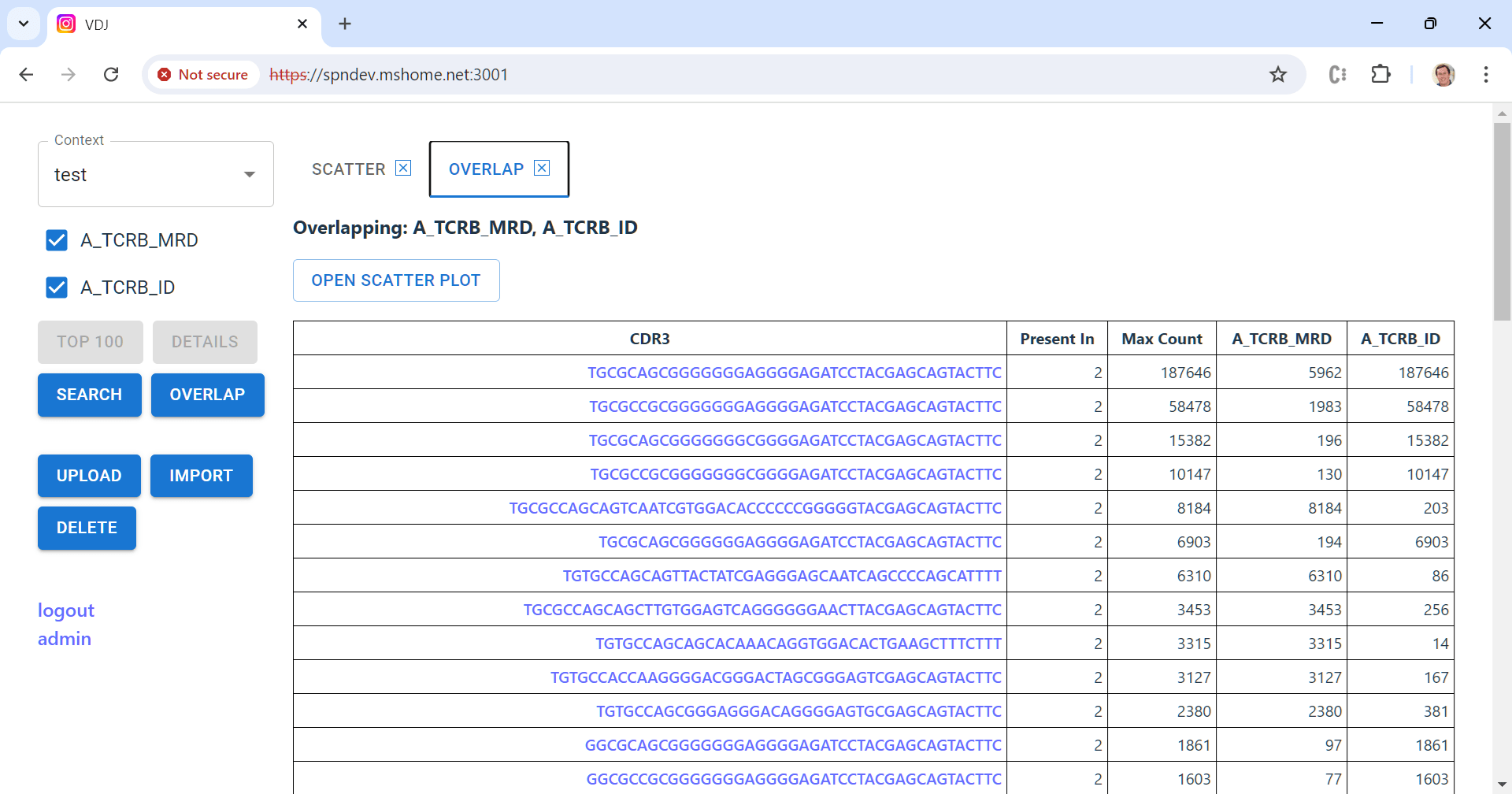
Anyway, even back when I was CTO, Lanny was asking for a visualization tool to help him examine cases. We never got it done then, and a few weeks ago he emailed me “just saying” that it still would sure be helpful. Since (a) I like writing code, and (b) I like Lanny, I decided to give it a shot. The result is an open source tool that I’m hopeful will be useful not just for Lanny, but for anyone in the small but mighty community that works with Adaptive data.

Adaptive’s test creates a laundry list of all of the unique T- or B-cell receptor sequences in a sample of blood or bone marrow. In blood cancers, one of these cells begins to multiply out of control. Post-treatment, detecting even one of these cells can be clinically relevant. Adaptive routinely reports out millions of unique sequences, and with a bunch of metadata per sequence the output files can get pretty huge. Not “LLM” huge, but big enough that working with them in memory gets challenging really quick.

A key feature of the tool is to compute the “overlap” between a set of samples from the same patient — which sequences appear in more than one sample, and at what frequency. This is a challenging computation to do efficiently because you have to compare every sequence in every sample. The best way uses two steps: (1) sort the sequences in each sample, then (2) compare them in order starting from the front. That part of the code is here.

Sorting again!

Of course, this only works if you can sort the sequences in the first place! Not a problem, you say — every modern environment provides built-in, well-optimized sort routines. In some ways these are so convenient they make my teeth itch — one innocent-looking line of streaming sort code can hide wicked performance issues (sorry, old guy again).

But itchy teeth aside, this usually is the best first thought. Sorting in memory is simple, and given the crazy-low cost of RAM, even for really big files it can make perfect sense to just super-size the environment and get ‘er done. But not always. First, in a cloud environment like AWS or Azure, RAM costs aren’t actually crazy-low at all. A 2 CPU / 1GB RAM VM at Azure today runs about $8 per month, while a 32 CPU / 128GB RAM VM is $972! Of course you’re paying for both CPUs and RAM here, so it’s not a perfect comparison, but still, that’s real money. Yeesh.

“Just go bigger” also breaks down in multi-user environments — it may be OK to hog a few gigabytes of RAM for a single sort operation, but multiple concurrent users, all using big memory at the same time, can easily break the bank.

External Merge Sort

All of which — finally — brings me to the punchline for today: external merge sort. This approach caps memory use by leveraging secondary storage for interim results. Only sequential reads and writes to secondary storage are used, so it’s well-suited for spinning disks where seek time matters a lot. We don’t need it very often, but when we do it’s definitely all that. The algorithm works like this:

  1. A fixed-size “chunk” of the input file is read into memory. The data in the chunk are sorted using built-in methods, then written to a temporary disk file. This process is repeated until the entire input file has been chunked, internally sorted and written out. Because there’s never more than one chunk active at a time, its configured size defines the high-water mark of memory usage.
  2. Each pair of temporary files is merged together and written into a new combined temporary file. Because each input is already sorted, this operation requires basically no memory at all; individual entries can be streamed directly from the two inputs into the combined file.
  3. This pairwise-merge process is repeated, using the new combined files as inputs, until only one file remains — the final, fully-sorted result.

There are a few external libraries that implement external merge sort, but the grand-daddy of them all is the GNU sort tool written in 1988 by Mike Haertel and Paul Eggert.

Knobs and dials

There are a few ways we can tweak things to optimize performance in specific scenarios. First and most relevant in the modern world, we can pick a pretty big chunk size. Big enough and some inputs may completely fit in a single chunk — in which case, we can do the whole sort in memory after all!

This turns out to be a really important lesson for contemporary environments: use what you’ve got. It’s a perfect combination for the Adaptive case, where for reasons of cost and biology input size can vary dramatically.

You can also choose to merge more than two temporary files at a time (in fact, you can see this in the overlap code I mentioned earlier). Each merge step re-reads and re-writes data elements, so a larger number here can make a lot of sense.

Because each merge step is completely isolated from the others, the algorithm is also well-suited to multithreading. In my version, each pairwise merge runs in its own worker thread.

Steal this code: LineSorter.java

Note: the rest of this article is just a description of my EMS implementation, useful for working with the code but boring otherwise. Feel free to bail out if that’s not your thing — I hope the first half was worth your time!

I’m fond of the external merge sort implementation I wrote for the Adaptive visualization tool (KeySorter.java). But it makes some assumptions that aren’t particularly reusable, so for the purposes of this article, I rejiggered things a bit as LineSorter.java in the ShutdownHook Toolbox.

Other than a few references to the “Easy” utility class (“easily” removed, ha), you should be able to take this file as-is and drop it into your projects. Or you can just build it as part of the toolbox (you’ll need git and mvn and a semi-recent JDK):

git clone https://github.com/seanno/shutdownhook
cd shutdownhook/toolbox
mvn clean package
java -cp target/toolbox-1.0-SNAPSHOT.jar \
    com.shutdownhook.toolbox.LineSorter \
    -s: -c0 -o0 < /etc/passwd

(That last command is just an example that returns a sorted list of all the usernames in your /etc/passwd file. “-s:” tells it to use a colon as field separator, and “-c0 -o0” tells it to sort and output the first field of each line. Use “-?” to see a full list of options in the entrypoint, which includes an option to experiment with chunk size.)

Interfaces make it usable

LineSorter, as you might gues from the name, sorts line-based input. The class uses three interface implementations to work with the contents of each line:

  • LineParser breaks each line into two strings: a “Key” (the content used for sorting) and “Output” (the content that will be written to the final output file).
    • IdentityLineParser simply uses the input line as both Key and Output.
    • XsvLineParser parses fields separated by a comma, tab or other character and extracts specific fields for use as Key and Output.
  • SortItem and SortItemFactory are used to compare Keys against one another.

Most typical use cases should be covered by these concrete implementations, but of course you’re free to provide your own LineParser and/or SortItem[Factory] as needed.

More parameters

In addition to these interfaces, LineSorter takes a few other parameters:

  • An ExecutorService that supplies worker theads; take a look here for a simple example that just creates and caches threads as necessary.
  • HasHeaderRow indicates whether the first line of the input should be treated as headers rather than data.
  • ReverseSort does the obvious. 😉
  • LinesPerChunk tunes how big each chunk should be — the default is 500,000 lines which honestly means most files will sort in memory anyways. Match to your environment.
  • KeySeparator and CommentChar probably don’t need to be changed, but they’re there just in case!

Asynchronicity

The class offers both asynchronous and synchronous versions of the public interfaces:

I have a love/hate relationship with async code — it’s often a must-have to keep things running smoothly, especially for IO-bound operations. But it also can make code really messy, really fast. I try to compromise using function pairs like these. The first is a purely synchronous version – straight up logic, do your job cleanly and well. The second wraps up the first in a CompletableFuture and handles the noise that comes along with that. Actually, the async versions are pretty much boilerplate; maybe I’ll build an interface tht cleans up the copy/paste code. Another task for the queue!

Anyway, I guess that’s it for today — the rest of the implementation is (hopefully) pretty self-explanatory. I really do enjoy writing little bite-sized bits of useful code — once a nerd, always a nerd. Until next time!

Oh wait, one more bit of sorting trivia because I just don’t know how to stop. It turns out that Java’s generic List sort implementation is based on TimSort, a merge sort that takes advantage of existing runs of sorted data in the input (a common real-world occurrence). So if our data is mostly sorted AND fits into a single chunk, our sort will be lightning-fast. You can apply this approach to the initial chunking step of EMS as well, but avoiding the degenerate case gets a bit complicated. OK, that’s really the end this time.

Defending the Enlightenment

Most non-fiction “idea” books are way, way, way too long. They start with some engaging anecdote in chapter one that sets up the thesis or observation in chapter two. The rest of the book is endless restatement — sometimes with useful supporting information, often not. I assume there is some minimum length that editors require for a “serious” book. Give me a pamphlet any day.

Enlightenment Now is also really long, with a thesis that can be stated pretty succinctly. But the length here has a purpose. Pinker absolutely pummels with data to prove his points — and while it was tough to keep focused on chart number 5,008 of a million, he succeeds.

It’s almost impossible not to be worn down by the inanity of the public sphere; Enlightenment Now offers insight and tools that offer hope to those of us who believe in progress and innovation and the steady improvement of humankind. I’ll try to pick out the high points here, but the full meal deal is worth the effort; highly recommended.

1. Things are pretty amazing

Humans have been around for tens of thousands of years. For most of that time, we bumbled along, slowly improving our lot but largely living hand to mouth, the exception being tiny ruling classes that thrived on the backs of their impoverished people. But for some reason, starting in the late 18th century, pretty much everything started to accelerate for the better.

The obvious thing to do here would be to recount facts from the book, but there are just too many to do it justice. Just a tiny selection:

  • Since the 1700s, the % of people in extreme poverty has dropped from 90% to 10%.
  • 6% of children die at birth in the poorest parts of the world, down from 33% in the richest.
  • Catastrophic famine has virtually disappeared from the earth.
  • Nuclear stockpiles are down 85% from their high in the 80s.
  • War between countries has become the extreme exception vs. the norm.
  • Two hundred years ago 1% of world population lived in a democracy. Today, 66% do.
  • Since the early 1900s, Americans are 96% less likely to die in car accidents, 92% less likely to die in a fire, 90% less likely to drown, 95% less likely to die on the job. We also work 22 hours fewer per week.

Again, this is just a tiny random sample. And the problem with presenting this stuff in bullet form is that it feels counterintuitive and/or naive. After years in Iraq/Afghanistan and Israel/Hamas/Russia/Ukraine, is war really the exception? Should we really be excited about an 85% drop in nuclear arms when 15% is more than enough to destroy civilization? Global averages don’t matter if you’re at the bottom of the scale. And what about other existential threats like climate change or pandemics?

That’s why the book is worth reading. There is an avalanche of good news, including stuff you would never expect, and Pinker backs it up with real data — the narrative is messy and a bit mind-numbing, but he’s convinced me that it’s real.

2. How did this happen?

Things have been improving pretty consistently for hundreds of years, but why? It turns out that the Age of Enlightenment was really quite special. We began to turn away from superstition, and instead applied our brains to understand the world and make it better. We accepted that there is a reality underlying our world; that it is understandable and consistent; and that we can continually improve our understanding to create the circumstances that maximize human flourishing. We became scientists.

Of course there were scientists before the 1700s, and great ones at that. But as a species, we were bound by religion and made-up stories. Those aren’t gone, but by “mostly” accepting that magic isn’t real — that our understanding of the world is limited and often wrong — that we can keep iterating to make it better — and that we can use our knowledge to shape the world through technology, politics, education — we’ve been able to enjoy exponential progress.

There are some interesting warnings tucked in there. It depends on an objective reality, and it accepts that we’ll be wrong a lot. It assumes a more-or-less shared understanding of what “human flourishing” is. There are forces that push back on these and more, but we’ve been able to keep at it for about a  quarter of a millennium.

The big takeaway is that, despite it all, the world is working. The United Nations works. Doux commerce works. Nonviolent protest works. The WHO, NIH, and CDC work. The FDA, EPA and international agreements work. Interpol works. Charitable giving works. Education and even Democracy work. None of them perfectly, and not all of them forever. We can / must do better. But still, pretty impressive.

3. So why aren’t we all psyched?

First of all, “better” and even “better in almost every way by huge margins” doesn’t mean great. Millions suffer every day, and the most privileged of us still have legitimate cause to be depressed sometimes. We haven’t solved climate change and Russia is doing their best to screw things up. It’s easy to be overwhelmed by negative trends that, while maybe short-term in the life of the species, easily can encompass our own lifespans. And it’s just human to focus on today’s problems vs. those of twenty years ago, even if they’re smaller by comparison.

Pinker also hypothesizes that at least some increased anxiety in our lives is completely rational. When you don’t know how to read, never leave your village, and have the local priest telling you God has it all figured out, life is seems a lot less complicated. We know more and understand more, so guess what? The world is huge and scary and capricious and certainly doesn’t care about me personally. Yikes.

But even people that say they are personally happy tend to feel (or at least say) that the world is getting worse. While it seems trite to say, it turns out that this “intuition” is strongly reinforced by “the media” interacting with the way our brains have evolved:

  1. Availability: We think things we hear about are common, even though they may not be.
  2. Recency: We heavily weight what we just heard, even if it’s the exception.
  3. Confirmation: Once something is in our head, it holds on for dear life.
  4. Nostalgia: We tend to remember the past as far better than it really was.

There are for sure incredible journalists out there, but writ large “the media” just wants us to watch their ads and buy their content. The things that accomplish that are big, scary, explosive, titillating and sexy, so that’s what gets reported. Random statistical fluctuations turn into “surges” or “concerning trends” or they “signal potential disaster.” We’re told to be angry about everything. Slow news days here in Washington always bring out the stories about Mt Ranier popping off, or the continental plates pulling a Lex Luthor on my house at Whidbey.

Of course I get sucked into this too — and if you cover the whole world and predict disaster every day, you’re going to be right sometimes! It’s hard to know what to do about this; ignoring the news might make you happy but also makes you a lousy citizen. The best I can come up with is to try and limit the “breaking news” popups on my phone and try to read whole articles rather than just scroll headlines. Not easy.

4. So we can just relax, right?

Of course not.

All of the goodness that Pinker catalogs happens because real people are making it happen. They’re recognizing problems, using facts and history and ideas to understand them, designing solutions, trying them out, throwing away the ones that don’t work and improving the ones that do.

This is why life without God has meaning — we’re all part of a great machine that, despite our own innate irrationalities, are helping humanity flourish in the world. Inexorably, hard won, with terrible setbacks. My failures easily outnumber my successes, but I’m still pretty proud of what I’ve created so far (mostly looking at you, A & C).

Enlightenment Now was published in January 2019, smack in the middle of the Trump presidency. Given events since then, it seems like the world saw the book and said “Pinker, hold my beer.” Populism, COVID, abortion, human rights, inflation, Ukraine, Hamas — and the risk of more chaos and setbacks if we elect a convicted felon to his second term.

But when I was in high school, my lit teacher told us that Victor Hugo wrote to a friend, “the key is to live as if men were good, while knowing they are not.” I’ve never been able to find the actual quote or source here, but I like it anyways, and will add this twist: “Work like the world will end if you don’t, even though it probably won’t.”

Dory had it right — just keep swimming (and vote for the deep state).

(Mostly) Miraculous

My last Thursday afternoon and evening were quite the whirlwind — home to ER to OR to recovery to home in just under twenty-four hours. And good as new, despite a scare that probably would have killed me not that many years ago. Back when I worked in healthcare, first-hand patient stories always made the best market research. And since so many of my connections are still fighting that good fight — here’s one for free!

Woke up Thursday with some mild discomfort in my gut. Although I’ve been clear since my colectomy, years of dealing with diverticulitis made me dedicate a few brain cells to the issue while taking care of errands during the day. By afternoon the pain had gotten quite a bit worse and, more unsettling, focused in my lower-right side. This is not typically diverticulitis territory, but it is where the appendix sits. Huh. Time to take a closer look.

The Nolan family has gotten a lot of care at Overlake Hospital over the years. Along with the city of Bellevue, Overlake has grown dramatically since our first kiddo was born — in many ways for the better, and in others not always so much. But it’s hard to beat the convenience of a hospital ten minutes away, so it’s still our go-to. I drove over, successfully navigated into a tight little spot in the garage, and headed upstairs to the ER.

Waiting Around, Act One

Check-in and triage were fine. It wasn’t particularly crowded, but nobody was going to call Code Blue over a tender belly, so I settled in to wait with my book (a worthwhile one by Kara Swisher). My fellow patrons and their families were scattered around the room, all looking up hopefully every time somebody in scrubs opened a door or walked by.

By far the worst part of the ER experience is the open-ended waiting. A few years ago I listened to an audiobook course about Emergency Medicine trying to figure out why it’s so terrible, and I didn’t really get a good answer. Of course it’s a tough environment to predict — new cases show up all the time, and some of them are going to take precedence. But it’s more than the waiting, it’s the lack of feedback that makes it awful — did they forget me? Should I check back in? I have to go to the bathroom, but what if they call me while I’m gone?

It would be super easy to post a status board, so all I can think is that ER administrators must have decided that not knowing is better than knowing. And maybe there’s some truth to that — it’d be pretty tough to stand by quietly with a hurting child while others jump the line, even if it is the right “big picture” call. But for me, especially at a time when people are reaching out to be cared for, I believe hospitals can and should do better.

Anyways, after about an hour I was called back by a great nurse (such an amazing profession). She correctly predicted that the doc would want urine and blood samples, so got those going while I … waited some more. When I finally did see a doc (actually a PA, but he was fine) we were about three hours into the process and he ordered a CT Scan. Then back out to a special part of the lobby, a kind of a no-man’s land with recliners set up in a maze of temporary screens. Settle in.

The Best ER Hack

If you’re at a hospital in the United States today, you almost certainly have access to an online “patient portal” (most likely Epic’s MyChart). Thanks to a lot of folks who pushed this rock uphill for many years, just about all the information about your visit is available in the portal, in near real-time. This includes test results, visit details, even provider notes.

I can’t recommend this strongly enough: Make sure you have access to your patient portal during your time at the hospital! If you haven’t set things up ahead of time, use your wait time to do it, either by installing an app or just using the mobile browser on your phone. The folks at the front desk should be able to help if you need a hand.

Because of MyChart, I was able to see that my test results had come back. I had blood in my urine and a bunch of markers for infection in the blood — so something was up, albeit not clear exactly what. Even more important to my sanity, I could see that the CT Scan order had actually been sent to the imaging department and not lost.

After another hour and a half somebody called my name into the maze, brought me in for the CT, and deposited me back in my recliner. I was getting dangerously close to the end of my book!

Waiting Around, Act Two (aka The Hallway)

After about another hour fifteen in my recliner, an ER coordinator hunted me down in the maze and brought me back into the ER proper, leaving me in a side chair in the hallway with assurances that “somebody” would come by in a few minutes. This time the wait wasn’t actually that long — about fifteen minutes, during which I had this text exchange with Lara:

  • Me: Assume must not be actively dying or would warrant not the hall.
  • Lara: It’s appendicitis. I can see your chart.
  • Me: Ah sh*t there it is.
  • Lara: Also u have a notably small bladder but I think we knew that.
  • Me: Rub it in.

Right about this time, a “doctor-looking” guy came up and asked if I was Sean. I confirmed I was, and asked if there was anything other than surgery for appendicitis. He startled a bit and asked me how I knew the diagnosis. Remember how I mentioned the value of having real-time access to your chart?

Anyways, the answer to my question was no, and he left quickly to make sure they could get an operating room ready right away. A couple of minutes later, the coordinator reappeared and said “I can’t find a wheelchair but you’re supposed to be upstairs in five minutes. Can you walk ok?”

And we were off.

Punch it!

As we walked out of the elevator, a nurse (who I met later as Nancy) went jogging past saying “They told me you were bringing a bed, now I have to find one.” We kept going down the hall to a mostly empty room where I met two more nurses, Lolo and Michelle. You know that scene from The Princess Diaries where Mia is getting transformed by an army of stylists all working on hair, nails, makeup, etc. at the same time? This was me but kind of in reverse. From about 8:30pm to 9:15pm, in no particular order (it was all happening at once), the team:

  • Found a bed
  • Got me changed into a gown and hair cover
  • Collected my clothes and book into a bag
  • Sterilized my body head to toe
  • Shaved my abdomen (and vicinity!)
  • Had me gargle with chlorhexidine and swabbed a bunch of iodine goo up my nose
  • Itemized the contents of my wallet and pockets and sent it all to a safe somewhere
  • Had me sign a bunch of consents
  • Took at least a million vital signs
  • Administered IV antibiotics and other goodies
  • 2x reconfirmed my complete medical history and corrected the pharmacy on file
  • Helped me video call Lara to tell her I was going into surgery
  • Had me talk to the anesthesiologist about his plan
  • Hooked up leg compression sleeves
  • Attached me to a warm air blower of some kind
  • Let me use the bathroom

After all of this they dimmed the lights and I just kind of hung out for about twenty minutes before being wheeled into the OR itself, where I met some more staff and they had me climb onto the operating table. The oxygen mask went on, I started some deep breaths and counting backwards and, and I’ll defer to MyChart for the rest because I was out cold:

I injected a few cc of 0.25% marcaine to the LUQ abdomen and made a small incision. I inserted a Veress needle to enter the peritoneal cavity. I used the saline drop test to make sure its correct location. I then insufflated the peritoneal cavity with carbon dioxide and achieved 15 mmHg. I made a 12 mm infra-umbilical incision and inserted a 12 mm port under direct visualization with 10 mm camera. I inserted 10 mm 30 degree camera, and inspected for any injury or bleeding while gaining access. There was none. I removed the Veress needle. I placed a 5 mm port in the suprapubic area and another 5 mm port in the left lower abdomen. The patient was then placed in the Trendelenburg position with the right side up.

The appendix was inflamed but without perforation. It was located inferior and lateral to the cecum. I grasped the tip of the appendix with a Hunter grasper, and ligated the mesoappendix with Ligasure. thereby leaving only the appendix attached to the cecum. The appendix was then stapled at it base with a white load stapler. The specimen was placed in an Endocatch bag and extracted through the 12 mm umbilical port. I irrigated the peritoneum with normal saline. The staple line was intact and hemostatic. The surgical count was correct. I closed the 12 mm port using a zero PDS tie and the Carter Thompson device. The 5 mm ports were removed under direct visualization and the peritoneal cavity was deflated. The skin incisions were closed with a 4/0 monocryl stitch. The patient tolerated the procedure well and was extubated and transferred to the PACU in a stable condition.  I was present throughout the entire procedure and performed all the portions myself.

The sheer volume of technology in these two short paragraphs is almost beyond comprehension:

  • A Veress needle is used to access the abdomen and inflate it with carbon dioxide. It has a little spring-loaded tip that covers the sharp end as soon as it enters the cavity so that the surgeon doesn’t accidently poke other important stuff in there.
  • The “saline drop test” (aka “hanging drop test”) helps the surgeon know that they entered the abdomen correctly. A drop of saline should be sucked into the inserted Veress needle because our abdomen apparently holds negative pressure; if the drop stays on the surface, placement is incorrect.
  • I first encountered the Trendelenburg position during my colectomy a few years ago.
  • A grasper is a long thin tool that is used to manipulate tissues during laparoscopic surgery — the “Hunter” style seems to have a particular toothed gripping end for traction.
  • LigaSure is used to cut and automatically seal tissue — in my case it was used to remove the mesoappendix that surrounds and holds the actual appendix.
  • A stapler is used to, well, staple tissue closed — for the appendix, this both separates the organ and ensures it’s closed up.
  • The Endo Catch bag could not look more like a little fishing net.

By 11:15pm I was awake in recovery, and by 11:30pm I was in a bed two floors up, ready to call it a night. Actual miracles.

Waiting Around, Act Three

I actually slept pretty well, getting up for good about 6am. My roommate Hank was a friendly older guy working through a boatload of challenges, but he too had a pretty restful night, apparently the first in weeks after getting some UTI relief. We chatted a bit, then he had breakfast while I caught up on my chart. By 7am the ER surgeon on shift came by to see how I was doing — which was surprisingly fine. She said if I ate something without puking it back up, I’d be good to go by 9am.

Challenge accepted, I dutifully (and successfully) ate half an omelet, then unplugged my IV pump from the wall to take a walk. In my limited time as a hospital in-patient, I’ve found no better way to pass the time and feel less awful than to walk around. Because this particular ward was pretty small — a loop of maybe thirty rooms — I got to know it well. Down to the big wall of windows, cut back up the hall to the back elevators, past the nurse’s station, out past the coffee machine and public elevators, back by my room. And again, and again. Overlake participates in a program for local artists, and I enjoyed the display of geometric/abstract pieces by Ann Reynolds, who I can’t seem to track down online.

Unfortunately, the hospital settled back into its comfortable ways. 9am rolled on by, as did 10am, 11am, 12pm, 1pm and even 2pm before I was finally discharged. Really? This seems suboptimal for everyone involved. At about noon while walking a circuit (now in street clothes in a passive aggressive attempt to move things along), the ER surgeon saw me and asked “What are you still doing here?” There was no good answer.

But I did finally make it home — and despite all the wasted time, with sincere thanks and appreciation to the institution, docs and nurses for keeping me safe. The technical side of medicine, especially what can be done with surgery and reconstruction, is the very definition of miraculous. If only we could do as well with payments and patient experience. Someday.

Work the Problem

My father-in-law is actually a really great, super-nice guy. But that doesn’t mean he’ll pass up an opportunity to give me a hard time — say, paddling the canoe towards the alligators while I’m in the bow. Or more to the point of today’s post, bringing over the New York Times Crossword puzzle and pretending we’ll do it “together.” For years we’d sit down and he’d basically watch me stare blankly at the clues. Then, on cue every thirty seconds or so, he’d throw one out like he was just guessing: “maybe try OBLIGEE for 20 across?” He always knew the answers, and he knew I knew he knew the answers, and that was the fun part. Infuriating, but I’m just too competitive to not get sucked in again and again.

So when I retired a few years ago, one of the many items on my to-do list was “get good at the NYT crossword.” Since then I’ve done the puzzle pretty much every day, missing maybe a half dozen over three years. And of course, it turns out that solving crosswords is a skill like any other; enough practice and it becomes pretty straightforward. Most interesting to me, it turns out that techniques for solving puzzles overlap a ton with techniques for debugging software.

Now maybe I shouldn’t be surprised that this is the case, because both tasks are about establishing possibilities and fitting them into a set of constraints. Or as Gene Kranz (or Margo Madison) might put it, “working the problem” until you find the answer that was hiding in there all along.

Note: I’m going to be spoiling a few answers for recent NYT puzzles — if you do them in arrears you have been warned!

The Basics

OK, on the surface this seems pretty obvious; we’ve all been doing some form of crossword since elementary school vocabulary worksheets. A bunch of clues to interlocking words, across and down in a grid. It helps to know a lot of trivia, a few foreign words and the names of various artists (modern and not so much). The NYT puzzle goes through a weekly progression where Monday is the easiest and Saturday the hardest. Many folks are surprised to learn that Sunday isn’t the most difficult; it’s just the “biggest,” meant to be done leisurely over your weekend soft boiled egg and tea looking out from your brownstone over Central Park or whatever. Thursday is an interesting day, because it tends to have a “gimmick” — more on that in a bit.

Beyond just “knowing stuff,” the first thing folks learn about puzzles is that there are certain words that repeat all the time. Just a very few:

  • The artists Sia and Ice-T are quite popular with puzzle authors.
  • Their favorite Olympic sport is definitely fencing, specifically épée.
  • Just about every disturbance is an ado, many people are prigs or fops and get into snits.
  • Authors all wish they drove a GTO or at least a car with a T-top.
  • In amour with your amie? Maybe it’s just the romance of été along the Loire.

You get the idea. These common words are usually the quickest way to get started on a puzzle, because they’re easy to pick out. The checklist of things I walk through when faced with a weird debugging problem works much the same way:

  • Off-by-one?
  • Out of memory?
  • Infinite loop or recursion?
  • I/O failure?
  • Unexpected input?
  • Divide by zero?

In both cases, a relatively small number of solutions account for an outsized proportion of problems. And because they happen so frequently, you being to develop a “feel” for their symptoms (or clues) … most of the time running through these common cases will put you on the right path to a complete solution.

Confirmation

Another sort-of obvious technique for puzzle solving is to increase confidence or eliminate possibilities through confirmation. As much as I can, I defer writing in answers until I find and least one intersecting answer that corroborates the first. For example, since I can’t remember what networks show what shows, the four-letter answer for “Several CBS dramas” could be either “CSIS” or “NCIS”. If overlapping clues support a C or N in the first position, or a S or C in the second, that gives me greater confidence in both of them.

One thing that makes a puzzle harder is to provide fewer or more complicated opportunities for easy confirmation. Saturday grids tend to have more “open” sections with longer, multi-word answers placed intersecting and side-by-side. Another approach is to isolate sections of the puzzle from each other, so that solving one doesn’t help you get started on the others.

Confirmation is key to debugging as well. Theories are easy to come by, especially with bugs related to user input or distributed systems. Maybe two users clicked “submit” at the same time. Perhaps one system crashed while another was holding an open network connection. Or it could be something that happens on every 32nd request. Coming up with these ideas is important, but proving or eliminating them is the heart of the work.

Unless you’re able to reproduce the bug on demand, your best friend for confirmation is detailed, timestamped system logs. These let you look back in time and see who was doing what when; the tiny performance hit is always, always, always worth it. Today most enterprises use third-party or cloud-provided distributed logging solutions, but an old-school rotating disk file can do the job just as well. Either way, great engineers learn to slice and dice logs to find evidence that corroborates and confirms their theories — there’s no rush like finding that smoking gun.

Getting Stuck

Sometimes — whether you’re working a puzzle or debugging code or something else — you just get stuck. This is what separates the grownups from the children in the room — do you stick it out and find some way to make progress, or do you just give up, go home, and let it be somebody else’s problem? If you sense a little moral judgment in that phrasing you’d be correct. 😉

While it’s not  the easy answer, years of experience have proven to me that the best thing to do is just keep trying. Read the clues again. Force yourself to look beyond your initial interpretation — a “70s Ford” may not actually be a car! The answers are in there, and if you give your brain enough chances to fire the right neurons, it will happen. And it works for debugging too; a full decade ago and in another life I wrote about it here: The definition of insanity works!

But while giving up is not an option, walking away for a few minutes often is a great idea. It’s quite surprising how often a change of scene will help shake out a solution — answers just pop out where they seemed impossible before. Sticking it out and changing context — it’s all about giving your brain space to make connections.

Patterns and Partial Answers

Something is better than nothing — so when you just can’t figure out that next answer, there are a few ways to keeping pushing forward:

  • Plurals usually end with -S, past tense with -ED and active verbs with -ING. Of course these are often wrong, but they can be super-helpful as confirmation for intersecting clues.
  • Sometimes you can make a guess at part of the answer. For example, it’s a pretty good bet that “Where you’ll find women out to drink” ends with BAR, and “Platonic outing” starts with FRIEND.
  • Even when you’ve got no confirmation at all, it can be helpful to write in guesses that fit. Seeing letters in place is a great way to trigger those stubborn neurons, and I can easily scribble over at least two mistakes before the square becomes illegible!

These techniques all reduce the unknowns. We’re not built to juggle too many things in our head simultaneously, and fewer empty squares makes it easier to focus on the ones that remain. It really doesn’t matter whether the guesses are right or wrong — that will become evident as we make progress on their neighbors.

Once again (and I swear I’m not just forcing these), this same approach helps debug code, where it’s called “divide and conquer.” Split the problem in half and just assume that one half is working correctly. If that’s true, the bug must be in the other half — so find it there. If you can’t, then your assumption must have been wrong. Either way, you’ve made progress.

The Reverse Solve

I mentioned that Thursdays are often a “gimmick” puzzle. Sometimes these are structural — answers extend into the black squares, or multiple letters go into one square. Other times they’re just tricky themes. For example, last week the trick was about missing letters in a set of clues:

  1. First, solve the clue “thrice-remade movie” (A-STAR-IS-BORN)
  2. Next reparse that answer as six words (A-STAR-IS-B-OR-N)
  3. Replace the stars in clues with a B or an N to get the actual clue. For example, replace the star in “*acre on the ocean floor” to get “Nacre on the ocean floor” for the answer “MOTHER-OF-PEARL”

There was no way I was getting this by working “forwards” — I got the movie title, but couldn’t for the life of me figure out how to parse that into six “words.” Instead, I ended up working in reverse. I was able to solve “Acre on the ocean floor” as “mother of pearl” based on confirmation — it had to be correct, but it made no sense. But I knew that M-O-P was another term for NACRE (one of those commonly reused crossword favorites), and eventually it dawned on me that that could fit with “acre” in the clue, and eventually that let me work out the “B or N” part of the primary clue. From there, things fell into place quickly (“*assist in a foursome” was MCCARTNEY, etc.).

And believe it or not, this is yet another way to make your way through a debugging problem — you know the outcome of the bug has to be true because you see it happening. Look at the step right before this — what has to be true for that outcome to happen? And if that’s true, what has to come before that? It’s kind of amazing how often novice debuggers will simply deny what they are seeing right in front of their face. If only I had a nickel for every time I disproved “that just can’t happen” in production code….


… and that’ll do it for yet another wander through “something-that-isn’t-code actually working a lot like code.” It seems clear that over the next few years, AI is going to be writing a lot of software. And that’s OK because progress is progress and there are tons of coding jobs that at their core really should be done by machine. But I do love the craft of it all, and I hope there will remain some space for artisan code, just like we still value artisan woodwork and clever crosswords. I know that sounds a bit funny, but I mean it. We will see!

Nit-Picking my Tesla

Lara, Copper and I just finished another LA-Seattle run in our 2019 Tesla; just about 23 hours on the road including charging stops. I enjoy the drive — great scenery along most of the route, a good audiobook or two, a lot of snacks, and a quick overnight to explore a new town (OK, usually the same town — there are great donuts in Mount Shasta).

Plus, of course, Autopilot and Dog Mode and optimized routing through the remarkable Supercharger network. Five years in, this stuff just doesn’t get old.

But that doesn’t mean it’s perfect. So from a place of love, and on the slim chance that tweeting non-crazy stuff at Elon still works, a few things that need fixing. From a guy who has spent a lot of highway miles thinking about it.

1. Routing & Charging Stops

Our car gets about 300 miles on a full charge, and there are a ton of Superchargers up and down the West Coast. Getting stranded is just not a real concern, unless you’re dumb — the same kind of dumb that runs out of gas in a “normal” car anyways. Just like in my “normal” car, I don’t like to push my range too low when I’m on a trip. I’m sure that different folks will have different tolerances for this kind of thing.

Tesla has a truly impressive routing system that takes charging into account. For example, when I start in Bellevue and want to drive south to Mount Shasta, it figures out where I’ll need to charge and adds those stops along the way: Kelso, Harrisburg, and Medford. It estimates the remaining charge at each stop, and how long I’ll have to stay before setting off again. It’s smart about charging time too — efficiency slows way down as you approach a full charge, so it usually arranges things so you only need to get to around 80% or even less before continuing.

And because many factors can impact range, it constantly re-assesses these stops as you drive. If the margin to reach a charger gets too slim, it will automatically find a closer option and rejigger the rest of the trip to match. It’s really fun to experience it in action — the kind of innovation that cloud-connected software makes possible.

Anyways, this is all great — BUT. As you can see, Tesla considers it safe to arrive at a stop with 9% charge remaining. At 9% I have about 25 miles left, the gauges are red and the car is disabling AC to conserve power. Sure it’s “fine,” but my blood pressure doesn’t concur.

Ask: Let me set a minimum charge level. I’d love to use 18% as the floor (about 55 miles for my car). Without this setting, I often feel compelled to mess around manually with my route to stop earlier and/or charge longer. Is it a huge deal? No — but it’d be nice to just not think about it. Help me out here.

2. Speed Limit Mistakes

When driving on Autopilot, the car automatically reduces speed when the effective speed limit drops (only slower, never faster). This is a fine feature, and certainly handy when you’re coming into a metro area or whatever and the limit is bopping up and down frequently. The problem is that, especially in the last few FSD iterations, the system gets confused by signs that set alternative limits — e.g., for trucks towing trailers or with more than two axles.

I actually didn’t realize that the car still tried to read signs at all; I just assumed it was using some published data source and GPS. But this happened at least ten times on our last drive; the sudden slowdown to 55 when you’re happily zipping along with traffic at 75 is jarring and annoying. I don’t think it’s strictly “dangerous” since braking is sensitive to traffic to the rear, but it still sucks.

Ask: Do better tracking the current speed limit.

3. Bogarting the Passing Lane

I like to drive consistently about five to eight miles over the speed limit; pretty safe from tickets while still moving along at a reasonable clip. This means I stay mostly in the travel lane, occasionally pulling over to pass folks on the left. Since I’m only going a few clicks faster than the folks I’m passing, maneuvers happen pretty slowly — so I keep an eye out for folks pulling up behind me in the fast lane and stay out of their way as much as possible.

FSD doesn’t deal super-well with this. When it notices that I’m going faster than a car ahead of me — even though that car is quite far ahead and I won’t approach it for some time — it moves into the fast lane. While I don’t love this, it would be OK except that the system is NOT sensitive to folks approaching from behind. So left to its own devices, at my preferred speed I’d be that a**hat squatting in the passing lane blocking people trying to pass.

The system does know generally that riding the passing lane is a bad idea and will sometimes move to the right. But something about this particular scenario screws up that behavior. Ask: Improve awareness of cars approaching from the rear and get out of their way.

4. Semi-Automated Lane Changes

Because of the behavior in #3, I will often put the car into “Minimal Lane Changes” mode. This setting limits automatic lane changes to safety reasons (e.g., to make room during a merge), or to follow an active route (e.g., to take a highway exit). Honestly I don’t mind this at all — it’s a nice compromise between letting the car do the work and being an active driver. But there are a couple of annoying things that need work.

First, the setting doesn’t stick. I cannot for the life of me figure out why they did it this way, but “Minimal Lane Changes” stays active only for the duration of the current drive. They take pains to tell you this every time you turn it on, so it’s not just a bug. I either have to remember myself, or wait for the car to attempt a lane change, cancel it, and catch the popup on the main console before it disappears. This is the only setting on the car that works this way! Ask: Make the “Minimal Lane Changes” setting sticky.

The other challenge here is that, just in the past few software iterations and only sometimes, the car is super-slow to respond to lane change requests. The way this works is the driver uses the turn signal to “request” a lane change, and the car automatically moves over when the target lane is clear. Typically this maneuver is very responsive and happens right away. But every few times now, the car just sits there. The blinker is on, the FSD display shows a clear path to the target lane, but nothing happens for 15-30 seconds. Eventually the car moves over, but only after somebody is annoyed — either me trying to pass, or somebody else trying to pass me!

Ask: Figure out why the car is (sometimes) sluggish to move into a clear lane.

5. Mid Speed Follow Distance

A few software iterations ago, Tesla removed the ability to fine-tune follow distance by number of car lengths. Instead, it’s managed by the FSD “profile” (Chill, Average, or Assertive) without direct control. As with some of the other issues I’ve brought up, “generally” it’s fine, but the inability to change the distance manually is a problem at speeds around 25-40mph, especially on a congested highway. In this range, the gap is too large and invites people to constantly cut in front of the car. Honestly it must be what it feels like to drive a semi.

I suspect this is going to be a tough one to get right automatically, because closing up the distance too much — even though it’s what almost all drivers do — certainly increases the risk of a fender bender. And there a ton of folks out there happy to hold FSD to a much higher standard that our fellow humans. So, my ask: At least for now, give me back fine-grained control of follow distance.

6. “Miles Remaining” Calculation

Maybe this is my blood pressure talking again, but one of the most important stats on the display is “Miles Remaining.” It basically takes the place of the gas gauge, giving me a sense of which destinations are in range and which are not. But unlike gas cars which have relatively consistent MPG, electric miles are super-variable. Elevation, speed, temperature and a host of other factors impact this — coming down out of the Oregon passes even turns the dial significantly backwards, gaining about twenty miles thanks to regenerative braking!

The value reported is clearly based on the last X miles of driving, for some unpublished value of X. That is, it’s pretty accurate if you keep driving in the same conditions. Which is fair if you think about it; the car can’t read your mind to know where you’ll be driving next. Or can it?

From what I can figure out, it seems that the “% remaining at next charge” value we talked about in #1 does predict the future, based on the active route. Those California-Oregon passes are my best recent example. Leaving Corning (CA) the Tesla told me I’d have about 15% charge remaining at my next stop in Medford (OR). By the time I’d climbed to the top of the passes, that expectation was down to 10%, but my “Miles Remaining” value was far, far lower — nowhere near enough to make Medford. But as I said earlier, as we dropped down the other side, “Miles Remaining” actually climbed about 20 miles and we cruised into Medford with just about exactly 10% remaining.

Now I don’t know what the software is really doing here. But somehow, even at the top of the pass, the routing system “knew” that I would use far less energy getting from there to Medford than I had so far. Maybe it did this using data from previous trips (my own and others’), or maybe it actually considers elevation. But one way or the other, the routing system consistently estimates residual charge better than the real-time system does.

Ask: When there is an active route, sync these systems up to show the same information!


There are other issues here and there: the automatic wipers are sadly useless, and I wish I could convince the falcon doors that the posts in my California garage are NOT in their way. But I don’t want to get greedy, and I don’t want to give the impression that these are anything but nits. To be clear, I love my Tesla. I’m turned off by some of Elon’s personal behavior, but I also believe he’s a straight-up genius whose ventures are having a remarkably positive impact on the future of our species. It’s adorable when folks claim (with all the confidence of a college freshman) that “anyone” could have done what he’s done. Spare me, please.

Lastly — I think it’s useful to note that all of the problems I’ve brought up are software issues. I can’t stress enough how important this is — what Tesla is building (and maybe Rivian and a few others) is fundamentally different than what the traditional automakers are building. They’re not just swapping out a gas motor for electric; they’re inventing a whole new kind of vehicle. It’s a lot less of a hassle to deal with a “recall” when it means your car updates overnight in your garage. The car just gets better and better day by day. That’s amazing, and super-fun.

Be the one who knows (Excel edition)

The utter haplessness of so many business leaders amazes me. Somehow we’ve created a culture in which the more “important” you are, the less you actually do for yourself. Folks talk about “staying above the details” or “focusing on the big picture” like that’s a good thing, but for my money it’s just code for lazy and/or ignorant. And honestly, at least in my experience, at the end of the day it’s usually easier to find answers yourself than it is to explain to somebody else what you need. Not always — but often enough.

Nowhere is this more true than with respect to data. Solid decisions want information — what’s driving customer behavior, service outages, cost trends, morale problems, schedule delays, merger options, marketing opportunities? Every knot is easier to untangle when you understand its data context. Do not underestimate the influence you can have just by being the one who knows stuff.

And it’s a lot easier than you think. I love my SQL, but there’s a ton of knowledge hiding behind just a few simple clicks with Excel (or Google sheets or whatever, sure. We all know who really grabbed the torch from Lotus and Multiplan and made the spreadsheet the powerhouse it is today). Seriously, if you spend ten minutes with me here, it’ll pay back just about every day until you retire and sit around spewing entropy into the universe.

Use these links to VIEW or DOWNLOAD the final version of the Excel workbook

0. Tables, rows and columns

“Tables” of data are everywhere — so ubiquitous that we just take them for granted. But 2D grids are really quite remarkable and can help us reason about just about anything. Each row of the table represents an instance of “something,” and each column represents a “feature” of that something. For example, I just randomly grabbed this screenshot of my song queue from the Spotify app:

The “something” in this table is a song. Each of the five columns represents a distinct feature of the song:

  • Position in the queue
  • Thumbnail image
  • Song title and Artist name
  • Album name
  • Duration of the song

Now, before we can do anything interesting with data like this, it needs to be in a format that Excel understands. We’ll look at that in a second, but for now just marvel at how many of these tables you use every day. Weather forecasts, credit card activity, Explorer (or Finder) windows on your laptop, contact lists, invoices, nutrition labels… even your grocery list is a table, albeit with only one column. Rows and rows of data, each described by distinct feature columns. Nerdvana.

1. Get the data

The hardest part about asking your own questions is usually just getting the data. In enterprise settings folks are always trying to “control the message,” so you end up with pretty but mostly static reports and charts that answer the questions they think you want to ask. But every reporting system has an option to export raw data to Excel, or more likely to a “CSV” file. CSV is just a fancy text file in which each line is a row and each column is separated by a comma (CSV == “comma-separated values”). As I’ve talked about before, it’s the workhorse of the modern age — efficient and universally accepted.

When your question involves more public stuff — economic or census data, stock reports, weather, health, etc. — you can almost always find it in CSV format thanks to https://data.gov and its regional counterparts. The Obama-era “open data” initiatives created by folks like Aneesh Chopra, Todd Park, Greg Downing et al were really quite revolutionary; it’s a shame more people aren’t aware of them. I miss the heydays of Health Datapalooza!

For the purpose of this article, let’s ask the question — over the past few years, what’s happened to the cost of energy at my house in Bellevue, WA? Everybody talks about these costs being out of control, but the truth is we haven’t really felt it at home. So what’s up?

First let’s get the data for my house. Thanks again to those Obama years, I can get started by just logging into my Puget Sound Energy account and hitting the “Green Button” hiding at the bottom of the usage page. The download gives me three years of usage data in two files, one for electric and one for gas. Let’s double-click electric and see what happens:

Not bad! But not ideal for analysis either. Here are the first few things I always do to clean things up:

  1. Remove the title rows at the top (Name/Address/etc.) … everything in Excel is easier if your sheet is a uniform table with a single header row. Click and drag over the row numbers one through five to highlight those rows, then right-click and “delete” them.
  2. On the View ribbon, choose “Freeze Panes” and select “Freeze Top Row.” Now when you scroll around in the document, you’ll always be able to see the column headers.
  3. Hit Control-A to select the whole sheet, and then on the “Data” ribbon choose “Filter.” This adds little dropdown controls on each column which we’ll check out later.
  4. With the whole sheet still selected, double-click the vertical line between column letters A and B. This auto-adjusts all of the column widths so that you can see everything in each cell (e.g., you see start and end dates rather than a bunch of number symbols).

Much better!

First Quick Hits

There is a huge payoff just for the little bit of effort we’ve put in so far. First click on the column label F to select all of the cost data. At the bottom of the window, Excel computes some quick statistics for you — e.g., my average monthly bill for the period was $198.88. Click on the “Start Date” dropdown and unselect the years 2021 and 2022, and the average (for 2023 and 2024) actually drops to $196.89.

To look at the trend another way, click the “Start Date” dropdown again and make sure “(Select All)” is checked. Then on the “Insert” ribbon, choose “Recommended Charts” and then “Line Chart.” OK, it’s clear that winters cost more, but is there an overall trend? Click on the chart, then the “+” button on the right, then check “Trendline.” Boom! While our quick average check above hides it, there is a slow upward progression over time. Not enough to freak out about, but a hint.

Formulas

We haven’t looked at gas data yet. Also, I’d really like to go back further than 2021. The Green Button data doesn’t have this, but I can view charts into the past, and transcribing usage and cost data from those is pretty easy. This is another “be the one that knows” lesson — entering data manually feels like it takes forever, so most people avoid it. But the reality was just twenty minutes — time well spent in return for insights others will miss. Get ‘er done.

Next I combined the gas and energy data into a single table, and reorganized the columns a bit. Most interestingly, I added two formulas that normalize out seasonal usage variability.

Excel formulas are a bit of black magic, but with a few patterns you can get a lot of value for a little investment. The basic ideas are:

  • A cell whose contents starts with “=” is a formula — a computed value.
  • Formula inputs are typically other cells, referenced by column letter and row number: “A1” is the top left cell.
  • Standard mathematical operators (+=/*) can be used in a formula. For example “=B3/2” resolves to the value in cell B3 divided by 2.
  • Formulas can also reference functions. For example, “=LEFT(B3,4)” returns the first 4 letters in the value in cell B3.
  • Some functions reference a range of cells, referenced by the top-left and bottom-right cells to include: “=AVERAGE(B3:C10)” computes the average value of cells in columns B and C from rows 3 through 10.

The values in column D (“Electric $/KwH”) were set up like this:

  1. Click on cell D2 and enter the formula “=C2/B2” — dividing the total month’s cost by the number of kilowatt hours used.
  2. With cell D2 selected, scroll all the way to the bottom of the table and shift-click on cell D97.
  3. Hit Control-D to “fill down” the formula from D2 into all of the selected rows.
  4. Click the “$” button in the middle of the “Home” ribbon to format all of these values as dollars.

Here’s the magic — somehow, every formula you just created is “correct” — that is, column D in row 50 references columns B and C from row 50 as well. How did that happen? It turns out that when you copy a formula, the input values are automatically updated so that they are in the same relative — not absolute — position as in the original formula. When we typed “=C2/B2” in cell D2, we were really saying “divide the cell one column to the left by the cell two columns to the left.”

Excel can do all kinds of “fills” — but the basic Control-D “fill down” is by far the most useful; you’ll find yourself there again and again. The exact same steps were used to compute the cost of natural gas per CCF (100 cubic feet, a standard measure for residential use) in column G, using the formula “=F2/E2” and filling down.

Line graphs and trendlines for these new normalized values looks pretty similar to what we’ve seen before. There’s a late 2023 spike in gas, but that’s come down and otherwise looks like a very slow, steady upwards trend — not great, but not something to panic about either.

Add some reference data

Washington gets most of its electricity from hydropower, so there are some trends we’re protected from. Let’s see how my home data compares to the rest of the country, courtesy of https://data.gov. A quick search for “electric and gas costs monthly” led me directly to the US Dept of Energy’s “Total Energy” page, which had exactly what we’re looking for.

As always, my first step was to apply the same “freeze/filter/width” steps we used earlier to get familiar with the data. Starting with electric, it looks pretty good — one row for each monthly average, and values in the same KWH units as my home data. Sweet! We could just start charting things right here and eyeball the relationship to usage data. Not a bad idea at all, but let’s go one better and try to correlate the trends more closely. In thinking about that, two issues pop out:

  1. The file contains more than just Residential prices; the dropdown for “Description” also shows values for Commerical, Industrial, etc.. We’ll need to make sure we use only the ones that represent household usage.
  2. Date values are in YYYYMM format. My usage data is keyed on the specific day that starts my billing cycle. Correlating these is going to take a bit of work.

While you can reference data between spreadsheet files, it’s a huge pain and almost always breaks. Much better is to add multiple “sheets” inside of your file, which are managed with the little tabs and controls at the bottom-left of the window (each file starts with a single “sheet” named “Sheet1”). Use Control-A / Control-C in the electric data to copy it all, then in your usage file (1) Click the “+” sign at the bottom-left to create a new tab; (2) Control-V to paste in your data; then (3) right-click the tab for your new sheet, choose “Rename” and call it “us-elec.” You could just leave the default names, but things are easy to keep track of with something mnemonic.

Combine the data with VLOOKUP

The next trick is to create a column in our table that represents the corresponding US average, so we can easily chart them together. This is going to require the biggest guns of our adventure, primarily a function called “VLOOKUP” (yes I know about XLOOKUP but I’m old). I’m going to try to balance explaining this all with keeping our collective sanity — for deeper dives there a ton of fantastic books and tutorials out there. Again, the good news is that 99% of the time a few patterns will get you where you want to be.

The basic idea here is a formula that “looks up” data in another sheet using a per-row key that connects the values. In our workbook, that looks like this:

First, we need to set up a key value that matches the reference data (YYYYMM). Insert an empty column into our usage data by right-clicking on the Column B header, choosing “Insert,” and naming the column “YYYYMM.” Enter this formula into column E2, using a bit of simple math to end up with the format we need:

=(YEAR(A2)*100)+MONTH(A2)

Select the column from B2 to the bottom and use Control-D to fill down. Progress! Now we need to use this column to “find” the correct value in the us-elec sheet. To make that happen, insert a column after “Electric $/KwH” and (don’t freak out) add this function in cell F2:

=VLOOKUP(B2,'us-elec'!$B$2:$C$639, 2, FALSE)/100

The first parameter to VLOOKUP is the key value — our computed value in B2. The next one is, let’s be honest, a bit of a hot mess. What we’re trying to do is to identify the “range” of cells that contains our target data. It breaks down like this:

  • ‘us-elec’! indicates that the data is on the tab called “us-elec”.
  • Cells B2:C639 on that tab contain the residential energy data we care about. The first column on this range must contain the key values.
  • The $ signs tell Excel that this range is “absolute” — that is, when we fill down, DON’T adjust the range like we saw earlier.

The third parameter “2” indicates that our target value (the cost data) is in the second column of the range. And finally, the last parameter FALSE says that matches must be “exact.” Don’t worry about this one — you’re pretty much always just going to use FALSE.

Notice that we divide the found value by 100 — the reference data is in cents, not dollars. Careful with stuff like this — doing the wrong thing can make you look pretty stupid!

Fill down this formula to the bottom of column F (you’re starting to get good at this). Control-click the column headers A, E and F, then choose “Recommended Charts” and “Line Chart” on the “Insert” tab:

Interesting — while we definitely have cheaper electricity than the rest of the country, the trend looks pretty darn similar. But check out what happens when we do the same work for natural gas!

What’s with those summer spikes? It turns out that the national average is dominated by deregulated markets in Texas and a few other states — it’s easy to understand why folks get annoyed when prices fluctuate so dramatically. But even smoothing that out with a trendline, the average is rising faster nationally than it is in Washington. There’s always more to love about the PNW: a diverse energy portfolio, proximity to supply, a relatively mild climate, and the big bad WUTC.

One More Trick: (Basic) Pivot Tables

Pivot tables will mess with your mind. They’re awesome, but also pretty fundamentally incomprehensible. At least to me. But that doesn’t mean we can’t use them to our advantage! A few simple patterns make it a breeze to summarize and compare data across dimensions. Let’s check that out.

For most of this exercise we’ve been focused on price-per-unit data, and that’s shown to have been pretty stable. But in the very first chart, we saw that my total bills fluctuated seasonally, which makes intuitive sense — Washington winters are going to require more energy than Washington summers. But some winters are colder and some summers hotter; can we see that in the data too?

To make this easier, we’ll add two more columns to our main sheet; one for the month and one for the year. These are simple formula columns; use the same patterns we’ve already walked through. Now Control-A to select all of the data, and then click “Pivot Table” on the “Insert” tab and accept the defaults. This will create a new sheet — it looks familiar, but rather than editing cells directly we’re going to use the “PivotTable Fields” control on the right:

  1. Drag the “Month” field to the “Rows” box.
  2. Drag the “Year” field to the “Columns” box.
  3. Drag the “Gas Usage (CCF)” field to the “Values” box.
  4. Back on the “Insert” ribbon, choose “Recommended Charts” and “Line”.

Woo hoo — this view really highlights seasonal usage variability:

But once again, it’s pretty stable from year-to-year. The only interesting bit I see is in 2020 and 2021, when total usage was a bit lower because we spent most of those years out on Whidbey Island. But even that gets lost in the muddle of overlapping years in the chart.

So what do we know?

None of this analysis looks at oil or gasoline prices, and those have had their own trajectories. But I can say with some data-backed confidence:

  • Overall energy use in my home has remained relatively stable over the last eight years.
  • Like most other goods I buy, energy costs have risen slowly, but not dramatically.
  • Washington State has some key factors that keep these energy prices lower and more stable than in many other parts of the country.
  • A number of specific incidents (in particularly COVID and the inflationary period in 2022/2023) are clearly visible in the data.

Most importantly, I have a solid “feel” for how things have moved around over the years. I am well-armed in a conversation to rebut extreme or cherry-picked claims. And from a career perspective, I’m going to stand out as a knowledgeable and — assuming I don’t act like an a**hole — valuable member of the team making decisions.

Just do it. Find or ask for the data, open it up Excel or your favorite spreadsheet, and (as the tech bros say) “f*ck around and find out.” It takes way less effort than you think and will pay back far more than you expect. Remember: you don’t need to be a huge data wonk, you just need to know a few key patterns. “Open; Control-A; Freeze; Filter; Widths; Recommended Charts” gets you 80% of the way there. You’re welcome.

Support, by Malcolm

I finally got a 3D printer. Well, technically Lara got me a 3D printer, but I’ve been waffling about it for so long that it’s really on me. Anyways, it’s here now. And it’s super cool.

Having printed a grand lifetime total of ten models, I could not be more of a novice. But as I was trial-and-erroring my way through my first project, I did learn some useful stuff — strikingly, stuff with interesting parallels to leadership and parenting. But while I thought these lessons would be fun to share, they also feel just a bit “on the nose,” so I’m going to spare you the soapbox. Let’s just nerd out over some 3D printing stuff, and if you happen to make the same connections I did, well, that’d be cool too.

The very basic basics

Just to get ourselves oriented here, my printer is a Prusa i3 MKS+, and it’s pretty awesome. It seems like you can 3D print anything these days (how about food, or these no-seam sweaters from Oliver Charles that I love) — but the OG technology uses spools of plastic filament as the construction material. The filament is melted and laid down in layers starting from the bottom of the piece building upwards. Just as with regular printers, you can dial the “resolution” up or down, creating more detailed models at the expense of speed.

Creation here involves three steps:

  1. Model design using a CAD program to describe a three-dimensional shape, typically saved in an STL file. High-end CAD tools have been around forever, but the popularity of 3D printing has spawned a bunch of simpler alternatives. I haven’t even really begun to get good at this, so I’m starting with Tinkercad, a beginner-focused online tool created by the folks at Autodesk. If you’re not into creating models yourself, there are gazillions available to download at places like Printables.
  2. Slicing the design into a set of bottom-to-top horizontal layers that can be laid down sequentially to build the model. I’ve been using Ultimaker Cura to do this, and as we’ll see, it’s way more complicated than it first appears. Sliced models are generally stored in G-Code, a programming language interpreted by 3D printers.
  3. Printing the design on an actual printer. Which seems pretty self-explanatory.

Introducing Malcolm

As soon as she heard I’d gotten a printer, my D&D-loving daughter sent me an STL file for one of her characters. Malcolm (a magical half-dragon book nerd it appears) was created at Hero Forge, a neat site that lets gamers turn their paper-based characters into 3D models. Malcolm stands about an inch and a half high and is quite detailed.

I’m pretty bad at reading directions, so I basically googled “STL to GCODE”, downloaded Cura, hit the “Slice” button, saved the file to an SD card and started it printing. Which, I have to say, actually looked promising at first. But about a third of the way in, the model popped off the build plate and fell over. Of course the printer had no way of knowing this had happened, so it kept trying to lay down filament layers in midair. This did not end well and required quite a bit of cleanup.

Thus began my quest to print a quality Malcolm.

Support at the beginning

It turns out that this “popping off” problem is pretty common and is referred to as “build plate adhesion.” As each layer is applied, it applies a bit of lateral drag to the layer(s) below. The layers themselves bond pretty securely — which obviously has to be the case, or else the build wouldn’t hold together. But at the bottom, the attachment between the model and plate is pretty weak — which it also has to be, or else you couldn’t remove the build from the printer when it was finished!

This balance is the central challenge to successful printing — temporary support bonds need to be strong enough to do their jobs during the print, but weak enough to detach cleanly at the end.

There are tons of different ways that folks address this: build plate material, obsessive cleaning, even putting down a layer of glue stick before printing. But what seems to be the most effective is to print a “brim” around the model itself. A “brim” is a very thin layer that spreads around the base of the model like a shallow puddle, creating (a) more surface area to adhere to the plate, and (b) more resistance to lateral force as the layers stack up. The brim just peels off when the print is finished, so the only real cost is a bit of print time and extra filament.

The lesson: a solid base sets things up for success.

Support along the way

The next problem was Malcolm’s book and tail — or rather, the empty space underneath them. Remember that models build bottom-up, each layer sitting atop the one below. But what happens when there isn’t a layer below? Obviously the filament can’t just float in mid-air. (Well ok, obvious after I just let fate take the wheel that first time. Whoops.)

Completely empty space below the model is an extreme case of “overhang” — surfaces that rise up at an outward angle. Because the filament is really sticky, you actually can get away with a bit of this. It depends on the printer and material, but generally up to about fifty degrees of slope is OK. Beyond this, successful prints require some kind of support structure underneath the model. And wow are there a ton of ways to approach it. This kind of hyper-configurability can be tough to deal with and generally happens when we don’t quite understand the problem enough to handle it well in software. Yeah, been there.

Traditional printing supports are just thin, vertical pillars that extend from the model down until it finds support, either on another part of the model or on the build plate. As long as you can detach these supports from the model when it’s finished, it works pretty well. But sometimes there are little concave sections where the pillars can be tough to remove — or really tall models where the pillars have to be so tall they become unstable. For these latter cases, there’s yet more configuration that enables “support for the supports” at the cost of time and material.

“Tree supports” are a newer alternative to pillars. Instead of purely vertical supports, one or more “trunks” are planted on the build plate, outside of the model proper. “Branches” in all their fractal glory extend from the trunks at “safe” upward angles (i.e., less than fiftyish degrees) and find their way to the parts of the model that need support. The algorithms for generating tree supports are super-complicated and the end products look a little organically creepy. But folks seem to really like them; they use less overall material and require fewer attachment points to the model itself.

As a newbie, I chose the more traditional pillar model for Malcolm. Which worked great, except on the upper part of the model around his chin and underarms. Especially at the small scale of a minifig, supports in these areas were just too muddy and difficult to remove. This also isn’t uncommon, so the software allows you to manually block supports from parts of the model. The lesson: choosing when and how to apply support is complicated and there’s rarely a one-size fits all approach.

Support at the end

The trickiest bits are the spots where support attaches to the model. We’ve been here already — strong enough to bind, but weak enough to remove without scarring. The primary value that drives this balance is Z Distance (and to a lesser extent XY distance), empty space left between the model and the support itself. At first this seems a little counterintuitive. Ater all, we’re adding supports to fill empty space, right? But it turns out that the filament material melts across the gap, so the two surfaces do touch — just barely enough to create adhesion if you do it right. Yet another example of the physical world being way more nuanced than the digital one.

Another setting that impacts this boundary is the Support Roof (and Floor). Settings here tend to widen the touchpoints between the support and model, creating additional stability. This seems to have been created largely for use with water-soluble support filament. My printer only supports one filament per model, but many printers can use more. This enables prints with multiple colors and materials — like for example, special “support” filament that dissolves away after printing! This is super super cool and there may be an upgrade in my future.

In any case, the lesson: it can be hard to know when and how to let go.

One of my favorite ever books is Walkaway by Cory Doctorow. Its basic premise is that scarcity isn’t real (anymore), but our social and economic systems keep pretending that it is, because it supports existing power structures. One of the key plot devices is 3D printing — with a few basic materials, just about anything could be made just-in-time directly at the point of use. I 100% buy this core premise — and expect that in not-too-many years printing will displace shipping for things like dishwasher parts, mounting brackets, toys and the like. Malcolm himself is an early example!

But we ain’t there yet — there’s a ton to learn and it’s all super finicky and it’s not altogether clear when you’re doing it right. Sounds like some other things in my life. ‘Nuff said!