Our dock in Ventura floats up and down with the tide on brackets connected to two big concrete pillars. The tops of the pillars have pointy caps that look “fine” on their own, but really are just begging for cool mounted sculptures. The problem is that I kind of hate buying stuff like this — it’s so much more awesome when it’s something Lara, or I, or somebody we know has made themselves. So when I got pushed an ad for Sculptcoat, it seemed like the Universe telling me to get busy.
The concept was to (1) learn to do digital sculpting with Blender, (2) print up something awesome on my 3D printer, (3) cover it with Sculptcoat stone paint, seal it up for the weather and (4) mount it on one of our pillars. Easy peasy!
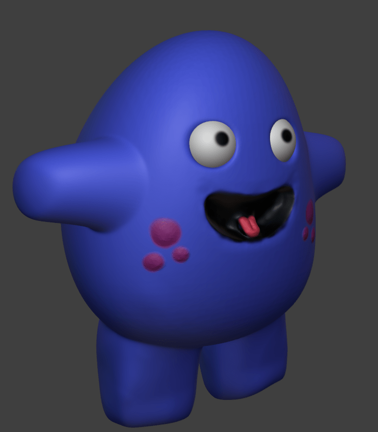
And actually I am quite fond of the final product — a PNW Orca (which the savvy will recognize as a transient vs a resident) watching over our place in SoCal. But it took a good chunk of the Spring to get it right. Neither easy nor peasy, but tons of fun.

Step 1: Sculpting
I had very little confidence that I could make this happen — representational art is one of my major kryptonites. But just buying a model wasn’t any better than buying the finished piece. So, into the breach.
I’ve gotten relatively comfortable using FreeCAD for parametric design — combining geometric shapes and planes and transforms to create useful stuff. But digital sculpting is different, more like molding a lump of clay by poking and pulling it. The go-to app for this kind of work is another amazing open source tool called Blender.
There’s a ton of YouTube tutorials for Blender newbies; I wandered my way to the 45 minute Sculpting a Cute Character in Blender for Complete Beginners and was off to the races (that is, after I realized that doing this with a mouse was impossible and picked up a cheap USB drawing tablet). Surprising everyone, I was thrilled to discover that my character was, in fact, pretty cute.
The idea is to start with a simple object like a sphere — imagine that’s your lump of clay. The surface of the shape is composed of connected polygons, like the pentagons and hexagons in a more-or-less-round soccer ball. Sculpting is the process of stretching, moving and splitting these polygons until you’ve achieved the desired shapes.
The tools used for this tend to be analogs of real world operations. “Grab” and “hook” tools let you pinch a section of the surface and stretch it out or push it in. “Clay strips” and “blob” tools add volume to your model. “Smoothing” and “creasing” do exactly what you’d expect. It’s pretty impressive how they’ve translated natural movements into polygon edits.
The key departure from the real world is that you have to be hyper-aware of the number of polygons that make up your model. If you think about starting with that soccer ball, it’d be pretty much impossible to stretch and transform its twenty hexagons and twelve pentagons into a “cute character” with arms and legs and a tongue and eyes and more.
Digital sculpting handles this with various ways to “add geometry” where it’s needed to shape a detailed form. You can get a sense in the video below. In the first part, I’ve created a sphere with 80 “faces” (polygons). As I try to stretch it out, you can see the polygons trying to match my intent but it just isn’t working. In the second part, I increased the polygon count to 20,480 — the sphere appears smooth, and detailed curves and divots emerge as I manipulate it.
This is a constant balancing act; you need enough polygons to provide detail, but not so many that your computer pukes on the computation. This latter problem can happen very quickly, because “remeshing” an entire object is combinatoric. Features like “dyntopo” and “multiresolution” try to optimize the process by selectively adding polygons only where and when they’re needed. Cool stuff.
But of course none of this magically transforms me, a mediocre user at best, into a great sculptor — that’s just a slog! I found myself very thankful to nature for bilateral symmetry. Blender’s symmetry feature automatically mirrors actions across a defined plane, ensuring that when I finally get one pectoral fin right, the other will be cool as well. Reducing the degrees of freedom like this made it way easier for my brain to grok the organic shapes required for a good looking piece. Who knew?
Anyway, after a long learning process I’d created an orca I was quite fond of. I particularly like his little crooked smile!

Step 2: Printing
This part was actually pretty straightforward. I used simple PLA filament, because it was going to be encased in Sculptcoat anyways. The only real trick was that, at the scale needed to look right on the pillar, there was no way that my little Prusa i3 MK3S+ (8.3″ tall and deep, 9.84″ wide) could print it all in one go.
But never fear, Prusa Slicer made it easy to cut the model into three (just barely) printable pieces, and my old friend JB Weld stuck them together for good. Honestly it kind of looked like that crazy Japanese fish market where they hack up the enormous ahi into slabs for commercial sale.
Step 3: Sculptcoat and Seal
Learning to sculpt on the computer was the big challenge for me, but Sculptcoat is what really made this project sing. It’s one of those products you get pushed on Facebook and think “seems a little too cool to be real” — but at least so far, this one really lives up to the clickbait.
They pitch the product as “paintable stone” — it comes as a powder in a number of natural-looking colors (“Desert Clay” is like terra cotta, “Soapstone Grey” is like granite, “Ashstone Black” is a black clay, and “Chalkstone white” is a nice bright white like talc or, ok, chalk). Mix with water until it’s kind of a runny peanut butter texture, and paint it right onto your printed model.

I used two coats of white over the whole model, then two more with black and white to make classic orca markings. A full cure takes 72 hours in a humid environment (I put it in a sealed trash bin and misted the inside with water every few hours for the first day and a half). You can sand the coat after curing, but I left it rough for the handwork effect.
Because the model lives outside in a sunny marine environment, the last step was to paint on a few coats of silane-siloxane blend concrete sealer — the same stuff that goes on concrete driveways. The product I used really soaked in, leaving the original matte appearance alone, which was exactly what I was hoping for. Woot!
Step 4: Mounting
The last hurdle! The pillars have a roughly flat square top; some of our neighbors have just put sculptures right on top of them. This can work for things that sit flat (like an amphora or whatever), but for organic shapes I just don’t like the vibe. There isn’t a lot of color variation in stone, so it just ends up “muddy” — hard to parse at a distance what is sculpture and what is pillar.
On our dock, pyramid-shaped white plastic caps fit over the pillars – they look nice, and the point at the top makes a perfect spot for an organic shape to sit. The only question was, how to attach a mounting post?

I ended up designing a simple sleeve mount that sits on top of the cap. The inside of the mount is coated with a tacky rubber that helps keep it in place, and two bolts do backup duty in case it’s extra windy.
This was a classic FreeCAD job, but every project teaches me new tricks — the most interesting this time was the use of formulas and named constraints. I hauled out some old geometry rules to figure out that the pyramid sides went up at a 24.62 degree angle. For the pad and pocket making up the sleeve, I could use this value plus the size of the base to compute an appropriate height, i.e.:
<<Exterior_Sketch>>.Constraints.BaseDimension / (2 * tan(24.62)) * .99
(.99 is a fudge to make sure the projection lines don’t cross at the top.)
Keeping this as a formula made it easy for me to play with how much the sleeve “covered” at the top of the pyramid without having to keep recalculating it all by hand. Pretty slick!
And that’s all she wrote. There are quite a few neat sculptures on the docks in our neighborhood, but with no attempt at humility I’m quite sure ours is the coolest. The two big questions are: (A) how will the finish hold up in the weather; and (B) what should we put on the other pillar? I spent some time experimenting with a Western grebe and it’s not bad, but Lara is fomenting for a California sea lion. Thoughts and suggestions always welcome!