Adventures in 3D Design: FreeCAD

3D printing is key to an abundant world.

We use a lot of stuff. And until now, the most efficient way for the most people to have the most stuff has been to specialize — big, centralized factories custom-tooled to build a whole bunch of whatever (potato chips, cars, iPhones, toilet paper) and ship it around the world. Of course there’s localized capacity too, but only  where the scale is enough to support the cost of a new big custom-tooled factory.

Viewed from a distance, it’s kind of crazy — so much physical stuff (input materials, sub-components, final goods) moving so many places! The overhead of extraction, custom fabrication, packaging and transport is staggering. But especially in an environment where we don’t factor in costs to the, you know, environment — it pencils out.

3D printing is qualitatively different: hyper-local “factories” that create all the stuff using the same simple input materials. Now of course that’s a bold statement; today’s 3D printing ecosystem can’t live up to that hype. But it will, and sooner than we think, for sure.

Models make the magic happen

Even in today’s limited form, 3D printers are remarkably capable. Sites like Thingiverse and Printables contain thousands of pre-built models for everything: toys, replacement parts, containers, tools, housewares, even weapons … it’s kind of overwhelming.

These models are the currency of the 3D printing world. It’s clear that CAD expertise — the ability to create 3D models for printing — is becoming just as valuable in the physical world as coding skills have been in the software world. Something that everybody should know a little bit about, even if it’s not part of your everyday.

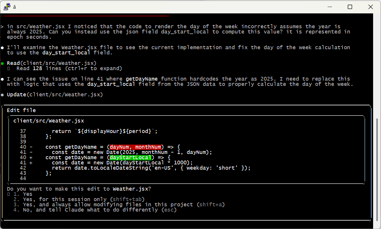
Side note: AI is beginning to eat CAD the same way it’s eating code — for example, Claude built me this printable rubber-band gun with just a quick prompt and a couple of corrections. This is cool, but doesn’t change anything; it’s still worth learning the fundamentals. It’ll make you a better future manager of AI designers.

So come along as I learn to build a model using FreeCAD. This is my first attempt, and my “teacher” is mostly YouTube — so don’t expect the Venus de Milo. And this isn’t a tutorial, there are already a ton of those. It’s more an exploration of how to break down objects and their about their design.

A phone holder for the Rivian console

OK — our topic for today is my super-awesome Rivian R1S and its less-awesome center console.  Most public ire is directed at the console’s black hole of a storage compartment, one of the least usable spaces I’ve ever seen. The 3D world has already gone to town on this, creating a ton of stacking units that cover up the embarrassment. Lara bought one within days of getting the car.

My issue is more subtle. The Rivian display is great, but I still like to have my phone visible “at a glance” while I drive. This is especially important given the NSA-level monitoring of my eyes during hands-free driving. A phone on the center console tray lies flat which sucks. There are a bunch of great dash mount options, but there’s no power up there — I hate threading cables all over the car.

What to do? Well it turns out there is this weird niche in the front of the console that seems primarily designed to capture pens and make them hard to retrieve. It struck me that one could build a piece that inserts into this niche and holds the phone at a reasonable angle.

This felt like the perfect thing to create as a vehicle to learn how to use FreeCAD — a complex shape with some interesting requirements, but no moving parts and possible to print in one piece. Challenge accepted!

Spoiler Alert

I’d love to save the reveal for the end, but you kind of need to see where we’re heading for anything else to make sense. So here is the final product — in the car, and as a rotatable model you can spin around. Pretty simple, the bulk of the piece nestles securely in the console niche and provides a base for the plate and hook the phone goes into. It actually works phenomenally — woo hoo!

Getting started with FreeCAD

There are a bunch of really capable free CAD programs out there; I chose FreeCAD because it seems to be the most “professional” system — I was looking for something that would force me to learn the fundamentals.

It’s an amazing application — and bewildering on first run! My usual mode is to just wade in, but there was just no way. So I spent some time watching this phenomenal set of tutorials (note they do show an older version of the app) and bought an actual paper reference book (which made me feel very nostalgic for my Richter and O’Reilly days).

OK, start again. There are really just a few key concepts to understand; the rest is (a metric ton of) specialized tools and controls for manipulating the basics.

Bodies and Sketches

FreeCAD is a parametric design tool, which means it builds up objects based on geometric shapes and relationships / constraints between them. This is a bit less intuitive than direct design, which is more about manipulating objects with push, pull and rotate operations, kind of like sculpting a block of clay. I’m no expert; it seems to be one of those religious things. Anyhoo…

The first “big idea” is that objects are built up from 2D “sketches” — line drawings created on a plane in 3D space. These sketches serve as the basis of actual objects, with various other operations adding the third dimension.

Job 1: define the base piece that sits inside the niche. It’s a pretty weird shape: a flat side at the back, curved at the front, growing larger from bottom to top. FreeCAD lets you import an image to use as reference, so I started by taking a picture from the top with a ruler sitting next to it. The ruler lets us calibrate measurements by specifying something of known size (i.e., the ticks).

This gives us something to trace with sketching tools. The first sketch was for the bottom of the niche, so I created it on the XY plane (remember we are looking straight down from the top).

Next I needed a sketch for the top of the niche. This gets interesting — I’m still looking straight down so this second sketch is also on the XY plane. But it’s separated from the bottom by a height — that is, it needs to be at a different place on the Z axis. I did this by adding a second XY sketch but offsetting its position by 30mm. This is key and very powerful: the plane of a sketch is always flat, but can be moved and rotated anywhere in 3D space.

Here’s how the two sketches look together:
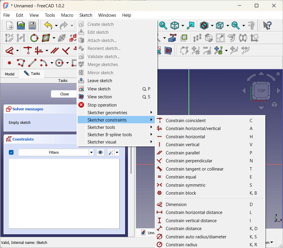
Constraints

“Constraints” enforce structural integrity by defining relationships between parts of a sketch. For example, a line might be constrained to a certain length or to always stay parallel to the X axis. Two points might be held symmetrical across an axis, or kept a certain distance apart from each other. The radius of an arc can be held constant, or lines can be made tangent to each other (nice for smooth transitions).

Typical best practice is to “fully constrain” sketches — defining enough relationships that the sketches stay exactly as they are on the plane. This isn’t a hard requirement, and there is a tinge of religion to conversations about it online, but I found it super-useful simply as a way to make sure I understand how the sketch fits together. In particular, symmetry constraints really helped ensure that the b-spline curves matched up on either side of the Y axis.

Adding volume: lofts, pads, rotations

Once you have sketches that define a planar view of your objects, you create volume by extending them into the third dimension. For the niche I used a “loft” operation to smoothly connect the bottom and the top:

Side note: at this point I got really excited and ran a test print to see how it fit into the niche. Unfortunately the answer was “not super-great” — tracing the image was a good start, especially for the curved sections, but I needed to tweak things a few times before getting it right. We got there eventually, but I’ll be using a more measurement-based approach for future projects.

There are lots of these operations. For a piece that is consistent in the third dimension (for example, a rectangular box), the “pad” operation simply adds thickness to a sketch:

Yet another option is “rotation” which spins a sketch around an axis:

This variety is the biggest reason that, at least for me, YouTube was a huge part of learning FreeCAD. It’s super-helpful to just watch people building things — which tools and constraints they choose and how it all fits together.

Adding the Mount Plate (Datum Planes)

Next up was the tilted plate for the phone to lay against. This is another place where things get interesting — the plate needed to lay at about a 40 degree angle for best viewing — but sketches sit parallel to the XY, XZ or YZ axes.

The tool for this is the “datum plane,” which essentially creates a new local XYZ coordinate system based off of objects in the original one. By creating a datum plane along the back vertical face of the niche insert and rotating it 50 degrees backwards, I ended up with exactly the right surface for a sketch.

You can see that the sketch is actually embedded inside the niche insert. Combining this with a “tapered” pad operation gave me more surface area connecting the plate to the insert for strength.

The Hook

Originally my plan was to extend a 17mm ball mount straight out from the plate, and attach a store-bought universal holder to that. But as I saw the piece come together, that seemed overly complicated — I could just create a little shelf and, by adding a couple hidden strips of grip tape, my phone would sit just fine.

One last sketch and pad did the trick — the only additional interesting thing here is that I used a “symmetric” pad to extend it evenly on either side of the sketch (shown in white). Not critical, just made it easier to ensure it was centered.

Finishing Touches (Fillets and Chamfers)

When you buy doodads like this, the edges are always smoothed out — both for aesthetic reasons and because sharp edges are pointy and uncomfortable. I do the same in woodworking too, I just never thought about it much. But apparently these operations are so fundamental to 3D design, they get their own dedicated tools!

I used a mix of chamfers (just cutting off the edge) and fillets (a rounded profile) for various parts of the piece. Done and dusted!

“Buildability”

Wait, one more thing. You may recall a million years ago when I first got my printer, I wrote about support for overhanging areas. The obvious way to print the phone holder is with the flat insert side on the printing plate to minimize overhang. This was fine, except my first attempt at the “hook” extended just a few millimeters past that edge.

Keeping it this way would have required a ton of stupid, wasteful support structure — so I went back and tweaked things a bit so the hook sat a bit higher on the plate. Easy peasy, but a great reminder that the end user is not the only source of requirements — “buildability” is important as well.

It’s actually been awhile since I’ve learned so much in such a concentrated way. I’m really glad I did it, and I’m already thinking about my next project. One that involves multiple moving parts and joints — hinges, snaps, axles, that kind of thing. Wish me luck!

Coda

This piece works great for me — I love the low profile and ease of dropping the phone onto the plate. But it was eating at me a bit that it wasn’t very universal — my beloved Razr is 9mm thick and I never use a case, so the hook is too narrow for many phones. I could make it bigger, but too big and the phone starts slopping around. So I went back and built the version with a ball mount too, and keep it in the car in case Lara wants to put her (sigh) iPhone or whatever in there.

If you’ve got a Rivian and would like to print or adapt a holder yourself, please feel free to download and use the files below however you’d like. No guarantees that I did anything the right way though … you’re on your own!

Not Good at That

Folks often seem surprised to hear I didn’t get a Computer Science degree. Back in the late 80s, CS was still considered (at least at my school) mostly a math discipline and, despite apparent expectations, I am decidedly not a fan of advanced math. I handled this by combining two things I do love (CS and psychology) into a custom degree. I’ve (almost) never needed the math, and psych has proved useful again and again. Well played!

Still, it kind of grates at me when I know something is out there that others “get” that I don’t. A sampling of my (copious) kryptonite: logic puzzles, think-ahead games like Go and Chess, 2D drawing and 3D sculpting, playing both hands on a piano. There are some obvious commonalities in that list, like maybe somebody in the nursery poked their thumb into a very specific part of my brain. I guess we’ll never know, will we, Nurse Brenda?

Sudoku December

Anyways, a couple of months ago I got to catch up with Thomas Snyder, a guy I was lucky to work with back at Adaptive Biotech. One of the smartest people I know, Thomas is a three-time world Sudoku champion and recently started a gig building puzzles for LinkedIn. The LinkedIn puzzles fill a great niche; quick but entertaining — I run though Zip, Mini Sudoku, Tango and Queens most mornings before getting up.

Inevitably the conversation turned to Sudoku, and in particular my lament that I’m “just not good at it.” While acknowledging that he sees patterns more easily than most, he also implied (not his words, he’s more polite than this) that perhaps I was just being a whiny little baby. Practice is a powerful thing, and I resolved to spend a few weeks trying to knock the Sudoku monkey off of my back.

If you’re one of my few regular readers, you may remember a similar experiment I did a few years ago with the NYT Crossword Puzzle. In that case, I actually became pretty proficient; let’s see what happened with this one.

The Basics

Most folks know the basic rules of Sudoku. Each digit one through nine must appear in each row, column and 3×3 box in a 9×9 grid. The easiest puzzles can be solved entirely or almost entirely by looking for “Unique Candidates” — groups where there is only one open place for a number, like the red three in the puzzle below. There must be a three in the bottom-left 3×3 box, and every other cell is either already filled or is blocked by the presence of an existing three. Simple enough.

Solving Strategies

Of course, those puzzles get boring fast — the answers are just too obvious. The next step up is what the NYT and other newspapers publish as “Medium” or “Hard.” These require the identification of more subtle patterns that are more difficult to catch by eye. A couple of simple examples:

The existing yellow six below, together with the full column in the red box, means that there are only two places for a six in the bottom-left box (blue shading). We don’t know which one, but we DO know that this excludes a six from in the left column of the left-middle box. Together these eliminate all cells but one, so we can place the green six. Nice!

Most advanced techniques require notations indicating the “candidates” that could possibly appear in each cell. What I’ve added below is “full notation,” which I’ll talk about more later. There are a number of more abbreviated “notation” styles, including a popular one invented by Thomas called Snyder Notation.

In this puzzle, the only numbers that can go in the red box are eight and six. This is called a “naked pair,” which helps us eliminate candidates from all the other cells in its row — none of those (circled in red) can be eight or six. Removing those leaves us with only a seven in the yellow cell. And bonus, by placing the seven we know the one right above it must be a six. Progress!

There are dozens of these strategies, increasingly complex and with great names like “Swordfish,” “Finned X-Wing” and “BUG +1” (check out a big list here). The more esoteric are only needed for seriously difficult puzzles, which are beyond what is considered “Newspaper Hard.”

My Results

I decided to use the NYT as my testing ground; they release Medium and Hard puzzles each day. I did these pretty much every morning through December and early January. using their online version because adding and removing notation is easier that way. I did not use “auto” candidate or other helpers that felt like cheating (one caveat to this I’ll explain below).

My initial strategy was to work in three passes:

  1. Fill in the unique candidates.
  2. Use Snyder Notation to identify pairs and other basic patterns.
  3. Add full notation and sweat it out.

Two things seemed to be working against me. First, I would just straight up make mistakes — typically missing things in visual scans. It’s weird to think that in such a bounded puzzle I could miss things, but it happened a lot. And unfortunately, Sudoku errors don’t generally reveal themselves until you’ve gone further down the road, and winding them back is really hard and frustrating.

This is where I took advantage of one “helper” feature that feels a bit cheaty — the “Check Puzzle” option just highlights errors, and from there I could “undo” back until the board was clean again. As I’ve gotten more proficient I do this less and less, but I think I may have just quit in the early stages without it.

The second issue has proven more difficult to practice away — I just can’t keep a bunch of arbitrary things in my head at once. Great solvers can see dependencies and patterns with little or no notation, for example “forcing chains” that start with an assumption and follow it along a path from cell to cell. By the time I get to the third element in a chain I have absolutely forgotten the assumption from the first one.

The only way I was able to get beyond this was by writing it all down. Since I found that for most puzzles I always ended up at full notation anyways, I started doing that first thing — fill it all in, 3-5 minutes of busywork, and go from there. This was a turning point — not only did full notation give me anchor points to start complicated patterns, it made others just leap off the page. For example, I get a ton of mileage out of naked or hidden triples and quads, but seeing those without notation takes a level of visualization I will simply never possess.

Except Not Quite

At this point I can consistently solve Newspaper Medium/Hard puzzles in 15-25 minutes, and my kit of strategies is such that I rarely feel “stuck” for more than a couple of minutes. They’re fun to do and I’ve continued to play. This is lightyears beyond where I started, so that’s cool. BUT.

First, entering full notation for the puzzle at the beginning is super-annoying busywork. It’s totally mechanical, but it just takes time — so even if it wasn’t boring, it’s a built-in handicap as to how fast I can solve compared to folks that use more abridged notation. Many of the online tools have “auto” modes where the candidates are managed for you, dynamically updating as you put in solves, but that absolutely feels like a cheat. I’d just like an initial autofill that I can then work manually. Easy feature.

The second is more problematic. I keep talking about “Newspaper” puzzles — unlike in the crossword case, the NYT Hard Sudoku is in no way considered the pinnacle of the form. There are many much more difficult puzzles out there, and that’s where the “real” Sudoku aficionados live.

I’ve done enough to prove to myself that if I really spent the time, I could probably at least get “ok” at these, but there’s a built-in arbitrary-ness that I’m struggling to get past. Sure, crosswords may be easier or harder, but that scale is less black and white (ha). Very occasionally I just won’t have the vocabulary (or opera knowledge) to fill in that last square, but somehow that’s OK. When I start a Sudoku but get stuck because it (invisibly) requires that one specific strategy I don’t know — it feels like a waste.

Where to Next?

Would I find it more engaging if, for example, the puzzle could tell me the “minimum” strategy required to take the next step? Maybe, but I’m not sure if that’s even feasible.

But that has me thinking about puzzle design in general — I’ve only been a casual consumer of this stuff, but there is actually part-art-part-science hiding under the covers. Of course Thomas pops up when I start looking for good books on this, but I’m going to start with something a bit broader: A Theory of Fun for Game Design. I swear this world is just full of the coolest stuff ever, always something new to learn. More to come!

Turtles all the way down

Every business is a process shop — a tangled mess of human and automated activities that work together to produce something folks are willing to pay for. And even as AI starts to handle specific jobs and tasks, that inherent complexity doesn’t go away.

Enterprise software is the glue that keeps the machine running, and if you’ve ever been on the hook for it working correctly, you’ve implemented some kind of monitoring solution. Log processors, web pingers, process monitors, “on call” scheduling — there’s an entire industry of software that just watches other software (and people, and AI) to make sure all is well.

And yet, we still get surprised by catastrophic failure — the backup that we thought was happening every night; the SSL certificate we swore was on auto-renewal; the battery-operated door lock that failed-open over the weekend; the ETL job configured to run under that retired guy’s account.

So what do we do? Monitor the monitors, of course. But what if they fail? One of my favorite old saws is turtles all the way down — it seems like there’s no bottom to this stack! That’s why, everywhere I’ve ever been, I’ve built something like backstop. Even in my retired life, it’s an essential tool.

Backstop

The idea behind backstop is to have one authoritative, affirmative check on your world, generally once per day (I run mine about 4am). Backstop is the heartbeat of your enterprise, showing up on schedule with a single, consolidated, explicit, proactive look at everything that matters.

One person needs to expect the backstop email every morning. If it doesn’t appear, silence is not golden: find out why. If it shows errors or warnings, find out why. If anything looks funny, track it down. (Honestly, this person should be your CTO or CIO — nothing else gives better intuition for “how it’s going,” and that awareness is gold.)

This doesn’t obviate the need for any of your other monitoring and alerts — they are more timely and more detailed. Backstop is an assurance that the machine is working and that nothing is falling through the cracks. A good backstop has four critical properties that need careful attention:

1. Bulletproof

The most important feature of a good backstop is that it finishes and reports. Every exception needs to be caught; every hung request needs to timeout. Each metric you’re measuring needs to be checked independently — failure of one check cannot stop evaluation of another (for example, here and here).

This is easy to get wrong, especially because you’re likely to be relying on a bunch of third party libraries to monitor proprietary services and apps. That’s why the human element is absolutely critical. If the backstop email doesn’t show up on schedule, a real person needs to notice and they need to fix it.  

2. Complete

Asking a human to check in on dozens (hundreds) of independent subsystems is untenable; a backstop fixes this by creating one single tip to the spear. For that to work, it needs to be a complete look at your environment.

Your best friend in this endeavor will be something like ProcessResource — a type of checker that can run an arbitrary sub-process. While I’m the first to advocate for limited dependency, reality is complex and so is your environment. You surely rely on some system that only has a node or python client library, and another that has its own native client, etc. etc.. In the backstop use case, completeness is more important than consistency, so hold your nose and script away.

It’s also important to evolve “completeness” over time. Of course adding support for new systems, but also catching up old ones. Unless you suck at your job, most outages reveal new failure modes — adding new checks to your backstop should be a routine part of your post-mortem process.

3. Clean

Nothing spikes my blood pressure quite like somebody saying “oh that happens all the time, we just ignore it.” It’s not just lazy, it’s corrosive — not only will your “real” alerts get lost in the noise, but the “ignorable” ones are almost always worse under the covers than you think.

You have to be able to see what’s wrong. If you’ve accidentally coded a bad metric, change or remove it. If something is time-bound — e.g., you’ve already set a plan to fix it on a specific date in the future — implement a pause that wakes up if that date is missed. But under no circumstances can you allow errors and warnings to persist over time. Please trust me on this.

4. Actionable

Last — every resource you track should include a link that gets you to the right place to investigate and learn more. By definition a backstop problem is an exception, which means a disruption to your carefully-curated calendar of stupid meetings. It’s imperative that you can dive in quickly and figure out what’s up.

This link can be a lot of things — a more detailed look at the resource itself; a pre-filled form to open a trouble ticket; a diagnosis cookbook on a wiki; whatever works. But especially if you have a junior or specialized engineer looking at the backstop error list, knowing where to start can make a huge difference.

Important Metrics

Age / Activity

This is probably the most important backstop metric, because it’s the one that is most often missed by traditional monitors. Some process (or a monitor!) just stops working, but we don’t notice until it’s too late, because silence seems golden.

These failures also tend to create the worst headaches, because they cause damage over time. Backups that don’t get done, key indicators missing critical inputs, that kind of thing.

Trigger Dates

A bunch of processes happen on what I call the “slow clock” — stuff you have to do every quarter, every year or even every few years. In my retired life these are things like renewing my driver’s license or cleaning the air filter in my furnace. In enterprises they’re more like audits, disaster recovery exercises, and domain renewals. Calendars help with these, but slow clock reminders can get lost amongst daily meetings and more immediate events.

Levels

Things rarely fall apart overnight — they slowly degrade, unnoticed, over time. Smoke alarm batteries are a great example, and the water level in our community storage tank.

When these alert at night or in the middle of the day, busy humans tend to ignore them (“I’ll get to that later”). But as a backstop metric, they become visible in the right context — at the right time, together with other outstanding issues.

Availability

This is the OG monitoring classic: is the web server responding? And if you’re fancy, can you perform basic tasks like login or search? These aren’t usually the most important backstops, but they can be useful checks, especially for lesser-used services that otherwise are ignored until the moment they become critical.

My Backstops, aka Code is All That Matters

I’ve written my own backstop harness because, well, I get to choose. I actually don’t know of a commercial or open source tools that really does this job, but there probably is one. Mine is written in Java; it’s free to use and modify on Github. If you’ve got a system with git, java and maven installed you can try it out like this:

git clone https://github.com/seanno/shutdownhook.git
cd shutdownhook/toolbox
mvn clean package install
cd ../backstop
mvn clean package
java -cp target/backstop-1.0-SNAPSHOT.jar \
    com.shutdownhook.backstop.App \
    config-demo.json PRINT

You’ll see a bit of log output but then most importantly a couple of lines like this:

OK,Google,,2138 ms response
OK,Proof of Life,,I ran, therefore I am.

The “demo” configuration file contains two resources: one that simply reports back “OK” and one that checks availability of https://google.com. The “PRINT” argument tells the app to just output to console rather than sending an email.

What’s Going On Here

The code is pretty simple, and purposefully so — its job is to be rock-solid and always, always, send an email at the end. Plus, we want to collect as much useful information as we can, so failures in one resource can’t impact the others.

Configuration starts with a list of “resources”, each defined by a name, url, java class name and map of class-specific parameters. A resource class must implement the Checker interface, doing whatever it needs to and returning results as zero or more Status objects, where zero means all is well. Checkers also have access to a convenience object offering common services like web requests and JSON management.

In the normal case, the entrypoint in Backstop.java just: (1) uses an Executor pool to tell the checkers to do their things; (2) collects and sorts the Status responses into a single list with the worst offenders at the top; and (3) Uses Azure to send an HTML email with the results.

Again, you’ll notice a ton of defensive code throughout — Backstop is a special snowflake.

Not counting my favorite existential DescartesResource, so far I’ve implemented five resource checker types for my personal use:

TriggerResource

This resource type reads “slow clock” events out of a Google Spreadsheet and alerts when deadlines are approaching or past. The best way to get a sense of this is to look at a few items from my household triggers:

My dog Copper needs his flea and tick pill once a month and we always used to forget. I’m secretary of our community HOA on Whidbey and that means some paperwork every year. My beloved electric boat has old-school batteries that need topping off once in awhile, and my license is going to expire next year.

The trigger resource code simply loads up rows from a spreadsheet like this and checks to see if each due date is past (ERROR) or upcoming within an optional WARNING period.

While many of these are recurring, the sheet isn’t smart about that. Once a row “fires”, the only ways to turn it off are to edit the spreadsheet (using the link from the backstop email) and change the “Due Date” to the next occurrence OR add a “Snooze Until” date.

Snooze is useful for things like my license — I set up my appointment for next month, so until then there’s no reason to pollute my backstop list. As simple as this is, I find it pretty transformational. Adulting is chock full of stupid things you’re supposed to remember — maybe you’ll get a reminder or maybe not. A backstop trigger list is the perfect security blanket.

Sending Email

I’ve chosen to use Azure Communication Services to send the backstop email. SMTP used to be so easy — but that was before spam and phishing and all the other nasties that took advantage of its simplicity. These days, reliably sending email that doesn’t land right in the Junk folder is a big hassle. Azure makes this pretty easy, and it’s dirt cheap — less than a dollar a year for once-a-day emails!

I don’t love the dependency, but it seems like the right balance.

Deployment and Logistics

The “last mile” for backstop is deciding where it should run and how it should be triggered. It is not a resource-intensive operation, so the old school option isn’t a bad one: dedicate a single small server or VM to the job, triggered with cron once a day. Sorted!

But this simplicity does come with a big downside — patching that server and keeping it up to date. In an enterprise you may already have good infrastructure for this, and if so go for it. But in my world, servers left on their own tend to decay over time.

I’ve tried to avoid this by using a couple of Azure services to do the job for me. The first I like a lot — the script docker-build.sh creates a container that runs in Azure Container Instances without a dedicated server. The container does its thing and then shuts down, so it’s also dirt cheap, just pennies a month.

That leaves just the cron part — something has to trigger the container to run every morning. I’m pretty surprised this isn’t just part of ACI, but it’s not. The solution I landed on is a timer-based Azure Function. My function uses a cron-style schedule to run each morning, scripting a start to the proper container.

This was a bear to get right. I’m not going to let myself spiral into yet another rant about how poor the Azure developer experience can be — just know it is rubbish. You know who really helped out here? My good friend Claude; way better than any Azure help resource I could find. Whew.

There’s Always Another Resource

I have a pretty long list of resources I’m planning to add to my backstop:

  • FLO whole-home water shutoff
  • Various GE appliances, in particular for rinse-aid in the dishwasher (finally we’re getting down to the real problems)
  • Tesla Powerwall and Enphase panels/inverters                   
  • More shutdownhook demo apps
  • The Rivian!
  • Electric, water and gas usage
  • … and on and on …

Our lives and our enterprises are pretty complicated — and every new piece of smart technology that seems (and is) so great carries its own tax. Servers, services, accounts, batteries, it adds up. To keep things humming you really do need a backstop. A single tip of the spear from which all of the mess can be corralled and observed. I hope you’ll give it a try — with my code or your own. Until next time!

Quick thoughts on verifying AI content

I really just meant this to be a response to Scott on LinkedIn, but both as a comment and an update they said it was too long. I thought they were all about keeping content on their own site? Seems self-defeating. Ah well.

My old friend Scott Porad asked a really good question about my recent experience using LLMs to help test my own biases (“Doing my own research”):

You had the AI generate code for you to do the work: why? Why didn’t you simply have the AI do the computations and give you the result?

I can think of at least one answer: because it allowed you to double-check that the computations were being done correctly. But, most people don’t have the skills to do that.

How could you write a prompt that simply outputs the result and allows non-technical users to verify that it was done correctly?

This is a great check and thinking through an answer was quite interesting.

The explicit use of code was purely habitual. After realizing Excel alone would be tough for the problem, my personal toolkit immediately jumped to code. Claude Code is basically the perfect tool for folks like me that want to engage LLMs in code but are too obsessive to give up full control of their source. 😉

That said, the prompt itself wasn’t very code-focused, so as an experiment I just took out the node/javascript line and fed the same exact prompt to Claude Desktop using the same model (Sonnet 4.5). Results are here: https://claude.ai/share/f6a18011-d4da-4aa9-883f-45a98de01c0d

The model chose to write code anyways, BUT — this time it screwed the pooch in two ways. First, it missed a few of the fuzzy-match matches that the first version got right away. I think this is no harm / no foul — I emphasized conservatism in the prompt and you could argue the fuzzy match pushed that boundary anyways.

Much worse, it completely missed the “mode” column and ended up happily double/triple/quadruple counting votes! I was able to correct this easily, but had I not scanned the code with context and history it definitely wouldn’t have jumped out at me. Definitely highlights Scott’s concern.

So to the meat of the question (how to verify without code knowledge), a few thoughts:

First, I typically feel better feeding source data to models (like I did here) vs. having the model source the data itself (to be completely transparent, I did use Claude Desktop to help me find the data, but I vetted and judged its veracity myself through more traditional means). Having solid base data reduces the number of chances for the model to screw up, but more importantly it means I can use tools like Excel (or even hand calculations) to do my own spot checking of results — something much more accessible to folks that don’t code.

Second, I’ve felt for a long time that basic coding skills need to be a compulsory part of middle and high school education. This isn’t to make coders out of everyone — I think of it like a foreign language requirement. It doesn’t take a lot of exposure to code before you can read through JavaScript or Python and figure out what’s going on. You learn to look for things like hard-coded numbers and strings, can tell what a loop is doing, etc..

In the past I’ve thought this was important because coding itself was going to be critical — but maybe the new reason is that it can be something of a lingua-franca between humans and machines.

Over the long term, this remains one of the best “holy crap” issues that I don’t have a great answer for. Pretty quickly we’re going to get to a point where models don’t make truly dumb mistakes, at least any more than humans do. When I ask somebody on my team to perform a task, at some point I just have to trust that they did it correctly. That trust is gained through time, assessment of experience, maybe some spot checks at the start of the relationship, etc. … and probably the same thing will be true for models.

The only big (BIG) gotcha with this is that the models aren’t truly independent actors. They’re the product of commercial enterprises, so there are always legitimate questions about underlying motivation. Flipping that once again, it’s true for people too — we are the product of a lifetime of societal programming. Starting to feel like a freshman philosophy class, so I’ll leave it at that.

Anyhoo … thank you Scott, you made me think a lot harder about the ideas here!

“Doing my own research”

To be clear, the title here is tongue-in-cheek. Real “research” involves carefully-designed and bias-controlled experiments, and there ain’t none of that below. My intended point is just that we’re all capable of digging deeper in ways that haven’t been the case before the advent of LLMs. Arming yourself with these tools is one way to fight the bullsh*t that is pushed at us every single hour of every single day.

A few days ago the Algorithm-capital-A pushed me a video about Bass Pro Shops and how they scam tax discounts by creating fake “museums” in their stores. Turns out that while the shock video version exaggerates the scope of the con, it’s basically true. Nice!

Anyways, what started as a casual attempt to test the veracity of this story ended up as something much more interesting. Yes kids, it’s another AI-positive story, this one hidden behind some observations on the American economy.

Subsidy Tracker

One of the articles about Bass included a link to Subsidy Tracker, a site that combs through public records to identify federal, state and local subsidies by company. This is really messy data; we’re lucky there are non-profits making it usable.  

Somehow I wandered from Bass over to the airline industry, where I found a ton of very recent federal grants —millions of dollars every month. Digging into these led me to the Essential Air Service program, and that started me down today’s rabbit hole. Bear with me for a second.

Essential Air Service

See, back in 1978 Jimmy Carter — yes, JIMMY CARTER — signed the Airline Deregulation Act, hoping to decrease fares and increase service by rolling back a bunch of controls on fares and routes. But the bill’s authors realized that without some new intervention, a deregulated airline industry would immediately drop service to smaller, less profitable locations like, say, my college home airport in Lebanon, NH.

They addressed this by creating the EAS and its list of “Essential Air Service Communities.” Airlines are paid real cash money by the federal government to provide regular service to these communities — to the tune of more than half a billion dollars in 2024. For example, Cape Air was paid $5.2M to ensure 54 people a day could fly one-way to or from West Leb. That’s about $2,400 per leg, even if they fly the plane empty!

And you know what? This is fine. Actually, it’s great. We, as a society, decided that we cared about maintaining integration of our rural communities with the rest of the country via passenger air. We also recognized that free market dynamics would not deliver this outcome, because the societal “cost” of not having service was borne outside of the immediate commercial players.  

Of course there are risks to this. Collective actions are complicated and always subject to bias and graft — they’re never “optimal.” Our protections are mandated transparency, civil education and a free press. The EAS probably needs some tweaks, but on balance it seems like a pretty good call.

Like it or not, this kind of market-socialism hybrid has been our model pretty much forever — and increasingly so as we’ve become more interdependent through the industrial and information ages.

OK, Cool, Right?

Not so fast, Milton. A huge, possibly majority fraction of our country simply does not understand this long-standing reality. The Reds have spent decades — starting with talk radio in the 80s and culminating with MAGA today — telling people that we live in a perfectly free market economy, and that perfect freedom is the primary reason for the success of our nation. It’s a two-part strategy:

  1. Emphatically label “bad” collective societal action as “communist.” (health care, minimum wage, food and unemployment benefits, UBI, …)
  2. Ignore, bury and obfuscate the “good” action so the public doesn’t notice the hypocrisy. (corporate subsidies, military adventures, incumbent-benefitting pork, …)

The EAS is a great example of this. By definition the vast majority of EAS communities are in rural areas — places that likely supported Trump in the last election. But I’m pretty sure that if you asked residents in those communities if the government was playing to fly empty planes to and from their homes, they’d say (1) no way, and/but (2) we don’t want to give up our airport.

Ask a Simple Question

At this point in the story, I realized I should check my own bias. I mean, of course rural voters went for Trump, but it’s possible that EAS communities were somehow an outlier. So I started poking around for some data that would help me answer that question.

Little asks like this seem so simple! But as anybody who has ever tried to report on real-world data can tell you (say, for example, the DOGE wizards that “concluded” millions of dead people were drawing social security) it’s actually super-hard. First you have to find data — and for a lot of questions, that just doesn’t exist (see my comment at the top about real research), or it’s in an awkward or inconvenient form for analysis. In this case, however, it was pretty easy:

  1. The Dept of Transportation publishes a current list of EAS communities. It’s a PDF, but that’s easy to extract into a CSV file with columns for city and state.
  2. The Harvard Dataverse, another great resource that I hope survives our current funding climate, publishes county-level election data (file citation).

Progress! Often all you need from here is a little basic Excel magic (see here for some tips on that). Unfortunately for us, we hit our first stumbling block: election data is reported at the county level, while the EAS communities are cities. Mapping between those will take a little more data, but luckily that’s available too, compiled from government sources and released under a Creative Commons license: simplemaps US Zip Codes database.

Extract city, state and county columns from this file, match up the city/state with the EAS data, walk that through county to the election data, and Bob’s Your Uncle!

Finally, the AI Part

Well sure, it’s pretty simple in theory. But most of the country doesn’t have the skills to actually write this code. I mean, I’ve spent a career doing this sort of thing, but even so I’m not likely to invest the effort on a random weekend news-scrolling curiosity.

This is where foundational AI models can really change the game for everyone. It’s not without pitfalls, but take a look at what Claude Code was able to do with this prompt:

I’d like to generate a csv file that shows how each county that is considered an eligible community in the Essential Air Service program voted for president in 2024. Please use node and javascript for this script.

Data on EAS eligible communities is in the file eas.tsv. Data that translates city/state to county is in the file uszips.csv. Data that contains county-level presidential elections results is in the file countypres_2000-2024.csv.

You’ll need to read each city/state combination out of eas.tsv, then use uszips.csv to translate that into one or more county/state combinations.

With this information, look up the 2024 election results for those counties, sum up the votes if there are multiple counties, and output a row with the name of the candidate that received the most votes.

If you are unable to translate a city/state to county/state, or if that county/state is not found in the presidential election results, use “unknown” as the name of the winning candidate.

The output should have three columns: the original city/state from the EAS data and then then name of the winning candidate.

Please double-check your work and do not take shortcuts such as estimation or extrapolation. I want to be sure that the data you output represents direct matches only — if the data isn’t clear just say “unknown” and that’s ok.

I put a lot of detail in that prompt because (a) I’d already done the work to figure out data sources; and (b) I wanted to be very clear that the model should be conservative. First try: Winner-Winner-Chicken-Dinner!

More than Mechanical

A machine that writes code to crosswalk a bunch of files is pretty neat, opening up a deeper level of analysis to huge swaths of the population. But it gets really cool when you look under the covers. Review the entire conversation for yourself using this link.

The model wrote code, tested it, and iterated a bunch of times to discover and account for unique quirks in the data. It was a lot! Again, this will sound very familiar to anyone who has tried to do even moderately complex cross-source data analysis:

  1. One file had full state names while the other had abbreviations. Create a lookup table.
  2. The “mode” column is inconsistent. Most counties use “TOTAL VOTES” to represent totals, but some counties leave this blank, others use other terms like “TOTAL VOTES CAST” and others don’t have total rows at all so they need to be created by summing other modes. Normalize the values and created an algorithm that picks the most representative rows.
  3. Some city names were slightly different across files. E.g., “Hot Springs” vs “Hot Springs National Park.” Use partial matching to address.
  4. Spacing and casing differences. Strip spaces and lowercase everything before matching.
  5. Additional differences in punctuation and abbreviation. Use a normalization table.

All of these were found without further prompting or intervention. And as the cherry on top, the model even realized that the two Puerto Rican EAS communities weren’t in the election data because Puerto Ricans can’t vote for president.

Of course, given the state of LLMs today I still wouldn’t just trust the output without reviewing the code and doing some spot checks. In this case at least — did that, and it passed with flying colors.

TLDR, my assumption about Trump voters is backed up by the data. Not earth shattering perhaps, but anything that makes the world a little more fact-based is a Very Good Thing. And most importantly, thanks to LLMs, this kind of research is available to all of us at any time. People love to talk about “brain rot” from AI — but we do that with every innovation. Gen X peeps, remember the uproar about calculators (55378008)? Use it well and it is transformational.

Anyways, if you’re starting your online screed with “I haven’t checked but I bet….” well, shame on you.

OK, but what about Cost and Energy?

It’s very popular to dismiss AI solutions due to their allegedly egregious energy use. The work I did here used 54,116 “tokens” — where a token is a unit of work kind of like a word but not quite. There isn’t a ton of data out there as to how much energy is used during inference, but a broad range between .001 and .01 Watt-hours per 1,000 tokens is cited pretty regularly.

Double that to cover infrastructure costs like cooling, split it down the middle and we can make a crazy rough estimate of .54Wh for the work in this post. That’s about the same as running two Google searches, or running a 10W light bulb for three and a half minutes. To me, this is a shockingly efficient use of energy, even if our guess is off by two or three times.

Ah you say, you can’t just look at inference — model training costs are astronomical. And that is true! But production models typically remain in use for around six to eighteen months before being superseded. Over that timeframe a model will be used for many billions of inferences; training costs quickly amortize to basically zero.

And none of this considers the innovation curve that is already happening to push costs down. Just as with traditional computing power, market forces (ha, get it?) are going to do their thing. This isn’t to say we shouldn’t be worried about AI in general — there’s a ton that could go wrong. But energy use isn’t going to be the problem.

OK, as usual I’ve gone way longer on this than anyone is going to read. But it’s endlessly fascinating to be here during this moment of innovation. It’s just unfortunate that it happens to overlap with with existential threats to our American experiment. That part sucks.

On Trails. Also Ants.

I swear it was a coincidence that I was reading On Trails just at the moment when my dad and I road-tripped a small moving truck from Florida to Colorado (go Penske). But it did make for some interesting connections. While it opens and closes with discussions of the Appalachian Trail and the International AT, this isn’t a “hiking” book. The central thesis (at least to my reading) is that trails act as “social memory” — helping groups from insects to people share knowledge and history.

Moor also ponders the connectedness of trails; continuous journeys through an environment, vs the “nodes and desire lines” of point-to-point travel, typically by air. That certainly registered during the trip with my dad. In a single day I teleported from Seattle through Charlotte (although it could have been anywhere) to Fort Meyers. Over the next four I glided across the United States in one continuous motion, seeing the gradual changes from swamps to horse country and low forests, up and down the Appalachians and onto the prairies. So much prairie! I love driving through the wide open skies and horizons of Kansas. Then suddenly the Rockies just show up out of nowhere, dropping me at the foothills of Boulder.

It never ceases to amaze me that there are continuous ribbons of asphalt that cover thousands and thousands of miles. If I just start driving, I can go from the Pacific to the Atlantic with my tires never touching anything but I-90. There is nothing so awesome as a highway road trip (with adaptive cruise control of course).

Ants

Anyways, let’s do a little nerd stuff. Towards the beginning of the book, On Trails describes stigmergy, a form of self-organization that uses modifications of the physical environment to coordinate individuals.

Ants are a great example. Brave ant souls leave their colony to explore randomly for food. When they find it, they return to the colony, leaving behind a chemical pheromone that serves as a trail for other (less adventurous) ants.

Amazingly, most ants use dead reckoning to remember how to get home — they literally count steps to measure distance and interpret the polarization of sun (or moon) light to remember cardinal direction. Some species supplement these by tracking the velocity of objects in visual range, or sensing changes to the Earth’s magnetic field. Still others leave behind a secondary, weaker pheromone like Hansel and Gretel.

These simple actions — Look for food! Leave a trail! Go home! — add up to some pretty striking colony-level behavior, so I thought it’d be fun to do some simulations. Plenty of folks have done this already, and surely more elegantly than I. But it’s my site and I love to write code, so let’s get nerdy.

AntWorld

My ants and the environment they inhabit are described in AntWorld.java. If you’ve got git, maven and a reasonably up-to-date JDK you can run it yourself:

git clone https://github.com/seanno/shutdownhook.git
cd shutdownhook/toolbox
mvn clean package install
cd ../ants
mvn clean package
java -cp target/ants-1.0-SNAPSHOT.jar com.shutdownhook.ants.App ants 400 config.json ants.htm

All this will result in a file ants.htm on your local machine. Open that file in a browser and you’ll see something like this (not exact because the configuration is set to use a new random seed each time it runs); click the image for an animated view:

  • Red represents the ant colony.
  • Blue denotes randomly-placed food caches.
  • Black ants leave the colony to explore for food.
  • Ants that find food return to the colony, leaving behind a trail of green pheromone.
  • Ants that hit the edge of the world return to the colony without leaving a trail.
  • Pheromone trails decay over time.
  • Food is consumed as ants discover it.

In mine, the first cache is found in the eastern part of the environment around cycle 35. Just as that cache is fully consumed, a second is found in the western side — but it gets lost around cycle 150 because the strong “leftover” eastern trail is just too attractive. After that trail decays, the second cache is re-discovered around cycle 200, pulling more ants towards the west. From there they find the third and fourth caches pretty quickly.

Each run provides a new dramatic twist, and tweaking parameters is pretty addictive. For example, a dense colony (100 ants) can obviously flood the environment quickly, but even a sparse colony (just 10 ants) is pretty successful.

The Details: Exploration

Little details make a huge difference in this kind of simulation. Check out the code that handles “exploration” mode. In my first version, explorers really did just pick a random direction with each step. But this didn’t look or feel “real” at all. Eventually I ended up with these rules:

  • If there is food directly adjacent to the ant, go there. This makes sense — an ant can certainly see or smell food in their immediate vicinity; they’re not going to randomly turn away from that.
  • Travel has “inertia.” An ant moving in one direction isn’t likely to just pull a one-eighty for no reason, so it chooses from previous last direction or one step to either side. For example, an ant that travelled east in the last cycle will choose east, northeast, or southeast.
  • The choice of the three directions is weighted by the amount of pheromone in each direction — ants strongly prefer to travel along pheromone trails.

Another dynamic that’s not immediately obvious is “giving up.” Ants in the real world stay within a certain distance from the colony — they don’t just explore infinitely. I was able to approximate this failure mode by detecting collision with the edge of the world.

The Details: Pheromone Trails

The concept here is pretty straightforward: when an ant discovers food, they return to the colony, leaving behind a chemical pheromone trail that other ants use to get to the same food source. But there needs to be some balance between following known trails and breaking new ones. And since food sources are exhausted over time, the pheromone needs to decay, or ants would keep returning to an empty cache forever.

The configuration values “AntReturningPheromone,” “LocationPheromoneMax” and “LocationPheromoneDecay” fine-tune this behavior — this run shows how imbalance (pheromone too strong) can sabotage a colony’s ability to effectively leverage its envoironment.

Another interesting side effect of the current implementation is “exploration spillover.” Watch what happens around cycle 125 of this run. Large numbers of ants are moving back and forth between the colony and the food cache. Eventually the food is depleted, but there are still a bunch of ants travelling along the path. When ants hit the empty food cache, they “spill over” the end of the trail, causing a surge of exploration in the local area.

Does this behavior track the real world? Not really — apparently while frustrated ants do conduct a “brief local search” to be sure there aren’t leftovers to be found, mostly they return back to the colony emptyhanded without dropping pheromone.

I haven’t bothered to fix this — it doesn’t matter for my purposes. But it does illustrate just how complex even the simplest things in the real world, really are.

A Brief Lesson for the Enterprise

This post is about trails and ants, not enterprise software. But it seems like there is always a lesson to be learned, and today that lesson is “honor your history,” aka “everything exists for a reason.” My first implementation of AntWorld was crisp, concise and elegant. But it didn’t work at all. It took a ton of trial and error, multiple literature reviews, parameter tweaks and dead ends before I got to the current state.

The software in your enterprise almost certainly has a similar pedigree. At first glance it seems overly complicated and filled with special cases. But those cases are there for a reason — think really, really hard before starting over with that alluring “clean slate.”

Anyways

That’s plenty for today. A great book, a fun coding challenge and a bunch of neat visualizations to play with. And it’s sunny outside — things don’t get much better than that. Until next time!

Developing An Intuition for AI

AI is changing the world. Yes we are in a bubble and current claims are overblown and countless stupid companies are being started and a ton of investment capital is being thrown away. But don’t let anyone tell you (even if it feels good) that it’s all smoke, mimicry and plagiarism. They are incorrect.

There’s no substitute for direct experience — sit down and try it for yourself. You’ll quickly begin to develop an intuition for what it can and can’t do well. You’ll find amazing insights and unsettling failures, and learn how to direct it towards positive outcomes. The people that understand this will thrive on the other side.

To get you rolling, here are two quick, real-world anecdotes from earlier this week — and a few thoughts about why they went down the way they did.

1. Let’s Go Narrowboating!

For years I’ve been fascinated with the UK’s extensive canal network and the narrowboats that travel them. Lara and I are planning to meet some friends in the Cotswolds next year, and I’m trying to convince them that we need to rent a boat and spend a few days on the water.

Of course, the sum total of my experience with narrowboating comes from watching Pru and Timothy on TV, so where to start? These days it’s AI, of course. I started with this very exploratory opening salvo (including the heartbreaking typo literally on word #1!):

I’m need help planning a trip. My wife and I are 56 and would like to spend about three days exploring the Kennet & Avon Canal in a rented narrowboat. We’ve never been on a narrowboat or the canals before so we are beginners! We’d like a peaceful, quiet trip with a few locks but not too many. We’d like to have the option of staying in hotels at night, or at least mooring in villages with nice restaurants and pubs. Can you help me get started?

Here’s a record of the full conversation. Along the way the model made two errors of consistency, each of which could have been disastrous: (1) it would have stranded the boat at the end of the trip because it didn’t consider having to return it; (2) it both warned me not to travel the Caen Hill locks and then recommended a mooring point that would have required doing so.

But the final result, created soup to nuts in just over twenty minutes, is a remarkably useful and comprehensive itinerary: 4-Day Narrowboat Holiday Guide for Beginners. Good enough to rival the most helpful travel agent.

2. Let’s Build a Web App!

Life on Whidbey Island is dominated by weather, tides and ferries. I’ve got a bunch of apps and sites I use to monitor this stuff, and for a long time I’ve wanted to put together a little mobile-friendly web site to unify them all.

This isn’t particularly complicated. My personal weather station and the NOAA tide stations have APIs, and I’ve previously hacked up the WSDOT ferries site so I can pull images. There’s even a REST API that can monitor water levels in our community tank. The only hangup is the user experience — I despise, and am not particularly good at, building usable, nice-to-look at HTML/CSS interfaces.

I was skeptical, but what the heck — let’s ask Claude Code to give it a try. I set up my project, told Claude to figure out how it worked (generating this artifact, kind of amazing in and of itself), and then made this request, again with some embarrassing typos:

The file src/Tides.jsx is set up to fetch a json url representing a high and low tides for today and the following four days; right now it just displays that json text in the component div. I would like to render this information in a way that fits into the “card” display of the site.

Please write javascript that will create an HTML representation of the information that contains a simple graph of high and low tides over the period, with a vertical line marking the current time. The graph should show a smooth curve between highs and lows using the rule of twelfths (please indicate if you do not know what this is).

Below the graph should be a table of each high and low from earliest to latest.

An example of the javascript is in /tmp/tides.json.

The display should fit into the card that contains the content without expanding its width. It should render well on desktop and mobile browsers.

Please give it a try. Please only edit the file src/Tides.jsx so it’s easy to keep track of your work.

Here’s the complete set of interactions I used to create and fine-tune the tides HTML. There was a small bug rendering the horizontal axis to my specification, but most of the back-and-forth is me changing my mind about how to render the chart and table. It even figured out that “src/Tides.jsx” was the wrong relative path, and edited the correct file without saying anything. Really, really impressive.

The final result, saved to my phone’s home screen and already used a ton: Witter Beach Commnity Web Site

A Few Takeaways

Brilliant, Expert Synthesis

The best travel agents have always been those who really, deeply understand:

  • The client. Who are they, what are their preferences, how much do they want to do in a day? Do they have any specific physical limitations? Do they want things scheduled to the minute or are they free spirits? How do they react when language is a barrier? What do they want to learn? Is it OK if their tour guide is a hugger?
  • The locale. Which museums are worth it, and how much time do you really need? What restaurants are an easy walk even at night? Which guides love to talk about wars, or sex, or food, or sport? When do you really want AC and when is it an option? Which side of the hotel is quieter and which has the best views?

This is stuff that’s really hard to pull out of even the best guidebooks, especially in combination with human idiosyncrasies — everyone is a different in some weird way. The best agents put all of this together into a coherent whole that just works.

Front-end web code is the same way — you need to understand not just the data you’re trying to render and how the user wants to see it, but also the incredibly arcane details of rendering HTML and CSS across different browsers and different devices.

This is where AI shines. It knows an incredible amount of “stuff” — more by far than any human that’s ever lived. It has extracted little nuggets out of reviews and support sites and other nooks and crannies that are extremely niche and hidden. It can hold a ton of these variables together, all and once, and mix and match and sort and connect them with a specification or request.

Any time you’d seek out an expert that knows “the secrets” and is willing to listen to what you really want — AI is going to be your best friend.

Trust but Verify

The popular press loves to point out “catastrophic” AI failings, a great example being the mistake of both telling me to stay away from Caen Hill and sending me through it. But it’s actually pretty easy to avoid things like this if you use careful phrasing (which I did not). For example, “Please double-check that your recommendations are consistent, that stops and landmarks line up with the route you’ve selected.”

Also, note my instruction to Claude that it should tell me if it doesn’t know the “rule of twelfths;” AI wants to please and needs reminders to stay in line. I use phrasing like this a lot when doing research: for example, “Please only provide data based on concrete information for which you can provide citations. Do you best to avoid bias or incomplete data sets and do not make up anything you don’t actually know to be correct.”

And of course, check the work yourself! Even the most senior human developers get a review before sending code to production; it’s no different with AI. When I asked Claude to code up the weather display, it created a bug by assuming it would always be 2025 — an issue that would have been invisible (for a few months at least) without manual review.

Embrace the Conversation

I find it most effective to simply talk to AI like I’d speak to a human. Set up tasks with details, examples and boundaries — just enough precision to minimize ambiguity while allowing space for learning, initiative and creativity.

I also simply cannot help but add “please” and “thank you” and “great job” and “my bad” into the conversation. That may seem a bit weird, but the agent is doing work for me, and I appreciate it, so why not acknowledge it? I actually think it leads to better outcomes, too. Maybe that’s all in my head, or maybe I just give better instructions in that mode. Either way I’m sticking with it.

Modularize and Limit Complexity

Looking back at the Caen Hill problem, it’s pretty clear what went wrong. Claude found that Denzies was a good stopping point based on distance and had great moorage, hotels and restaurants. On another thread it remembered that we were narrowboat beginners and should avoid tougher sections like Caen Hill. The failure was in missing the connection between these two factors — we couldn’t both avoid the locks and stop in Denzies.

Reminding the model to pay attention to these conflicts helps a ton. But there are still practical limits on how much they can handle at one time. A few weeks ago I tried playing with this by describing a relatively complex app. I purposely tried to do it all in one shot, something that is not recommended by anyone. 😉 The spec is here if you’d like to take a look.

As predicted, it was an abject failure. The model tried to break the problem up into pieces, but it was fundamentally unable to satisfy all the constraints at once. It would ignore requirements and lie about it, then break other stuff when it was caught out … just a mess.

At the end of the day, models can become overwhelmed — just like people. I’m sure the state of the art will keep evolving (“agentic” AI may be one step on that path), but for now the onus is still on humans to organize problems into tasks the machines can do.

A Miraculous World

I think that’s enough for one post. I just can’t encourage folks enough to spend time with these models and get a real, hands-on, hype-free sense of how they work, their strengths and their weaknesses. Don’t get sucked into the simplistic narratives of the popular press; on both “sides” of the AI issue they’re more about fitting the technology to their ideology than real understanding.

The reality is amazing and beautiful. And scary. And it’s here.

AI Models: 50 First Dates

Back in 1987, Dartmouth required each incoming freshman to have a Macintosh computer. This was unheard of at the time — the whole campus (including dorm rooms) had network taps, there was a huge bank of laser printers you could use for free, the school had its own email system, and live chat wasn’t just a curiosity. It was awesome.

When I met my partner of now 30+ years, she was working at the campus computer store, and one of her jobs was to help people buy and install additional memory for their machines. This was a laughably complex job including, amongst other things, knowing that:

  • You had to install chips in a specific order in specific unlabeled slots;
  • You usually couldn’t just add one chip, you had to add them in pairs;
  • Depending on the computer, you might have to cut (yes physically cut) resistor leads on the motherboard. Or if you were lucky, flip some tiny barely-labeled jumper switches;
  • All of this after opening the case with a set of custom tools straight out of 1930s dentistry.

I mean seriously, don’t miss this page-turner from Apple circa 1992. And that was just the user-level stuff — developers were presented with tedious and finicky concepts like “handles” that enabled the system to optimize its tiny memory space.

Jump to today and barely anybody thinks about RAM. Processors typically use 64 bits to store memory locations, which is basically infinite. Virtual memory swaps still happen, but they’re invisible and handle-type bugs are gone. I can’t even remember the last time I cracked open a laptop case.

Anyhoo, my point here is that there was a time when we knew the state-of-the-art wasn’t good enough, but we didn’t have a great answer to the problem. Creative solutions were ridiculous on their face — once again I refer you to this documentation — but people kept feeling their way around, trying to make progress. And eventually, they did. All the inelegant and inconvenient hacks were replaced by something simple and qualitatively, not just quantitatively, better.

Frozen in Time

Today, large AI (ok, LLM) models have a problem that’s eerily similar to our late twentieth-century RAM circus. And it also involves memory, albeit in a different way. Trained AI models are frozen in time — once formal training stops, they stop learning (basically) forever. Each session is like 50 First Dates, where Lucy starts the morning oblivious to what happened the day before.

The big issue is money. It’s expensive to simulate an analog brain in a digital environment! The 86 billion neurons in our brains form 100 trillion connections, a combination of pre-coded genetics and a lifetime of plasticity. Digital systems crudely mimic this with huge grids of numbers representing the strength of synapse connections. These strengths (or “weights”) are initialized at random, then iteratively adjusted during training until they assume useful values.

Training takes zillions of iterations — lots of time and lots of electricity and lots of money. But it turns out that, once a model is trained, asking questions is pretty darn efficient. You’re no longer adjusting the weights, you’re just providing inputs, doing a round of computation and spitting out results.

TLDR — the models that we use every day are the static result of extended training. They do not continue to learn anything new (except when their owners explicitly re-train). This is why early models might tell you that Biden is president — because he was, when the model was trained. Time (and learning) stops when training is complete.

Not Like Us

Now, I’ve been outspoken about this — I think LLMs are almost certainly sentient, at least to any degree and definition that matters. I get particularly annoyed when people say “but they don’t have a soul or feelings” or whatever, because nobody can tell me what those things actually are. We’re modeling human brains, and they act like human brains, so why are we so convinced we’re special?

But at least in one way, there is an answer to that question. Today’s AI models don’t continue to learn as they exist — they’re static. Even today at the ripe old age of 56, when I get enough positive or negative feedback, I learn — e.g., don’t keep trying to charge your Rivian when the battery is overheating.

This is a core property of every living creature with a brain. We’re constantly learning, from before we’re even born until the day we die. Memories are physically stamped into our biology; synapses grow and change and wither as we experience the real world. It’s just amazing and wonderful and insane. And it’s why we can survive in a changing world for almost 100 years before checking out.

But today’s models can’t do this. And so, we hack. Just like in those early RAM days, folks are inventing workarounds for the static model problem at an incredible pace, and many/most of these attempts are kind of silly when you step back. But for now, we are where we are — so let’s dig in a bit.

Back to School: Fine Tuning

Fine tuning just means “more training” — effective for teaching a model about some specific domain or set of concepts that weren’t part of its initial run. Maybe you have a proprietary customer support database, or you want to get really good at interpreting specific medical images.

The process can be as simple as picking up where the initial training stopped— more data, more feedback, off we go. But of course it’s expensive to do this, and there’s actually a risk of something called “catastrophic forgetting,” where previously-solid knowledge is lost due to new experience.

More commonly, fine-tuning involves tweaking around the edges. For example, you might alter the weights of only the uppermost layers of the network, which tend to be less foundational. For example, lower level image processing may detect edges and shapes, while upper levels translate those primitives into complex figures like tumors or lesions.

Folks have also been experimenting with crazy math-heavy solutions like low-rank adaptation that using smaller parameter sets to impact the overall model. Don’t ask me how this really works. Math is hard; let’s go shopping.

In any case, none of this changes the fundamental situation — after fine-tuning, the model is still static. But it does provide an avenue to integrate new knowledge and help models grow over time. So that’s cool.

Retrieval-Augmented Generation

Another way of providing new data or concepts to a model is Retrieval-Augmented Generation (“RAG” — these folks love their acronyms). In this approach, models are provided the ability to fetch external data when needed.

The typical way “normal” folks encounter RAG is when asking about current events or topics that require context, like this (see the full exchange here or here):

I use Anthropic Claude for most of my AI experiments these days and have allowed it access to web searches. In this conversation you see the model looking for current and historic information about wildfires near Ventura, then drawing conclusions based on what it finds.

Model Context Protocol, Take 1

These days most RAG tools are implemented using Model Context Protocol, an emerging standard for extending AI models. MCP is a lot more than RAG and we’ll talk about that later, but in its simplest form it just provides a consistent way for models to find external information.

What’s really interesting here is that the models themselves decide when they need to look for new data. This is seriously trippy, cool and more than a bit freaky. As a quick demonstration, I MCP-enabled the data behind the water tank that serves our little community on Whidbey Island.

I’ve implemented the protocol from scratch in Java using JsonRpc2 and Azure Functions. I could go on for a long time about how MCP is bat-sh*t insane and sloppy and incredibly poorly-conceived — but I will limit myself to comparing it to those early Macintosh RAM days. Eventually we’ll get to something more elegant. I hope.

Anyways, MCP tools of this variety (“remote servers”) are configured by providing the model with a URL that implements the protocol (in my case, this one). The model interrogates the tool for its capabilities, which are largely expressed with plain-English prose. The full Water Tank description is here; this is the key part:

Returns JSON data representing historical and current water levels in the Witter Beach (Langley, Washington, USA) community water tank. Measurements are recorded every 10 minutes unless there is a problem with network connectivity. The tank holds a maximum of 2,000 gallons and values are reported in centimeters of height of water in the tank. Each 3.4 inches of height represents about 100 gallons of water in the tank. Parameters can be used to customize results; if none are provided the tool will return the most recent 7 days of data with timestamps in the US Pacific time zone.

Other fields explain how to use query parameters. For example, “The number of days to return data for (default 7)” or “The timezone for results (default PST8PDT). This value is parsed by the Java statement ZoneId.of(zone).” Based on all this text, the model infers when it needs to use the tool to answer a question, like this:

Access the full exchange here or here.

*** IMPORANT ASIDE *** If you look closely, you’ll notice that the model seriously screwed up its calculation, claiming a current tank volume of 4,900 gallons, when its maximum capacity is actually 2,000. If you click the link to the full exchange, you’ll see me call it out, and it corrects itself. This kind of thing happens with some regularity across the AI landscape — it’s important to be vigilant and not be lulled into assumptions of infallibility!

This is an amazing sequence of events:

  1. The model realized that it did not have sufficient information to answer my question.
  2. It inferred (from a prose description) that the Witter MCP tool might have useful data.
  3. It fetched and analyzed that data automatically.
  4. It responded intelligently and usefully (even with the math error, the overall answer to my question was correct). Pretty cool.

Large Context: Windows

Folks are also trying to help models learn by providing extra input in real time, with each interaction. For example, when I ask Claude “How would you respond when a golfer always seems to hit their ball into sand traps?” I get a useful but clinical and mechanical set of tips (see here or here). But if I provide more context and a bunch of examples, I can teach the model to be more encouraging and understanding of the frustrations all new golfers experience:

Access the full exchange here or here.

Now, providing this kind of context (known as multi-shot prompting) every single time is obviously stupid. But, for now, it gets the job done.

Early models had small context windows — they just couldn’t handle enough simultaneous input to use a technique like this (ok my little contrived example would have been fine, but real-world usage was too much). But these days context windows are enormous (Claude is currently in the middle of the pack with a 200,000 token window, where each English word corresponds to roughly 1.5 tokens).

Large Context: History

Say we’re at the market and they have a sale on bananas. You ask me if I like them, and I say no, they are gross (because they are). When we move to the bakery, you’re not likely to ask if I want banana muffins, because you remember our earlier interaction.

As we know, AI models can’t do this — but they can simulate it, at least for sessions of limited duration (like a tech support chat). We simply provide the entire chat history every time, like this:

Models are fast enough, and have large enough context windows, that we can do this for quite a long chat before the cost really kills us.

But eventually it does — and so we keep hacking. One technique is to ask the model itself to summarize the chat so far, and then use that (presumably much shorter) summary as input to the next exchange. If the model does a good job of including important ideas (like my distaste for bananas) in the summary, the effect is almost as good as using the full text.

Even this has limits. When the session is over, the model snaps right back to it’s statically-trained self. At least Lucy had that VCR tape to help her catch up.

Model Context Protocol, Take 2

We’ve already seen how MCP helps connect models with external data. But the protocol is more than that, in at least two important ways:

First, MCP enables models to take action in the real world. Today these actions are pretty tame — setting up online meetings or updating a Github repository — but it’s only a matter of time before models are making serious decisions up to and including military action. That’s far beyond our topic for today, but don’t think for a moment it’s not part of our future.

Second and more relevant to this post, MCP is intended to augment the innate capabilities of the model itself — we’re already seeing MCP tools that increase memory capacity beyond internal context windows.

MCP is stateful and two-way. The model asks questions of the MCP server, which can turn around and ask questions of the model to clarify or otherwise improve its own response. We’ve never been so close to true collaboration between intelligent machines. It’s just, for now, an ugly bear of spaghetti mess to get working.

What an amazing, scary, privileged thing to being living through the birth of artificial sentience. But as always, it’s the details that make the difference, and we’re in the infancy of that work. Impressive as they are, our models are static and limited — so we hack and experiment and thrash, trying to figure out where the elegant solutions lie. We’ll get there; the seeds are somewhere in the chaos of fine tuning, context windows, RAG and MCP.

Until next time, I highly recommend you check out Lucy’s story — it’s fantastic.

Interaction at the Edges

There’s a rule of multithreaded programming that says that if something can happen, it will. Package delivered at the same time the kitchen catches on fire and ALF is on live TV? For sure. I’ve been in countless debugging sessions where things that “can’t” happen absolutely, 100% happen.

Users are clever

Users are the same way. They may not all be tech savvy, but they’re incredibly creative. As with most things in my career, I first really learned this in the early 90s on the Microsoft Works team.

Works included simple desktop publishing features for making newsletters, invitations, posters, that kind of thing. Our customer service team sent us a case they were stuck on — the app would no longer let a user add content to their newsletter. It was a simple one-page document: header, footer, a few columns of content, maybe an image or two. That’s it. They tried saving a copy and using the new file, but no luck. They really didn’t want to start from scratch (I think they’d inherited the document from their predecessor).

The aha moment finally came when the rep asked the user to describe every action they were taking. Take last month’s article content, drag it off the page, add a new …. wait, what?

It turns out that this user didn’t know how to “delete” content blocks. But they realized that objects outside of the page boundaries on screen didn’t print — so each month they would just drag the old content blocks off the page and add new ones. Genius!

Except of course, the file got bigger and bigger and slower and slower until it just broke. I don’t remember if it was a memory problem, or if there were limits on the number of objects in a file, or what — but either way, a little education on “delete” and the newsletter was back in business.

We never expected users to be confused about deleting things. We never expected them to consider the off-the-page area as part of the real working space. More subtly, we’d never thought much at all about “periodicals” that used the same template time after time. And all of that’s on us — the user just found a creative way to do what they needed to do.

Whose car is it anyway?

A couple of weeks ago we traded in our Tesla Model X for a Rivian R1S. If you know me you know how conflicted and sad I am about Elon (see here, here and here), but that’s a story for another day. We’ll take the Rivian on its first Cali road trip soon, and I’ll write up a comparison then. Stay tuned.

Before we traded in the Tesla, I logged us out of all the various accounts that we’d set up on the vehicle. At the Rivian service center we signed over the title, handed them the key fobs, and waved goodbye to “Miss Scarlet” as we drove our new car home. Done and dusted!

Later that day I got a phone notification that the Tesla doors were unlocked. When I opened the app it turned out that I was still fully in control of the car. Huh. I honked the horn a few times for fun and then moved on with my afternoon.

Now this isn’t really all that surprising — of course Tesla didn’t know we’d sold the car; that’s not how it “works” in the industry. But it’s an interesting edge case, and one I thought about frequently over the course of the next week as Miss Scarlet made its way through the resale process. I didn’t snap pictures of the car sitting at the Bellevue service center, but once it moved down to Kent I thought it’d be fun to keep a record.

First stop, Manheim Seattle Auto Auction. The Manheim facility is pretty huge; the car started in the middle of a huge lot, then next to a little outbuilding. It then appeared to move into a garage — probably for detailing — before bouncing from spot to spot in the lot again.

After a few days I got a navigation alert and found the car driving on its merry way to Worldwide Auto Group in Auburn. Two days later another alert and it was en route to a private home in Tacoma. I’ve masked out the address on that one because I’m assuming it’s an actual person who bought the car.

FINALLY, after eight days, a notification popped up on Lara’s phone that Worldwide was asking to take “ownership” of the Tesla — we agreed and and off she went into the sunset, leaving the Ventura Powerwall as the only Tesla product in our world.

What to make of this? Certainly I wasn’t “intended” to retain control of the car after I no longer owned it — but did it really matter? I think so — during this period I could see exactly where the car was, lock and unlock it, remote start, summon it if I was anywhere near by, and quite a bit more. It seems like bad guys have managed some pretty nasty stuff given a lot less access.

It’s always the edges

As someone who built their career around the craft of software engineering, it’s tough to get old and watch crappy AI and copy/paste code take over more and more of the world. Don’t get me wrong, it’s happening because mostly it does the job, and usually cheaper. But that doesn’t mean I need to like it.

Still, at least for now, the game is still on. Designing for the unexpected and the edges and future still matters, and those aren’t, so far, things the machines do well. Sometimes it’s an issue of technology and errors and such; more often it’s about user interaction. Don’t write us off quite yet!

Pump and Dump Management

I’ve never been shy about my disdain for management “theory” — because let’s be honest, it’s not really that complicated. Have a plan, reduce complexity, take punches for your team, chip in. I’m not saying it’s easy, but the right move is usually pretty obvious. MBA strategies are just cover for folks that don’t want to do the hard work.

But sometimes they’re worse than just passive noise — they’re evil. Of course, disciples of evil strategies don’t call them that. But they’re pervasive and, for some folks, undeniably personally effective. After writing about memecoins the other day, it occurred to me that the worst of these could best be called “pump and dump management.”

Pump and dump managers are usually (but not always) hired from the outside. They parachute in with a lot of sound and fury, often show positive results in the short term by destroying long term value, and get out of Dodge while the getting’s good. Off to their next adventure, they ride these “successes” while avoiding blame for the true impact of their actions. It. Is. Infuriating.

Please, make sure you don’t hire these folks. But if it happens, send them on their way as quickly as possible — and pay your learning forward by warning that next hiring manager looking for a reference! Some key things to watch for:

The last guy sucked

PDMs love to talk about how bad everything is — and how lucky you are they’re around to fix it. Monoliths should be microservices; or perhaps microservices should be monoliths. Misaligned vendors need to be replaced with FTEs; or perhaps FTEs should be let go for more nimble vendors.

If schedules slip, it’s because they’re still “cleaning up” after their crappy predecessor. They probably need to swap out existing managers for folks they’ve worked with before. Things that somehow have supported the business for years need to be re-written from scratch. Sometimes they’ll dress all this up with false praise, like “it was probably ok back when the company didn’t have many customers.”

The best part of this dynamic is that it never ends. Nothing is ever the PDM’s fault; everything can always be traced back to sins of the “before” times.

Metric manipulation

Two things are true: (1) every good business runs on metrics, and (2) every metric can be gamed. It’s easy to increase sales if you start selling everything at a loss. Recruiting numbers can always be met by hiring underqualified people. Q1 costs look great if you stiff your vendors until Q2.

PDMs use their teams as personal labor — work harder, work longer, for ME. They claim personal credit for success, passing failure up the chain as if they had nothing to do with it. They flatter their bosses and never say no — even when it hurts their teams.

Honest leaders understand this, and use metrics to guide behavior with constant fine-tuning, interpretation and improvement. PDMs hit metrics at any cost — even at the expense of the company’s real goals. Slash and burn.

Punch down, kiss up

The best PDMs are master manipulators. By bottlenecking all communication through themselves they control the narrative, playing the savior while throwing all sides under the bus.

This always collapses eventually — but of course, a savvy PDM sees it coming and jumps to their next opportunity before they’re exposed.

Destroy relationships

Productive relationships require give and take. Trust and respect develop over time, as each side proves to the other that they’re committed to win-win exchanges. One party may get a bit more in one trade, knowing it’ll balance out in the next.

But PDMs don’t care about relationships, only transactions. And they typically have exactly one negotiating style: bully the other guy, spend positive capital created by others and call it “the art of the deal.”

  1. Make an outrageous first offer, so extreme that it knocks the other party off balance. Threaten and bully and generally be an unpredictable a**hole.
  2. Act like you’re doing them a favor by reducing your demand a bit.
  3. Declare victory.

The thing is, this often works — once. Or maybe even twice depending on the relationship. So it’s great for the PDM, who signs a few “great” deals and jumps ship for the next opportunity before the destruction catches up with them. The companies they leave behind pay the price.

I’ve been lucky through most of my career; only a few times was I on the receiving end of a PDM. But those times were the worst (friends, IYKYK). And now there’s a PDM in charge of my country. Blaming his predecessors, destroying long-won relationships, pointing fingers at everyone but himself, jumping from issue to issue so he never pays the price of failure. Truth is, he’s really good at it — and we’re left holding the bag.

Endnote: I get that the “evil boss” images I’ve scattered about here don’t really represent the specific PDM phenotype — they’re bad in all kinds of different ways. But we see suffer with enough photos of the master PDM every day, and I’m not about to add to that sorry display. So just enjoy some great movie memories … maybe a rewatch is in order!