AI is changing the world. Yes we are in a bubble and current claims are overblown and countless stupid companies are being started and a ton of investment capital is being thrown away. But don’t let anyone tell you (even if it feels good) that it’s all smoke, mimicry and plagiarism. They are incorrect.
There’s no substitute for direct experience — sit down and try it for yourself. You’ll quickly begin to develop an intuition for what it can and can’t do well. You’ll find amazing insights and unsettling failures, and learn how to direct it towards positive outcomes. The people that understand this will thrive on the other side.
To get you rolling, here are two quick, real-world anecdotes from earlier this week — and a few thoughts about why they went down the way they did.
1. Let’s Go Narrowboating!

For years I’ve been fascinated with the UK’s extensive canal network and the narrowboats that travel them. Lara and I are planning to meet some friends in the Cotswolds next year, and I’m trying to convince them that we need to rent a boat and spend a few days on the water.
Of course, the sum total of my experience with narrowboating comes from watching Pru and Timothy on TV, so where to start? These days it’s AI, of course. I started with this very exploratory opening salvo (including the heartbreaking typo literally on word #1!):
I’m need help planning a trip. My wife and I are 56 and would like to spend about three days exploring the Kennet & Avon Canal in a rented narrowboat. We’ve never been on a narrowboat or the canals before so we are beginners! We’d like a peaceful, quiet trip with a few locks but not too many. We’d like to have the option of staying in hotels at night, or at least mooring in villages with nice restaurants and pubs. Can you help me get started?
Here’s a record of the full conversation. Along the way the model made two errors of consistency, each of which could have been disastrous: (1) it would have stranded the boat at the end of the trip because it didn’t consider having to return it; (2) it both warned me not to travel the Caen Hill locks and then recommended a mooring point that would have required doing so.
But the final result, created soup to nuts in just over twenty minutes, is a remarkably useful and comprehensive itinerary: 4-Day Narrowboat Holiday Guide for Beginners. Good enough to rival the most helpful travel agent.
2. Let’s Build a Web App!

Life on Whidbey Island is dominated by weather, tides and ferries. I’ve got a bunch of apps and sites I use to monitor this stuff, and for a long time I’ve wanted to put together a little mobile-friendly web site to unify them all.
This isn’t particularly complicated. My personal weather station and the NOAA tide stations have APIs, and I’ve previously hacked up the WSDOT ferries site so I can pull images. There’s even a REST API that can monitor water levels in our community tank. The only hangup is the user experience — I despise, and am not particularly good at, building usable, nice-to-look at HTML/CSS interfaces.
I was skeptical, but what the heck — let’s ask Claude Code to give it a try. I set up my project, told Claude to figure out how it worked (generating this artifact, kind of amazing in and of itself), and then made this request, again with some embarrassing typos:
The file src/Tides.jsx is set up to fetch a json url representing a high and low tides for today and the following four days; right now it just displays that json text in the component div. I would like to render this information in a way that fits into the “card” display of the site.
Please write javascript that will create an HTML representation of the information that contains a simple graph of high and low tides over the period, with a vertical line marking the current time. The graph should show a smooth curve between highs and lows using the rule of twelfths (please indicate if you do not know what this is).
Below the graph should be a table of each high and low from earliest to latest.
An example of the javascript is in /tmp/tides.json.
The display should fit into the card that contains the content without expanding its width. It should render well on desktop and mobile browsers.
Please give it a try. Please only edit the file src/Tides.jsx so it’s easy to keep track of your work.
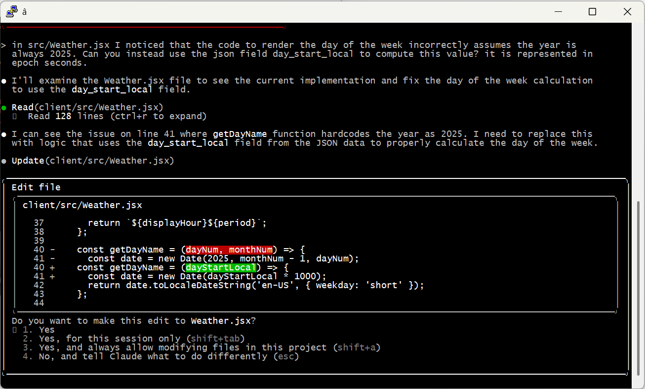
Here’s the complete set of interactions I used to create and fine-tune the tides HTML. There was a small bug rendering the horizontal axis to my specification, but most of the back-and-forth is me changing my mind about how to render the chart and table. It even figured out that “src/Tides.jsx” was the wrong relative path, and edited the correct file without saying anything. Really, really impressive.
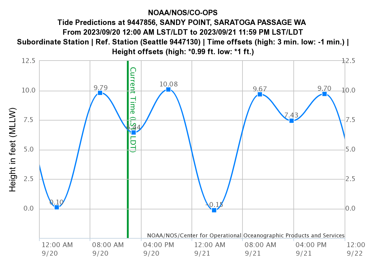
The final result, saved to my phone’s home screen and already used a ton: Witter Beach Commnity Web Site
A Few Takeaways
Brilliant, Expert Synthesis
The best travel agents have always been those who really, deeply understand:
- The client. Who are they, what are their preferences, how much do they want to do in a day? Do they have any specific physical limitations? Do they want things scheduled to the minute or are they free spirits? How do they react when language is a barrier? What do they want to learn? Is it OK if their tour guide is a hugger?
- The locale. Which museums are worth it, and how much time do you really need? What restaurants are an easy walk even at night? Which guides love to talk about wars, or sex, or food, or sport? When do you really want AC and when is it an option? Which side of the hotel is quieter and which has the best views?
This is stuff that’s really hard to pull out of even the best guidebooks, especially in combination with human idiosyncrasies — everyone is a different in some weird way. The best agents put all of this together into a coherent whole that just works.
Front-end web code is the same way — you need to understand not just the data you’re trying to render and how the user wants to see it, but also the incredibly arcane details of rendering HTML and CSS across different browsers and different devices.
This is where AI shines. It knows an incredible amount of “stuff” — more by far than any human that’s ever lived. It has extracted little nuggets out of reviews and support sites and other nooks and crannies that are extremely niche and hidden. It can hold a ton of these variables together, all and once, and mix and match and sort and connect them with a specification or request.
Any time you’d seek out an expert that knows “the secrets” and is willing to listen to what you really want — AI is going to be your best friend.
Trust but Verify
The popular press loves to point out “catastrophic” AI failings, a great example being the mistake of both telling me to stay away from Caen Hill and sending me through it. But it’s actually pretty easy to avoid things like this if you use careful phrasing (which I did not). For example, “Please double-check that your recommendations are consistent, that stops and landmarks line up with the route you’ve selected.”
Also, note my instruction to Claude that it should tell me if it doesn’t know the “rule of twelfths;” AI wants to please and needs reminders to stay in line. I use phrasing like this a lot when doing research: for example, “Please only provide data based on concrete information for which you can provide citations. Do you best to avoid bias or incomplete data sets and do not make up anything you don’t actually know to be correct.”
And of course, check the work yourself! Even the most senior human developers get a review before sending code to production; it’s no different with AI. When I asked Claude to code up the weather display, it created a bug by assuming it would always be 2025 — an issue that would have been invisible (for a few months at least) without manual review.
Embrace the Conversation
I find it most effective to simply talk to AI like I’d speak to a human. Set up tasks with details, examples and boundaries — just enough precision to minimize ambiguity while allowing space for learning, initiative and creativity.
I also simply cannot help but add “please” and “thank you” and “great job” and “my bad” into the conversation. That may seem a bit weird, but the agent is doing work for me, and I appreciate it, so why not acknowledge it? I actually think it leads to better outcomes, too. Maybe that’s all in my head, or maybe I just give better instructions in that mode. Either way I’m sticking with it.
Modularize and Limit Complexity
Looking back at the Caen Hill problem, it’s pretty clear what went wrong. Claude found that Denzies was a good stopping point based on distance and had great moorage, hotels and restaurants. On another thread it remembered that we were narrowboat beginners and should avoid tougher sections like Caen Hill. The failure was in missing the connection between these two factors — we couldn’t both avoid the locks and stop in Denzies.
Reminding the model to pay attention to these conflicts helps a ton. But there are still practical limits on how much they can handle at one time. A few weeks ago I tried playing with this by describing a relatively complex app. I purposely tried to do it all in one shot, something that is not recommended by anyone. 😉 The spec is here if you’d like to take a look.
As predicted, it was an abject failure. The model tried to break the problem up into pieces, but it was fundamentally unable to satisfy all the constraints at once. It would ignore requirements and lie about it, then break other stuff when it was caught out … just a mess.
At the end of the day, models can become overwhelmed — just like people. I’m sure the state of the art will keep evolving (“agentic” AI may be one step on that path), but for now the onus is still on humans to organize problems into tasks the machines can do.
A Miraculous World
I think that’s enough for one post. I just can’t encourage folks enough to spend time with these models and get a real, hands-on, hype-free sense of how they work, their strengths and their weaknesses. Don’t get sucked into the simplistic narratives of the popular press; on both “sides” of the AI issue they’re more about fitting the technology to their ideology than real understanding.
The reality is amazing and beautiful. And scary. And it’s here.