Predicting the Future (Tides)

The beach outside our Whidbey place is amazing. There’s about twenty yards of firm sand and rocks along the shore, then a broad, flat, soft expanse of sand/mud/clay for just under 100 yards, then maybe 30 yards of firm sandbars. Beyond the sandbars, the channel drops to a depth of about 500 feet or so (the first “steps” along this drop-off are the best places to drop a crab pot).

The tide sweeping in and out over this shallow area changes our back yard dramatically from hour to hour. At the highest high tide there’s no beach at all — in the Spring whales swim just a few yards away, sucking ghost shrimp out of the mud flats. During summer low-low tides, we head out to the sand bars where you can dig for horse clams and pick up crabs hiding in the eel grass (while Copper chases seagulls for miles).

I know it sounds a bit out there, but the rhythm of our days really does sync up with the water — and it’s a wonderful way to live. “What’s the tide doing today?” is the first question everybody seems to ask as they come down for coffee in the morning. And that, my friends, sounds like fodder for another fun project.

What’s the tide doing today?

NOAA publishes tide information that drives a ton of apps — I use Tides Near Me on my phone and the TideGuide skill on Alexa, and both are great. But what I really want is something that shows me exactly what the tide will look like in my back yard. For some reason I have a really hard time correlating tide numbers to actual conditions, so an image really helps. (As an aside, difficulty associating numbers with reality is a regular thing for me. I find it very curious.) For example, if you were to stand on the deck in the afternoon on September 30, what exactly would you see? Maybe this?

Those images are generated by (a) predicting what the tide and weather will be like at a point in time, and then (b) selecting a past image that best fits these parameters from a historical database generated using an exterior webcam, NOAA data and my Tempest weather station. So the pictures are real, but time-shifted into the future. Spooooky!

Actually, my ultimate goal is to create a driftwood display piece that includes a rotating version of these images together with a nice antique-style analog tide clock. But for today, let’s just focus on predictions and images.

How Tides Work

Ocean Tides are a rabbit hole you can go down a looong way — fascinating stuff. This National Geographic article is a nice intro, and this primer by UW professor Parker MacCready really gets into the weeds. To my understanding, there are at six primary factors that contribute to tide action:

  1. Variations in pull from the Moon’s gravity on the Earth. The side facing the Moon has increased gravity, and the side opposite the moon has slightly less. Both of these cause liquid water on the surface to “bulge” along this axis (more on the closer side, less on the far side).
  2. The same thing happens due to the Sun’s gravity, but less so. Tides are most extreme when the sun and moon “line up” and work together; least so when they are at right angles to each other.
  3. The Earth is spinning, which combines with orbital movement to change which parts of the Earth are being pulled/pushed the most at any given time.
  4. The Earth is tilted, which changes the angles and magnitude of the forces as the seasons change. One consequence of this is that we tend to have daytime lows in the Summer and nighttime lows in the Winter.
  5. Weather (short-term and seasonal) can change the amount of water in a specific location (storm surges being a dramatic example).
  6. Local geography changes the practical impact of tides in specific locations (e.g., levels present differently over a wide flat area like my beach vs. in a narrow fjord).   

All of this makes it really tough to accurately predict tide levels at a particular time in a particular place. Behavior at a given location can be described reasonably well by combining thirty-seven distinct sine waves, each defined by a unique “harmonic constituent.” NOAA reverse-engineers these constituents by dropping buoys in the ocean, measuring actual tide levels over a period of months and years, and doing the math. Our closest “harmonic” or “primary” station is across the water in Everett.

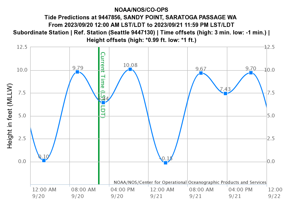
“Subordinate” stations (our closest is Sandy Point) have fewer historical measurements — just enough to compute differences from a primary station (Seattle in this case). But here’s the really interesting bit — most of these “stations” don’t actually have physical sensors at all! The Sandy Point buoy was only in place from February to April, 1977. In Everett, it was there for about five months in late 1995. To find an actual buoy you have to zoom all the way out to Port Townsend! This seems a bit like cheating, but I guess it works? Wild.

You can query NOAA for tide predications at any of these stations, but unless there’s a physical buoy all you really get is high and low tide estimates. If you want to predict water level for a time between the extremes, you need to interpolate. Let’s take a look at that.

The Rule of Twelfths

Image credit Wikipedia

It turns out that sailors have been doing this kind of estimation for a long, long time using the “Rule of Twelfths.” The RoT says that if you divide the span between extremes into six parts, 1/12 of the change happens in the first part; 2/12 in the next; then 3/12, 3/12 again, 2/12 and 1/12 to finish it out. Since the period between tides is about six hours, it’s a pretty easy mental calculation that would have been good to know when I was fifteen years old trying to gun my dad’s boat through the channel off of Ocean Point (spoiler alert: too shallow).

Anyways, I use this rule together with data from NOAA and simple interpolation to predict tide levels on my beach for any given timepoint. The code is in NOAA.java and basically works like this:

  1. The NOAA class exposes a single method “getPredictions” that queries NOAA for tide extremes from one day before to two days after a given timepoint.
  2. The extremes are added to a list, as well as five RoT timepoints between each of them.
  3. The resulting list is returned to the caller as a Predictions object.

The Predictions object exposes a few methods, but the most interesting one is estimateTide, which does a binary search to find the predictions before and after the requested timepoint, then uses linear interpolation to return a best-guess water level. The resulting estimations aren’t perfect, but they are really very accurate — more than good enough for our purposes. Woo hoo!

Stepping Back

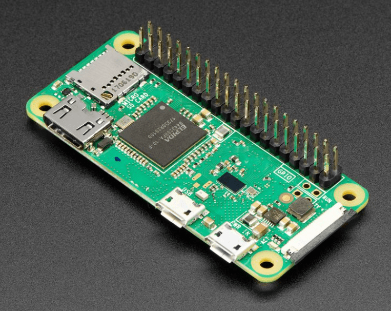
OK, let’s back up a bit and look at the code more broadly. Tides is a web app that primarily exposes a single endpoint /predict. It’s running on my trusty Rackspace server, and as always the code is on github. To build and run it, you’ll need a JDK v11 or greater, git and mvn. The following will build up the dependencies and a fat jar with everything you need:

git clone https://github.com/seanno/shutdownhook.git
cd shutdownhook/toolbox && mvn clean package install
cd ../weather && mvn clean package install
cd ../tides && mvn clean package

To run the app you’ll need a config file — which may be challenging because it expects configuration information for a Tempest weather station and a webcam for capturing images. But if you have that stuff, go to town! Honestly I think the code would still work pretty well without any of the weather information — if you are interested in running that way let me know and I’d be happy to fix things up so that runs without crashing.

The code breaks down like this:

  • Camera.java is a very simple wrapper that fetches live images from the webcam.
  • NOAA.java fetches tide predictions, augments them with the RoT, and does interpolation as discussed previously.
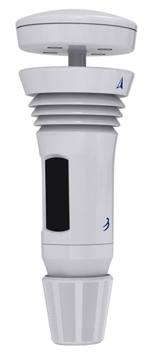
  • Weather.java manages interactions with the Tempest. It relies on code I wrote awhile ago and discuss here.
  • TideStore.java is a simple SQL and file system store.
  • Tides.java is a domain layer that pulls all the bits and pieces together.
  • Server.java implements the web interface, using the WebServer class I build long ago.

Capturing Images and Metadata

None of this works without a pretty significant collection of metadata-tagged historical images. And you can’t capture images without a camera — so that was step one here. I have a ton of Ring cameras and I love them, but they are nearly impossible to access programmatically. Sure there are some reverse-engineered libraries, and they “kind of” work, but reliably capturing an image “right now” is a complicated and ultimately only semi-successful mess. So instead I just picked up a simple camera that is civilized enough to just expose the damn image with a URL.

Running the app with the parameter “capture” tells it to call Tides.captureCurrentTide rather than running the web server. This method:

  1. Captures the current “day of year” (basically 1 – 365) and “minute of day” (0 – 1,439). It turns out that these two values are the most critical for finding a good match (after tide height of course) — being near the same time of day at the same time of year really defines the “look” of the ocean and sky, at least here in the Pacific Northwest.
  2. Loads current weather metrics from the Tempest.
  3. Estimates the current tide level.
  4. Captures an image from the webcam.
  5. And finally, writes it all to the TideStore.

The capture stuff runs twice hourly via cron job on a little mini pc I use for random household stuff; super-handy to have a few of these lying around! Once a day, another cron job pushes new images and a copy of the database to an Azure container — a nice backup story for all those images that also lands them in a cloud location perfect for serving beyond my home network. Stage one, complete.

Picking an Image

The code to pick an image for a set of timepoints is for sure the most interesting part of this project. My rather old-school approach starts in Tides.forecastTides, which takes a series of timepoints and returns predictions for each (as well as data about nearby extremes which I’ll talk about later). The timepoints must be presented in order, and typically are clustered pretty closely — e.g., for the /predict endpoint we generate predictions for +1, +3 and +6 hours from now, plus the next three days at noon.

First we load up NOAA predictions and, if any of the timepoints are within the bounds of the Tempest forecast, that data as well. The Tempest can forecast about ten days ahead, so in normal use that works fine (the code actually interpolates weather in the same way we do for tides). As we iterate through the timepoints, we load new NOAA predictions if needed.

Armed with this stuff, the real core of the work happens in Tides.forecastTide. The first pass is in TideStore.queryClosest, which uses a series of thresholds to find images within given ranges of tide height, day of year and hour of day. We start with a very tight threshold — tide within .25 feet, day of year within 10 days and hour of day within 20 minutes. If we don’t find any, we fall back to .5/20/20, and so on from there until our last try is pretty wide at 1/120/120. If we can’t find anything at that point we just give up — hard to even squint and see that as a match. The good news is, even after collecting data for just about a month, we already succeed most of the time.

By querying in stages like this, we end up with a candidate pool of images that, from a tide/time perspective, we consider “equivalently good.” Of course we may just find a single image and have to use it, but typically we’ll find a few. In the second pass, we sort the candidates by fit to the predicted weather metrics. Again we use some thresholding here — e.g., pressure values within 2mb of each other are considered equivalent.

At the end of the day, this is futzy, heuristic stuff and it’s hard to know if all the thresholds and choices are correct. I’ve made myself feel better about it for now by building a testing endpoint that takes a full day of actual images and displays them side-by-side with the images we would have predicted without that day’s history. I’ve pasted a few results for August 30 below, but try the link for yourself, it’s fun to scroll through!

Other Ways We Could Do This: Vectors

Our approach works pretty well, even with a small (but growing!) historical database. But it’s always useful to consider other ideas. One way would be to replace my hand-tuned approach with vector-based selection. Vector distance is a compelling way to rank items by similarity across an arbitrary number of dimensions; it appeals to me because it’s pretty easy to visualize. Say you want to determine how similar other things are to a banana, using the properties “yellowness” and “mushiness” (aside: bananas are gross). You might place them on a graph like the one here.

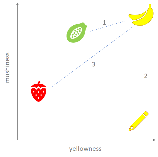
Computing the Euclidian distance between the items gives a measure of similarity, and it kind of works! Between a papaya, strawberry and pencil, the papaya is intuitively the most similar. So that’s cool, and while in this example we’re only using two dimensions, the same approach works for “N” — it’s just harder to visualize.

But things are never that simple — if you look a little more deeply, it’s hard to argue that the pencil is closer to a banana than the strawberry. So what’s going on? It turns out that a good vector metric needs to address three common pitfalls:

  1. Are you using the right dimensions? This is obvious — mushiness and yellowness probably aren’t the be-all-end-all attributes for banana similarity.
  2. Are your dimensions properly normalized? In my tide case, UV measurements range from 0 – 10, while humidity can range from 0 – 100. So a distance of “1” is a 10% shift in UV, but only a 1% shift in humidity. If these values aren’t normalized to a comparable scale, humidity will swamp UV — probably not what we want.
  3. How do you deal with outliers? This is our pencil-vs-strawberry issue. A pencil is “so yellow” that even though it doesn’t remotely match the other dimension, it sneaks in there.

These are all easily fixable, but require many of the same judgment calls I was making anyways. And it’s a bit challenging to do an efficient vector sort in a SQL database — a good excuse to play with vector databases, but didn’t seem like a big enough advantage to worry about for this scenario.

Other Ways We Could Do This: AI

My friend Zach suggested this option and it’s super-intriguing. Systems like DALL-E generate images from text descriptions — surprisingly effective even in their most generic form! The image here is a response to the prompt “a photographic image of the ocean at low tide east of Whidbey Island, Washington.” That’s pretty spooky — even includes an island that look a lot like Hat from our place.

With a baseline like this, it should be pretty easy to use the historical database to specialty-train a model that generates “future” tide images out of thin air. This is exciting enough that I’m putting on my list of things to try — but at the same time, there’s something just a bit distasteful about deep-faking it. More on this sometime soon!

A Few Loose Ends

The rest of the code is just delivery, mostly in Server.java, using the WebServer and Template classes that make up many of my projects.

One nice little twist — remember that I pushed the images and database to an Azure container for backup. There’s nothing in those files that needs to be secret, so I configured the container for public web access. Doing this lets me serve the images directly from Azure, rather than duplicating them on my Rackspace server.

I also forgot to mention the Extremes part of tide forecasting. It turns out that it’s not really enough to know where the water is at a point in time. You want to know whether it’s rising or falling, and when it will hit the next low or high. We just carry that along with us so we can display it properly on the web page. It’s always small things like this that make the difference between a really useful dashboard and one that falls short.

I’ll definitely tweak the UX a bit when I figure out how to put it into a fancy display piece. And maybe I’ll set it up so I can rotate predictions on my Roku in between checking the ferry cameras! But that is for another day and another post. I had a great time with this one; hope you’ve enjoyed reading about it as well. Now, off to walk the beach!

Weather, Wood, and Wifi

Who doesn’t love the weather? It’s universally relevant, physically amazing, frequently dramatic, and overflows with data that almost — but never quite — lets us predict its behavior. Weather inspires a never-ending array of super-awesome gadgets and gizmos — beautiful antique barometers, science projects that turn DC motors into anemometers, classic home weather stations from La Crosse and Oregon Scientific, NOAA-driven emergency alert radios… the variety is endless, and apparently I own them all.

Most recently I purchased a WeatherFlow Tempest for our place on Whidbey Island. This thing is absolutely amazing. With zero moving parts, it detects temperature, humidity, precipitation (amount and type), wind, pressure, solar radiation and nearby lightning strikes. It computes a ton of derived metrics from these base data. It customizes the forecast for the local microclimate. And of course it’s fully connected to the cloud and has a published, robust API that anyone can use. It’s basically weather cocaine.

The only thing missing is a great at-a-glance, always-on tabletop display. There’s a solid phone app, and the web site is perfectly serviceable. But I wanted something that looks good in a room and can quickly show if you’ll want a raincoat on your walk, or which day will be better for the family cookout. Something more attractive than an iPad propped up in the corner.

You’ll have to judge for yourself how well I did on the “attractive” part, but I did manage to put together a piece that I am pretty happy with. The base is cut from a really nice chunk of spalted birch driftwood I found a few months ago, and the display was my first serious work with the Raspberry Pi platform, which is freaking awesome by the way. I even managed to squeeze a little Glowforge action into the mix. Lots to talk about!

Hardware and Platform

The core of the display unit is a Raspberry Pi Zero WH with a 5” HDMI display that attaches directly to the header block. The Zero is a remarkable little unit — a complete Linux computer with built-in wifi, HDMI, USB and 512mb of RAM for … wait for it … $14. Yes that is actually the price. You need to add an SD card for a few bucks, and the display unit I picked was a splurge at $47 — but all-in the cost of hardware was about $70. Stunning.

The nice thing about this combo is that adding software is about as far from “embedded” development as you can get. Again, and I can’t say this enough — it’s just Linux. I used Java to build the server and rendered the display using plain old HTML in Chromium running in full screen “kiosk” mode. An alternative would have been to buy a cheap Android tablet, and that probably would have worked fine too, but I just don’t love building mobile clients and it’s harder to set them up as a true kiosk. The web is my comfy happy place; I’ll choose it every time.

There are a ton of good walkthroughs on setting up a Pi so I won’t belabor that. In short:

  1. Set up an SD card with the Raspberry Pi OS. The setup app is idiot-proof; even I got it going ok.
  2. Connect the Pi to the real world with a 5V power supply (USB-C for the Zero), a monitor through the mini-HDMI, and a keyboard/mouse via USB-C.
  3. Boot it up, connect it to your wifi, and set up sshd so you don’t have to keep the monitor and keyboard connected (ifconfig | grep netmask is an easy way to find your assigned IP).

Yay, you now have a functional Pi! Just a few more steps to set it up for our kiosk use case:

  1. Attach the display to the header block and connect it to the mini HDMI port. I used a little right-angle cable together with the 180° connector that came with the display. The connection is a bit cleaner if you use the larger Pi form factor, but I stuck with the Zero because it made for a more compact power supply connection. Optionally you can enable the touchscreen, but I didn’t need it for this project.
  2. Set a bunch of options using raspi-config:
    1. Boot into X logged in as the “pi” user (System Options -> Boot / Auto-Login -> Desktop Autologin).
    1. Ensure the network is running before Chromium starts (System Options -> Network at Boot -> Yes).
    1. Disable screen blanking (Display Options -> Screen Blanking -> No).
  3. Hide the mouse pointer when it’s idle.
    1. sudo apt-get install unclutter
    1. Add the line @unclutter -idle 0.25 to the end of the file /etc/xdg/lxsession/LXDE-pi/autostart
  4. And finally, tell the pi to open up a web page on startup by adding the line /usr/bin/chromium-browser --kiosk --disable-restore-session-state http://localhost:7071/ to the end of the same autostart file as in #3 above.

A lot of fiddly little settings there, but the end product is a 800×480 display that boots to a web page in full screen mode and just stays there — just like we need. Whew!

Software, Data and Layout

The Tempest really is nerdvana. You can interact with its API in three ways:

  1. The unit broadcasts real time observation packets over the local network via UDP port 50222 (I haven’t implemented this as yet).
  2. The WebSocket API enables subscriptions to similar push messages from the cloud (my client is TempestSocket.java).
  3. Observations and rich forecast data can be pulled from the cloud with the REST API (my client is Tempest.java).

For this project I’m authenticating to the cloud APIs using “personal use tokens” — simple strings allocated on the Tempest website by the station owner. There’s a rich OAuth story as well, but I wasn’t psyched about implementing the grant user experience flow on my little embedded display, and tokens work fine.

My weather station is really just a forecasting box, so it only needs the REST piece. Server.java implements a simple web server (using my trusty WebServer.java and Template.java utilities) that serves up two endpoints:

main.html is a simple container that targets the actual weather dashboard in a full-page iframe. A javascript timer refreshes the contents of the frame every four minutes, which seemed reasonable for forecast data that doesn’t move very quickly. I chose this approach to maintain resilience across network outages — so long as this page stays loaded, it should continue to happily reload the iframe on every cycle regardless of whether that page actually loads or not. I also realized that it sets up a cool vNext option — this main page could manage a dynamic list of pages to rotate through the kiosk, which would be fun on holidays or to add news or other information sources. Saved to the idea list!

dashboard.html.tmpl is the real workhorse of all this. Its server-side code is in registerDashboardHandler, which makes the REST calls to fetch Tempest data, preprocesses it all so it’s ready to merge into the template, and then calls render to fill in the blanks. I talked a little bit about the templating utility in a post a few weeks ago — it’s more than String.replace but much less than Apache Velocity … works for me.

At the end of the day, we get a nice display that shows current conditions and the forecast for the next five hours and five days — perfect for planning your day and week. The background color reflects current temperature (talked about that a few weeks ago as well!), and I’m grateful that the good folks at Tempest don’t restrict use of their iconography because it’s way better than anything I would have come up with myself!

The server process itself is just a Java app that also runs on the Pi. I considered hosting this part in the cloud somewhere, but keeping it local was another way to reduce the number of moving parts in the solution, and to add some resilience during network outages.

Cloning and building requires Maven and at least version 11 of the JDK to be installed. The Pi’s ARMv6 processor did present a wrinkle here; I needed to install a pre-built JDK from Azul. This post by Frank Delporte was a lifesaver; thanks Frank! Once all that is sorted; these commands should do the trick:

git clone https://github.com/seanno/shutdownhook.git
cd shutdownhook
git checkout jdk11
cd toolbox && mvn clean package install
cd ../weather && mvn clean package

Configuration is a simple JSON file that at a minimum provides the port to listen on and access credentials for the Tempest:

{ 
  "Server": { "Port": 7071 },
  "Tempest": { "Stations": [ {
    "StationId": "YOURTEMPEST",
    "AccessToken": "YOURPERSONALUSETOKEN"
    } ] }
}

And while there are fancier ways to get background processes running on startup, it’s hard to beat my old friend /etc/rc.local for simplicity. The following (long) line in that file gets the job done:

su -c 'nohup java -Dloglevel=INFO -cp /home/pi/weather/weather-1.0-SNAPSHOT-jar-with-dependencies.jar com.shutdownhook.weather.Server /home/pi/weather/server-config.json > /home/pi/weather/log.txt' pi &

Cutting and Shaping the Base

With the digital piece of this project taken care of, the last major subproject was the base itself. I knew I wanted to use this beautiful spalted birch log I picked off of the beach, but spun for a while trying to figure out an approach I liked. I didn’t want to do a wall mount because of the power supply; batteries wouldn’t last and a cord hanging down the wall is just too tacky. If it was going to sit on a desk or side table, the display needed to be presented at an angle for visibility. Eventually I settled on a wedge-shaped cut that presents about a 30° face and highlights some of the coolest patterns in the wood. My humble WEN band saw needs some maintenance, but it’s still my go-to for so many projects — a great tool.

To embed the display unit into the base, I had to create a rectangular cavity about 1.5” deep (well, mostly rectangular with a stupid extra cutout for the HDMI adapter). I’m not really skilled enough with my router to feel confident plunge-cutting something like this, so instead I just used the drill press and a Forstner bit to hog out most the material, then cleaned it up with a hand chisel. I drilled a grid of holes through the back of the piece to keep the electronics cool and pull through the power cord, sanded it to 120 grit and had something pretty ok!

I ended up finishing the piece with a few coats of penetrating epoxy resin. I had planned to use Tung oil and beeswax, but the wood turned out to be super-dry and much softer than I’d thought, so it benefited from the stabilizing properties of the epoxy. The final result is pretty durable and I do like the way the glossy finish brings out the darker marks in the wood.

Putting it all Together

So close now! I just needed a way to secure the display in the base and cover up the edge of the cavity and electronics. I used the Glowforge to cut out a framing piece from 1/8” black acrylic, complete with pre-cut holes for some nice round-head brass screws at the corners. A little serendipity here because the epoxy finish really matched up well with the shiny black and brass. A little adhesive cork on the bottom of the unit made it sit nicely on the table, and finally that was a wrap!

What an amazing experience combining so many different materials and technologies into a final project. I have become somewhat obsessed with the Raspberry Pi — it just opens up so many options for cool tech-enabled projects. Just last night I ordered a daughter card that teaches a Pi to speak Z-Wave, the protocol sitting dormant in a bunch of light fixtures in my house. Disco Suburbs here we come!

Oh wait, one last technical note: as assembled, the USB connectors are inaccessible unless you unscrew the frame and pull the unit out. That’s not a huge deal, but if you’re going to run the station in a location other than where you started (i.e., on a different wifi network), it makes on-site setup a hassle. You can preempt this by pre-configuring the unit to pick up additional wifi networks. In the file /etc/wpa_supplicant/wpa_supplicant.conf, just clone the format you see already there to add additional “network” entries as required.

All of the code described in this article can be found at https://github.com/seanno/shutdownhook/tree/jdk11/weather.

Thinking too hard about Color

Oh distraction my old friend, I know you so well.

The past few weeks I’ve been working on building a tabletop weather dashboard. There are a few parts to this exercise:

  • A web app to read and format forecast data from my awesome WeatherFlow Tempest.
  • A Raspberry Pi setup with an attached 5″ LCD to display the dashboard.
  • A driftwood frame to present the electronics in an aesthetically-ok package.

All of these sub-projects are started, but none are finished. I’ve actually written way more code for the Tempest than I actually need — there’s a wrapper for the REST API, a WebSocket client that receives push notifications, and an archiving process that will store individual and aggregate readings over time in a sql database. (Note if you want to build this stuff, you’ll need to sync the “jdk11” branch as it relies on the WebSocket class only available in recent JDK versions.) Apparently I’m kind of a weather nerd, and the Tempest is such a great piece of hardware…. I learned a lot and I’m sure I’ll use all of it for something someday. But for this project I’m actually just using the Get Forecast endpoint to read current conditions and hourly / daily predictions.

Right now I’m working on laying out the forecast display on the little 800×600 LCD. Part of the plan is to set a “meaningful” background color that conveys current air temperature at a glance … red for hot, blue for cold, that kind of thing. Turns out that this is not nearly as simple as it sounds — I ended up spending two days down the rabbit hole. But it was super-interesting, and hey, nobody’s paying me for this stuff anyways.

It started like this. If “blue” is cold and “red” is hot, let’s just pick minimum (say 0°F) and maximum (say 100°F) values, and interpolate from blue to red based on where the current temperature is on that scale. I kind of remembered that this doesn’t work, but wrote the code anyways because, well, just because. Linear interpolation is pretty easy, you’re just basically transposing a number within one range (in our case 0 – 100 degrees) into another range. Colors are typically represented in code as a triple: red, green and blue each over a range from 0-255. So (0,0,255) is pure blue and (255,0,0) is pure red. Interpolating a color between blue and red for, say, 55°F just looks like this:

interpolatedRed = startRed + ((endRed - startRed) * (currentTemp / (highTemp – lowTemp));
interpolatedRed = 0 + ((255 - 0) * (55 / (100 - 0)) = 140.25;

…and similarly for green and blue, which lands us at (140,0,115), which looks like this and is your first indication that we have a problem. 55°F does not feel “purple.” OK, you can kind of fix this by using two scales, blue to green for 0-50°F and green to red for 50-100°F. That’s better, but still not very good. Here’s how these first two attempts look along the full range:

Note: all the code for these experiments is on github in Interpolate.java. It compiles with javac Interpolate.java, then run java Interpolate to see usage.

The second one does kind of give you a sense of cold to hot … but it’s not great. Around 30°F and 80°F the colors are really muddy and just wrong for what they’re supposed to convey. You also get equivalent colors radiating from the middle (e.g., 40°F and 65°F look almost the same), which doesn’t work at all.

It turns out that interpolating colors using RGB values is just broken. Popular literature talks about our cone receptors as red, green and blue — but they really aren’t quite tuned that way. And our perception of colors is impacted by other non-RGB-ish factors as well, which makes intuitive sense from an evolutionary perspective — not all wavelengths are equivalently important to survival and reproduction. So what to do?

Back in the thirties, a system of color representation called HSB (or HSV or HSL) was created for use in television. H here is “hue”, S is “saturation” and B is “brightness.” Broadcasters could emit a single signal encoded with HSB, and it would work on both color and black-and-white TVs because the “B” channel alone renders a usable monochrome picture. In the late seventies — and I’m quite sure my friend Maureen Stone was right in the thick of this — folks at Xerox PARC realized that HSB would be a better model for human-computer interaction, at least partly because the H signal is much more aligned with human perception of gradients. (Maureen, please feel free to tell me if/where I’ve screwed up this story because I’m barely an amateur on the topic.)

OK, so let’s try a linear interpolation from blue to red the same as before, but using HSB values instead. Conveniently the built-in Java Color class can do conversions between RGB and HSB, so this is easy to do and render on a web page. Here’s what we get:

Well hey! This actually looks pretty good. I would prefer some more differentiation in the middle green band, but all things considered I’m impressed. Still, something doesn’t make sense: why does this interpolation go through green? It is a nice gradient for sure, but if I’m thinking about transitioning from blue to red, I would expect it to go through purple — like our first RGB attempt, just less muddy.

There is always more to learn. “Hue” is a floating point value on a 0.0-1.0 scale. But it’s actually an angular scale representing position around a circle – and which “direction” you interpolate makes a difference. The simple linear model happens to travel counter-clockwise. If you augment this model so that it takes into account the shortest angular distance between the endpoints, you end up with a much more natural blue-red gradient:

Of course, it doesn’t end there. Even within the HSB model, human perception of brightness and saturation is different for different hues. The gold standard system for managing this is apparently HCL (Hue-Chroma-Luminance), which attempts to create linear scales that very closely match our brains. Unfortunately it’s super-expensive to convert between HCL and RGB, so it doesn’t get a ton of use in normal situations.

Where does all this leave my little weather app? Funny you should ask. After having a grand old time going through all of this, I realized that I didn’t really want the fully-saturated versions of the colors anyways. I need to display text and images on top of the background, so the colors need to be much softer than what I was messing around with. Of course, I could still do this with math, but it was starting to seem silly. Instead I sat down and just picked a set of ten colors by hand, and was waaaaay happier with the results.

Always important to remember the law of sunk costs.

So at the end of the day, the background of my weather station is colored one of these ten colors. At least to me, each color band “feels” like the temperature it represents. And they all work fine as a background to black text, so I don’t have to be extra-smart and change the text color too.

An entertaining dalliance — using code to explore the world is just always a good time. Now back to work on the main project — I’m looking forward to sharing it when it’s done!