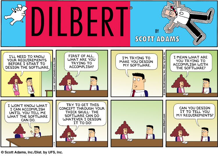
For reasons that are both complex and silly, I am now the proud owner of a twenty-foot shipping container. It’s a “one-trip” box, having made a single voyage across the Pacific, probably from China carrying Trump merch stamped “made in America.” In any case, it is now safely ensconced in my hillside, destined to be a storage shed and/or adjunct workshop. I’ve definitely outgrown the garage.
Outfitting a container turns out to be a super-fun project (not counting the second coat of “duckboat drab” paint I have to apply later today as phase one of Operation Camouflage). The company I bought it from blew a layer of foam insulation on the walls, so my first interior job was to build a wood frame onto which I could hang shelves, hooks, lights, pegboards and whatnot.
Non-structural framing is fun work; it moves quickly and delivers big, solid walls in just a few hours. It’s also easy to learn, and can be done exclusively with relatively cheap 2×4 lumber. You can even do it solo, although moving wall sections on your own any distance is a bit dicey (thanks Connor). But like everything in this world, the details make all the difference.
I can’t say this enough: the details make all the difference. There is more to everything in this world than first appears, and that goes for simple framing jobs too. Take a look at your tape measure — do you know why every 16” interval is highlighted? It’s because 16” is the standard distance between wall studs — those highlights are great time-savers as you mark top and bottom plates.
Or consider the humble 2×4 joist hanger, a little metal bracket that makes it easier to attach joists to wall segments. “Joists” run in parallel along ceilings or floors to provide strength and rigidity — my internal structure isn’t attached to the container at all (except a few screws into the floor), so the joists keep the walls from falling down. At first glance it’s a pretty simple little widget:
Four screws (or nails) attach the hanger to the wall.
The joist slides vertically into the bracket.
Two screws secure the joist to the bracket.
Easy peasy lemon squeezy, right? But wait, there’s more to learn. First of all, keeping the bracket correctly aligned as you screw it in can be an annoying challenge, especially if the wall is already standing and you’re on a ladder. See those little pointy tabs on either side of the bracket? Those are called “speed prongs,” and by hammering them down you can temporarily hold the bracket in place, exactly where you want it.
And take a closer look at the two screw holes that hold the joist in place. You’d think they’d be symmetrical, but they’re not — they’re just slightly staggered. This is because a 2×4 is pretty thin; if the holes were aligned the screws would run into each other.
This stuff is pretty obvious in retrospect, but the value is easy to miss at first glance. Without context these features might even seem kind of stupid — needless complexity that just makes the bracket more costly to manufacture and package for shipment.
Yeah, it’s another software analogy.
There is always a reason that things are the way they are. One of my biggest peeves is an engineering leader or manager who walks into an existing organization and decides that everything needs to be rebuilt from scratch. There are plenty of excuses: the existing code is spaghetti and hard to maintain, it’s built on obsolete technology, it didn’t keep up with the needs of the business, blah blah blah. All horsesh*t.
I mean OK, it’s not that these arguments might not have merit; it’s just that they aren’t really why people start from scratch. In truth,
They are too lazy or incompetent to understand the current state, and/or
They are trying to establish their own empire in their own image.
The reality is that even the “craziest” operational software is what it is for a reason. It has history. The company wasn’t populated by idiots doing stupid stuff for kicks. If you don’t understand the why — and often even if you do — your “reboot” is going to fall flat on its face.
The problem is that, just like speed prongs and offset screw holes, many crucial details don’t make sense or are simply lost when viewed without on-the-ground context. Everything looks simpler when you don’t get down and wallow in the (I know) details.
I just watched this happen again, in slow motion over (I kid you not) three and a halfyears. Within weeks of taking over, a new leader declared the company’s core operational systems not worth saving and started a reboot. Task forces were created, user interviews happened, vendors pitched their solutions head to head, much enthusiasm was expressed, and ….
… not only did the old systems carry the load successfully throughout the “transition,” they will continue to do so indefinitely because the reboot was just straight-up abandoned. All of it. Even worse, the other day I happened to be chatting with an executive who actually said (with a stunning lack of self-awareness), “of course we’ll have to figure out how to replace it somehow.” I mean come on people.
(Before you start telling my why your reboot was the right choice — I get that there are exceptions to every rule. I’ve had to start from scratch a few times myself. But take a long, hard look before you feel good about your choice; it was almost certainly a net loss.)
So what, just never do anything?
Of course not — needs change over time, and we’re always learning — our best design yesterday is almost certainly worse than our best today. It’s just that evolution, not revolution, is the way to go.
Software evolution (or more cleverly the tin-man paradigm) replaces a system in small bites, one step at a time. Eventually you’ll have rebuilt it all, and then it’s time to start the cycle again. In a well-functioning organization this process never ends — you’re always working on the next-most-important change.
Each update should be small enough that you can assess what the existing code is doing in the real world. All the edge cases, all the workarounds, all the accommodations. This is the really important bit — keep the scope small enough that important (yes) details don’t get lost in sweeping user stories.
If you’re starting with a monolithic system, breaking out little bites can seem super inefficient. You’ll probably have to build “throwaway” integration code, something that’s tough to swallow in a world of limited time and resources. But it’ll pay off in the end, I promise — and with the added benefit that if something goes wrong, you can retreat to the known quantity without too much fuss. It may even get you to that elusive “microservices” architecture everyone is so hot and bothered about.
None of this is rocket science — but again and again, the siren song of a clean slate sucks us in. Don’t let that happen! Just remember:
Everything exists for a reason. It was built by people just as smart as you.
Evolve systems in small bites. It’s the only way to understand what you’re improving.
Sweat the details. True in everything, and certainly here.
And look, if you want to design a better joist hanger — go for it! Just don’t forget the speed prongs — thumbnails everywhere will thank you.
Back in the nineties, recruiting was part of my job as a developer at Microsoft. The bar was high on purpose, and we were proud of it. A tough interview process is good for a lot of (mostly obvious) reasons, but for me the most important was that it created an assumption of competence at the company. If you were in the building, you probably weren’t an idiot.
As a person who collaborates best through, let’s say, “vigorous debate,” this was unbelievably liberating. If an idea was stupid, I could say that — and folks could say the same to me — and except in some very rare cases it didn’t get personal.
People are always surprised when I tell the (admittedly hilarious) story of Bill and the Gunshot Wound, but that was the path to success at Microsoft. Take a position and defend the hell out of it — if you win against all comers, you were probably right. I loved it, and it mostly worked.
And it’s exactly because it worked so well that it took me years to recognize that we (I) could do even better. Microsoft in the 80s and 90s conflated a particular personality type with intelligence and success. It just so happened to be my personality type, and I spent those early years blissfully working with a bunch of copies of myself. Building tools that worked the best for people like me.
Huh.
Now before we go too far here, let me be clear: I don’t abide stupid. Stupid kills and stupid loses. But it turns out that being stupid is mostly a personal choice. A half century of watching people has taught me that “everybody is good at something” is actually true — success comes down to taking ownership for figuring out what that is and working to become great at it. Stupid is just lazy.
Anyways, sitting here I can play back in my head dozens of real, brilliant individuals whose diversity and alternate perspectives made me and my products better — and sadly, a few (especially in my early years) that crashed out because I was unwilling to adjust my own behavior to optimize theirs.
I like to believe that I’ve gotten better at this year over year — but there is one person who probably doesn’t have a clue just how much she changed my life. She is extraordinarily smart, with a remarkable sense of personal responsibility and empathy. We built great things together for years, standing at whiteboards while I pushed and yelled and played every side of an argument to force her to defend her proposals.
Except one afternoon in the middle of a session, just a regular day, she sat down with actual tears in her eyes and asked me: “Why do you DO this?” She was exhausted and it was clear she had lost confidence in herself. I was honestly taken aback — none of this is personal, and if I didn’t believe she were the best person for this job, we wouldn’t have been there in the first place!
And yes, she “knew” this, but it didn’t matter. It turns out she was doing great work in spite of, not because of, my constant barrage of devil’s advocacy. Or more accurately, the way I was presenting my arguments. Some very small adjustments on my part led directly not just to a happier and more confident colleague, but to faster and better results. ***
And that’s the kicker — adjusting my own behavior and perceptions didn’t just help the other person, it got me more of what I wanted too, without costing me anything. You’d have to be crazy not to make that trade, right? Yet that is exactly what the “anti-woke” crowd pushes every day. Somehow we’ve created a ton of people that are so weak, so scared of anything that challenges themselves or their beliefs, they are actually pushing for the government to protect their fragile egos at their own expense. It’s insane.
The ”alpha male” narrative is not just super-weird, it’s also 100% upside down. What could possibly be weaker than crying “unfair” every time somebody challenges your position? Having a healthy ego by definition should mean you can listen and do a bit of introspection without being butt-hurt. I can be proud of my accomplishments and have a clear-eyed view of my unearned advantages at the same time.
This is true even if, in some incredibly rarified cases, the scales tip a little the other way. If DEI programs make it just a tiny bit harder for a white dude to get into a particular college or job, step up and work a little harder — isn’t that exactly what you’ve been saying to disadvantaged populations for years when the tilt is reversed? Don’t be such a chicken-sh*t.
I’m just really tired of the voice of “personal responsibility” and “strong men” being such a farce. Let’s create a world that works every day to be better and stronger and solve problems — not one that whines and cries and pretends it’s tough by buying a gun and hanging a flag on the truck. Wake up, white guys.
*** I suspect if my spouse reads this she’s going to laugh long and loud, because she taught me this lesson very early in our relationship — yelling in an argument was NOT going to end well. So why did it take so long to translate to work? Human psychology is weird, man.
The utter haplessness of so many business leaders amazes me. Somehow we’ve created a culture in which the more “important” you are, the less you actually do for yourself. Folks talk about “staying above the details” or “focusing on the big picture” like that’s a good thing, but for my money it’s just code for lazy and/or ignorant. And honestly, at least in my experience, at the end of the day it’s usually easier to find answers yourself than it is to explain to somebody else what you need. Not always — but often enough.
Nowhere is this more true than with respect to data. Solid decisions want information — what’s driving customer behavior, service outages, cost trends, morale problems, schedule delays, merger options, marketing opportunities? Every knot is easier to untangle when you understand its data context. Do not underestimate the influence you can have just by being the one who knows stuff.
And it’s a lot easier than you think. I love my SQL, but there’s a ton of knowledge hiding behind just a few simple clicks with Excel (or Google sheets or whatever, sure. We all know who really grabbed the torch from Lotus and Multiplan and made the spreadsheet the powerhouse it is today). Seriously, if you spend ten minutes with me here, it’ll pay back just about every day until you retire and sit around spewing entropy into the universe.
Use these links to VIEW or DOWNLOAD the final version of the Excel workbook
0. Tables, rows and columns
“Tables” of data are everywhere — so ubiquitous that we just take them for granted. But 2D grids are really quite remarkable and can help us reason about just about anything. Each row of the table represents an instance of “something,” and each column represents a “feature” of that something. For example, I just randomly grabbed this screenshot of my song queue from the Spotify app:
The “something” in this table is a song. Each of the five columns represents a distinct feature of the song:
Position in the queue
Thumbnail image
Song title and Artist name
Album name
Duration of the song
Now, before we can do anything interesting with data like this, it needs to be in a format that Excel understands. We’ll look at that in a second, but for now just marvel at how many of these tables you use every day. Weather forecasts, credit card activity, Explorer (or Finder) windows on your laptop, contact lists, invoices, nutrition labels… even your grocery list is a table, albeit with only one column. Rows and rows of data, each described by distinct feature columns. Nerdvana.
1. Get the data
The hardest part about asking your own questions is usually just getting the data. In enterprise settings folks are always trying to “control the message,” so you end up with pretty but mostly static reports and charts that answer the questions they think you want to ask. But every reporting system has an option to export raw data to Excel, or more likely to a “CSV” file. CSV is just a fancy text file in which each line is a row and each column is separated by a comma (CSV == “comma-separated values”). As I’ve talked about before, it’s the workhorse of the modern age — efficient and universally accepted.
When your question involves more public stuff — economic or census data, stock reports, weather, health, etc. — you can almost always find it in CSV format thanks to https://data.gov and its regional counterparts. The Obama-era “open data” initiatives created by folks like Aneesh Chopra, Todd Park, Greg Downing et al were really quite revolutionary; it’s a shame more people aren’t aware of them. I miss the heydays of Health Datapalooza!
For the purpose of this article, let’s ask the question — over the past few years, what’s happened to the cost of energy at my house in Bellevue, WA? Everybody talks about these costs being out of control, but the truth is we haven’t really felt it at home. So what’s up?
First let’s get the data for my house. Thanks again to those Obama years, I can get started by just logging into my Puget Sound Energy account and hitting the “Green Button” hiding at the bottom of the usage page. The download gives me three years of usage data in two files, one for electric and one for gas. Let’s double-click electric and see what happens:
Not bad! But not ideal for analysis either. Here are the first few things I always do to clean things up:
Remove the title rows at the top (Name/Address/etc.) … everything in Excel is easier if your sheet is a uniform table with a single header row. Click and drag over the row numbers one through five to highlight those rows, then right-click and “delete” them.
On the View ribbon, choose “Freeze Panes” and select “Freeze Top Row.” Now when you scroll around in the document, you’ll always be able to see the column headers.
Hit Control-A to select the whole sheet, and then on the “Data” ribbon choose “Filter.” This adds little dropdown controls on each column which we’ll check out later.
With the whole sheet still selected, double-click the vertical line between column letters A and B. This auto-adjusts all of the column widths so that you can see everything in each cell (e.g., you see start and end dates rather than a bunch of number symbols).
Much better!
First Quick Hits
There is a huge payoff just for the little bit of effort we’ve put in so far. First click on the column label F to select all of the cost data. At the bottom of the window, Excel computes some quick statistics for you — e.g., my average monthly bill for the period was $198.88. Click on the “Start Date” dropdown and unselect the years 2021 and 2022, and the average (for 2023 and 2024) actually drops to $196.89.
To look at the trend another way, click the “Start Date” dropdown again and make sure “(Select All)” is checked. Then on the “Insert” ribbon, choose “Recommended Charts” and then “Line Chart.” OK, it’s clear that winters cost more, but is there an overall trend? Click on the chart, then the “+” button on the right, then check “Trendline.” Boom! While our quick average check above hides it, there is a slow upward progression over time. Not enough to freak out about, but a hint.
Formulas
We haven’t looked at gas data yet. Also, I’d really like to go back further than 2021. The Green Button data doesn’t have this, but I can view charts into the past, and transcribing usage and cost data from those is pretty easy. This is another “be the one that knows” lesson — entering data manually feels like it takes forever, so most people avoid it. But the reality was just twenty minutes — time well spent in return for insights others will miss. Get ‘er done.
Next I combined the gas and energy data into a single table, and reorganized the columns a bit. Most interestingly, I added two formulas that normalize out seasonal usage variability.
Excel formulas are a bit of black magic, but with a few patterns you can get a lot of value for a little investment. The basic ideas are:
A cell whose contents starts with “=” is a formula — a computed value.
Formula inputs are typically other cells, referenced by column letter and row number: “A1” is the top left cell.
Standard mathematical operators (+=/*) can be used in a formula. For example “=B3/2” resolves to the value in cell B3 divided by 2.
Formulas can also reference functions. For example, “=LEFT(B3,4)” returns the first 4 letters in the value in cell B3.
Some functions reference a range of cells, referenced by the top-left and bottom-right cells to include: “=AVERAGE(B3:C10)” computes the average value of cells in columns B and C from rows 3 through 10.
The values in column D (“Electric $/KwH”) were set up like this:
Click on cell D2 and enter the formula “=C2/B2” — dividing the total month’s cost by the number of kilowatt hours used.
With cell D2 selected, scroll all the way to the bottom of the table and shift-click on cell D97.
Hit Control-D to “fill down” the formula from D2 into all of the selected rows.
Click the “$” button in the middle of the “Home” ribbon to format all of these values as dollars.
Here’s the magic — somehow, every formula you just created is “correct” — that is, column D in row 50 references columns B and C from row 50 as well. How did that happen? It turns out that when you copy a formula, the input values are automatically updated so that they are in the same relative — not absolute — position as in the original formula. When we typed “=C2/B2” in cell D2, we were really saying “divide the cell one column to the left by the cell two columns to the left.”
Excel can do all kinds of “fills” — but the basic Control-D “fill down” is by far the most useful; you’ll find yourself there again and again. The exact same steps were used to compute the cost of natural gas per CCF (100 cubic feet, a standard measure for residential use) in column G, using the formula “=F2/E2” and filling down.
Line graphs and trendlines for these new normalized values looks pretty similar to what we’ve seen before. There’s a late 2023 spike in gas, but that’s come down and otherwise looks like a very slow, steady upwards trend — not great, but not something to panic about either.
Add some reference data
Washington gets most of its electricity from hydropower, so there are some trends we’re protected from. Let’s see how my home data compares to the rest of the country, courtesy of https://data.gov. A quick search for “electric and gas costs monthly” led me directly to the US Dept of Energy’s “Total Energy” page, which had exactly what we’re looking for.
As always, my first step was to apply the same “freeze/filter/width” steps we used earlier to get familiar with the data. Starting with electric, it looks pretty good — one row for each monthly average, and values in the same KWH units as my home data. Sweet! We could just start charting things right here and eyeball the relationship to usage data. Not a bad idea at all, but let’s go one better and try to correlate the trends more closely. In thinking about that, two issues pop out:
The file contains more than just Residential prices; the dropdown for “Description” also shows values for Commerical, Industrial, etc.. We’ll need to make sure we use only the ones that represent household usage.
Date values are in YYYYMM format. My usage data is keyed on the specific day that starts my billing cycle. Correlating these is going to take a bit of work.
While you can reference data between spreadsheet files, it’s a huge pain and almost always breaks. Much better is to add multiple “sheets” inside of your file, which are managed with the little tabs and controls at the bottom-left of the window (each file starts with a single “sheet” named “Sheet1”). Use Control-A / Control-C in the electric data to copy it all, then in your usage file (1) Click the “+” sign at the bottom-left to create a new tab; (2) Control-V to paste in your data; then (3) right-click the tab for your new sheet, choose “Rename” and call it “us-elec.” You could just leave the default names, but things are easy to keep track of with something mnemonic.
Combine the data with VLOOKUP
The next trick is to create a column in our table that represents the corresponding US average, so we can easily chart them together. This is going to require the biggest guns of our adventure, primarily a function called “VLOOKUP” (yes I know about XLOOKUP but I’m old). I’m going to try to balance explaining this all with keeping our collective sanity — for deeper dives there a ton of fantastic books and tutorials out there. Again, the good news is that 99% of the time a few patterns will get you where you want to be.
The basic idea here is a formula that “looks up” data in another sheet using a per-row key that connects the values. In our workbook, that looks like this:
First, we need to set up a key value that matches the reference data (YYYYMM). Insert an empty column into our usage data by right-clicking on the Column B header, choosing “Insert,” and naming the column “YYYYMM.” Enter this formula into column E2, using a bit of simple math to end up with the format we need:
=(YEAR(A2)*100)+MONTH(A2)
Select the column from B2 to the bottom and use Control-D to fill down. Progress! Now we need to use this column to “find” the correct value in the us-elec sheet. To make that happen, insert a column after “Electric $/KwH” and (don’t freak out) add this function in cell F2:
=VLOOKUP(B2,'us-elec'!$B$2:$C$639, 2, FALSE)/100
The first parameter to VLOOKUP is the key value — our computed value in B2. The next one is, let’s be honest, a bit of a hot mess. What we’re trying to do is to identify the “range” of cells that contains our target data. It breaks down like this:
‘us-elec’! indicates that the data is on the tab called “us-elec”.
Cells B2:C639 on that tab contain the residential energy data we care about. The first column on this range must contain the key values.
The $ signs tell Excel that this range is “absolute” — that is, when we fill down, DON’T adjust the range like we saw earlier.
The third parameter “2” indicates that our target value (the cost data) is in the second column of the range. And finally, the last parameter FALSE says that matches must be “exact.” Don’t worry about this one — you’re pretty much always just going to use FALSE.
Notice that we divide the found value by 100 — the reference data is in cents, not dollars. Careful with stuff like this — doing the wrong thing can make you look pretty stupid!
Fill down this formula to the bottom of column F (you’re starting to get good at this). Control-click the column headers A, E and F, then choose “Recommended Charts” and “Line Chart” on the “Insert” tab:
Interesting — while we definitely have cheaper electricity than the rest of the country, the trend looks pretty darn similar. But check out what happens when we do the same work for natural gas!
What’s with those summer spikes? It turns out that the national average is dominated by deregulated markets in Texas and a few other states — it’s easy to understand why folks get annoyed when prices fluctuate so dramatically. But even smoothing that out with a trendline, the average is rising faster nationally than it is in Washington. There’s always more to love about the PNW: a diverse energy portfolio, proximity to supply, a relatively mild climate, and the big bad WUTC.
One More Trick: (Basic) Pivot Tables
Pivot tables will mess with your mind. They’re awesome, but also pretty fundamentally incomprehensible. At least to me. But that doesn’t mean we can’t use them to our advantage! A few simple patterns make it a breeze to summarize and compare data across dimensions. Let’s check that out.
For most of this exercise we’ve been focused on price-per-unit data, and that’s shown to have been pretty stable. But in the very first chart, we saw that my total bills fluctuated seasonally, which makes intuitive sense — Washington winters are going to require more energy than Washington summers. But some winters are colder and some summers hotter; can we see that in the data too?
To make this easier, we’ll add two more columns to our main sheet; one for the month and one for the year. These are simple formula columns; use the same patterns we’ve already walked through. Now Control-A to select all of the data, and then click “Pivot Table” on the “Insert” tab and accept the defaults. This will create a new sheet — it looks familiar, but rather than editing cells directly we’re going to use the “PivotTable Fields” control on the right:
Drag the “Month” field to the “Rows” box.
Drag the “Year” field to the “Columns” box.
Drag the “Gas Usage (CCF)” field to the “Values” box.
Back on the “Insert” ribbon, choose “Recommended Charts” and “Line”.
Woo hoo — this view really highlights seasonal usage variability:
But once again, it’s pretty stable from year-to-year. The only interesting bit I see is in 2020 and 2021, when total usage was a bit lower because we spent most of those years out on Whidbey Island. But even that gets lost in the muddle of overlapping years in the chart.
So what do we know?
None of this analysis looks at oil or gasoline prices, and those have had their own trajectories. But I can say with some data-backed confidence:
Overall energy use in my home has remained relatively stable over the last eight years.
Like most other goods I buy, energy costs have risen slowly, but not dramatically.
Washington State has some key factors that keep these energy prices lower and more stable than in many other parts of the country.
A number of specific incidents (in particularly COVID and the inflationary period in 2022/2023) are clearly visible in the data.
Most importantly, I have a solid “feel” for how things have moved around over the years. I am well-armed in a conversation to rebut extreme or cherry-picked claims. And from a career perspective, I’m going to stand out as a knowledgeable and — assuming I don’t act like an a**hole — valuable member of the team making decisions.
Just do it. Find or ask for the data, open it up Excel or your favorite spreadsheet, and (as the tech bros say) “f*ck around and find out.” It takes way less effort than you think and will pay back far more than you expect. Remember: you don’t need to be a huge data wonk, you just need to know a few key patterns. “Open; Control-A; Freeze; Filter; Widths; Recommended Charts” gets you 80% of the way there. You’re welcome.
I want to be clear up front that I’m not a “methodology” guy. Whatever the hype, software methodology is inevitably either (a) full employment for consultants; (b) an ego trip for somebody who did something good one time under specific circumstances and loves to brag about it; or (c) both. I’ve built software for decades and the basics haven’t changed, not even once.
Make decisions.
Break big things down into little things.
Write everything down.
Use a bug database and source control.
Integrate often.
With that said, the rest of this might sound a little bit like software methodology. You have been warned!
Crossing the Ocean
I spend a bit of time these days mentoring folks — usually new startup CTOs that are figuring out how to go from nothing to a working v1 product. “Zero to Launch” is a unique, intense time in the life of a company, and getting through it requires unique (sometimes intense) behaviors. In all cases the task at hand is fundamentally underspecified — you’re committing to build something without actually knowing what it is. In bounded time. With limited resources. Who even does that? Startup CTOs, baby.
Like an ocean crossing, getting from zero to launch is a long journey that requires confidence, faith and discipline. There are few natural landmarks along the way, but there are patterns — the journey breaks down into three surprisingly clear and consistent phases:
What are we building anyways?
Holy crap this is way bigger than we thought!
Will this death march ever end?
Hopefully, one reason you have the job is that you know how to code fast and well — CTOs that can’t (or don’t) code drive me up the wall. And you’d better hire great people. But you’re going to need more than just those chops to get to launch. Each phase needs a different set of skills and behaviors; let’s dig in.
What are we building anyways?
You likely have two constituencies telling you what your software needs to do: (1) non-technical co-founders that see a market opportunity; and (2) users or potential users that want you to help them accomplish something. Each of these perspectives is essential, and you’d probably fail without them. But don’t be fooled — they are not going to give you clear requirements. They just aren’t. They think they are, but they’re wrong.
The first mistake you can make here is getting into a chicken-and-egg battle. Your partners ask for a schedule, you say you can’t do that without full requirements, they say they already did that, you point out the gaps, they glaze over, repeat, run out of money, everyone goes home. Don’t do that.
Instead, just understand and accept that it is up to you to decide what the product does. And further, that you’ll be wrong and folks will (often gleefully) point that out, and you’re just going to have to suck it up. This is why you hire program managers, because synthesizing a ton of vague input into clarity is their core competency — but it’s still on you to break ties and make judgment calls with incomplete information.
And I’m not just talking about invisible, technical decisions. I’m talking about stuff like (all real examples):
Does this feature need “undo” capability? If so how deep?
Do we need to build UX for this or can we just have the users upload a spreadsheet?
Can we cut support for Internet Explorer? (ok finally everyone agrees on that one)
What data needs to be present before a job can be submitted?
Does this list require paging? Filtering? Searching?
You get the idea. This can be hard even for the most egocentric among us, because really, what do we know about [insert product category here]? Even in a domain we know well, it’s a little bold. But there are two realities that, in almost every case, make it the best strategy:
Nobody knows these answers! I mean sure, do all the research you can, listen, and don’t be stupid. But at the end of the day, until your product is live in the wild, many of these are going to be guesses. Asking your users or CEO to make the guess is just an indirection that wastes time. Take whatever input you can, make a call, consider how you’ll recover if (when) it turns out you were wrong, and move on.
Normal people just aren’t wired to think about error or edge cases. For better or worse, it’s on you and your team to figure out what can go wrong and how to react. This is usually an issue of data and workflow — how can you repair something that has become corrupt? “Normal” people deal with these problems with ad-hoc manual intervention, which is a recipe for software disaster.
For this to work, you need to be obsessively transparent about what you’re building. Write down everything, and make sure all of your stakeholders have access to the documents. Build wireframes and clickthrough demos. Integrate early and often, and make sure everybody knows where the latest build is running and how they can try it. This isn’t a CYA move; that’s a losing game anyways. It’s about trying to make things real and concrete as early as possible, because people are really good at complaining about things they can actually see, touch and use. You’re going to get a ton of feedback once the product is live — anything you can pull forward before launch is gold. Do this even when it seems embarrassingly early. Seriously.
Transparency also gives people confidence that you’re making progress. As they say, code talks — a live, running, integrated test site is what it is. No magic, no hand-waving. It either works or it doesn’t; it has this feature or it doesn’t; it meets the need or it doesn’t. Seeing the product grow more complete day by day is incredibly motivating. Your job is to will it into existence.This is a key but often unstated startup CTO skill — you need to believe, and help others believe, during this phase.
Holy crap this is way bigger than we thought!
Once you’ve gotten over the first hump and folks have something to look at, things really start to heat up. Missing features become obvious. “Simple” tasks start to look a lot less simple. It can get overwhelming pretty quickly. And that’s just the beginning. Over on the business side of things, your colleagues are talking to potential customers and trying to close sales. Suddenly they desperately need new bells and whistles (sometimes even whole products) that were never on the table before. Everything needs to be customizable and you need to integrate with every other technology in the market. Sales people never say “no” and they carry a big stick: “Customers will never buy if they don’t get [insert one-off feature here].”
Herein we discover another problem with normal people: they have a really hard time distilling N similar instances (i.e., potential customers) into a single coherent set of features. And frankly, they don’t really have much incentive to care. But it’s your job to build one product that works for many customers, not the other way around.
During this phase, your team is going to get really stressed out, as every solved problem just seems to add three new ones on the pile. They’re going to want to cut, cut, cut — setting clear boundaries that give them a chance to succeed. This is an absolutely sane reaction to requirement chaos, but it’s on you to keep your team from becoming a “no” machine.
A useful measure of technical success is how often you are able to (responsibly) say “yes” to your stakeholders. But saying “yes” doesn’t mean you just do whatever random thing you’re told. It means that you’re able to tease out the real ask that’s hiding inside the request, and have created the right conditions to do that. It’s very rare that somebody asks you to do something truly stupid or unnecessary. Normal people just can’t articulate the need in a way that makes software sense. And why should they? That’s your job.
During this phase, you have to be a mediator, investigator, translator and therapist. Try to be present at every feature review, so you can hear what the business folks and users say first-hand. If you can’t be there, schedule a fast follow-up with your team to discuss any new asks while they’re still fresh. Never blind-forward requests to your team. Propose simpler alternatives and ask why they won’t (or will) work. Use a cascading decision tree:
What is the real ask? If you’re getting an indirect request through sales, ask them to replay the original conversation exactly — what words were used? If it’s coming from users, ask them to walk you through how they think the feature should work, click by click. Ask what they do now. What do other similar products do? Try to find other folks making the same ask — how do they word it?
Do we need to do anything? Sometimes new asks are just a misunderstanding about what the product already does. As they say in Hamilton, “most disputes die and no one shoots.”
Do we need to do something right now? Beyond just schedule, there are good reasons to delay features to “vNext” — you’ll know more once you’re live. Do we really need this for launch, or can it wait? One caveat here — be careful of people who want to be agreeable. I remember one company in particular where the users would say “it’s ok, we don’t need that,” but then go on to develop elaborate self-defeating workarounds on their own. It took awhile to get everyone on the same page there!
Can we stage the feature over time? This is often the best place for things to end up. Break the request down into (at least) two parts: something simpler and easier for launch and a vNext plan for the rest. You’ll learn a ton, and very (very) often the first version turns out to be more than good enough. Just don’t blow off the vNext plan — talk it out on the whiteboard so you don’t have to rebuild from scratch or undo a bunch of work.
Is there something else we can swap for? Sometimes yes, sometimes no. And don’t turn stakeholder conversations into horse trading arguments. But costs are costs, and if you can remove or delay something else, it makes launch that much closer. Again, you’re always learning, and there’s no honor in “staying the course” if it turns out to be wrong. Be smart.
This phase is all about managing up, down and sideways. Things will get hot sometimes, and people will be frustrated. Reinforce with your stakeholders that you’re not just saying “no” — you’re trying to figure out how to say “yes.” Remind your team that you understand the quantity-quality-time dilemma and that if there’s a fall to be taken, it’s on you not them. And tell your CEO it’s going to be OK … she’ll need to hear it!
Will this death march ever end?
You might notice that, so far, I haven’t mentioned “metrics” even once. That’s because they’re pretty much useless in the early stages of a product. Sorry. Products start out with one huge issue in the database: “build v1.” That becomes two, then four, and suddenly you’re in an exponential Heather Locklear shampoo commercial. New features come and go every day. Some are visible and quantifiable, but many are not. You are standing in for metrics at first — your gut and your experience. Read up on proton pump inhibitors my friend.
But as you get closer to launch, this balance shifts. Requirement changes slow down, and issues tend to look more like bugs or tasks — which tends to make them similar in scope and therefore more comparable. There’s some real comfort in this — “when the bug count is zero, we’re ready to launch” actually means something when you can measure and start to predict a downward trend.
But things get worse before they get better, and sometimes it feels like that downward shift will never happen. This is when the most grotty bugs show up — tiny miscommunications that blow up during integration, key technology choices that don’t stand up under pressure, missing functionality discovered at the last minute. Difficult repros and marathon debugging sessions suck up endless time and energy.
The worst are the bug pumps, features that just seem to be a bundle of special-cases and regressions. I’ve talked about my personal challenge with these before — because special-cases and regressions are exactly the symptoms of poor architecture. Very quickly, I start to question the fundamentals and begin redesigning in my head. And, sometimes, that’s what it takes. But just as often during this phase, you’re simply discovering that parts of your product really are just complicated. It’s important to give new features a little time to “cook” so they can settle out before starting over. Easy to say, tough to do!
During this home stretch, you need to be a cheerleader, mom and grandpa (please excuse the stereotypes, they’re obviously flawed but useful). A cheerleader because you’re finding every shred of progress and celebrating it. A mom because you’re taking care of your team, whatever they need. Food, tools and resources, executive air cover, companionship, music — whatever. And a Grandpa because you’re a calming presence that understands the long view — this will end; it’s worth it; I’ve been there.
I can’t promise your company will succeed — history says it probably won’t. But I can promise that if you throw yourself into these roles, understand where you are in the process, stay focused, hire well and work your butt off, you’ve got a really good chance of launching something awesome. I’m not a religious guy, but I believe what makes humans special is the things we build and create — and great software counts. Go for it, and let me know if I can help.
Recently I discovered that old Project Runway seasons are available on the Roku Channel, so I’ve been binging through them; just finished season fourteen (Ashley and Kelly FTW). At least once per year, the designers are asked to create a look for a large ready-to-wear retailer like JCPenney or JustFab or whatever. These are my favorites because it adds a super-interesting set of constraints to the challenge — is it unique while retaining mass appeal, can it be reproduced economically, will it read well in an online catalog, etc. etc.. This ends up being new for most of the participants, who think of themselves (legitimately) as “artists” and prefer to create fashion for fashion’s sake. Many of them have never created anything other than bespoke pieces and things often go hilariously off the rails as their work is judged against real world, economic criteria in addition to innovation and aesthetics. Especially because the judges themselves often aren’t able to express their own expectations clearly up front.
This vibe brings me back to software development in an enterprise setting (totally normal, right?). So many developers struggle to understand the context in which their work is judged. After all, we learned computer science from teachers for whom computer science itself is the end goal. We read about the cool new technologies being developed by tech giants like Facebook and Google and Amazon. All of our friends seem to be building microservices in the cloud using serverless backends and nosql map/reduce data stores leveraging deep learning and … whatever. So what does it mean to build yet another integration between System A and System B? What, in the end, is the point?
It turns out to be pretty simple:
Does your software enable and accelerate business goals right now, and
Does it require minimal investment to do the same in the future?
Amusingly, positive answers to both of these turn out to be pretty much 100% correlated not with “the shiniest new language” or “what Facebook is doing” but instead beautiful and elegant code. So that’s cool; just like a great dress created to sell online, successful enterprise code is exceptional both in form and function. Nice!
But as easy as these tests seem, they can be difficult to measure well. Enterprises are always awash in poorly-articulated requirements that all “need” to be ready yesterday. Becoming a slave to #1 can seem like the right thing — “we exist to serve the business” after all — but down that road lies darkness. You’ll write crappy code that doesn’t actually do what your users need anyways, breaks all the time and ultimately costs a ton in refactoring and lost credibility.
Alas, #2 alone doesn’t work either. You really have no idea what the future is going to look like, so you end up over-engineering into some super-generalized false utopian abstraction that surely costs more than it should to run and doesn’t do any one thing well. And it is true that if your business isn’t successful today it won’t exist tomorrow anyways.
It’s the combination that makes the magic. That push and pull of building something in the real world now, that can naturally evolve over time. That’s what great engineering is all about. And it primarily comes down to modularity. If you understand and independently execute the modules that make up your business, you can easily swap them in and out as needs change.
In fact, that’s why “microservices” get such play in the conversation these days — they are one way to help enforce separation of duties. But they’re just a tool, and you can create garbage in a microservice just as easily as you can in a monolith. And holy crap does that happen a lot. Technology is not the solution here … modular design can be implemented in any environment and any language.
Draw your business with boxes and arrows on one piece of paper.
Break down processes into independent components.
Identify the core data elements, where they are created and which processes need to know about them.
Describe the conversations between components.
Implement (build or buy) each “box” independently. In any language you want. In any environment that works for you.
Respect both form and function, knitting together a whole from independent pieces, and you are very likely to succeed. Just like the best designers on Project Runway. And the pottery show. And the baking one. And the knife-making one. And the …
OK, let’s see if I can actually get this thing written.
It’s a little hard to focus right now. We’re almost two weeks into life with Copper the shockingly cute cavapoo puppy. He’s a great little dude, and life is already better with him around. But holy crap, it’s like having a human baby again — except that I’m almost thirty years older, and Furry-Mc-Fur-Face doesn’t use diapers, so it seems like every ten minutes we’re headed outside to do his business. Apparently it’s super-important to provide positive reinforcement for this, so if you happen to see me in the back yard at 3am waxing poetic about pee and/or poop, well, yeah.
What’s interesting about my inability to focus (better explanation of this in a minute) is that it’s not like I don’t have blocks of open time in which I could get stuff done. Copper’s day is an endless cycle of (a) run around like crazy having fun; (b) fall down dead asleep; (c) go to the bathroom; (d) repeat — with a few meals jammed in between rounds. Those periods when he sleeps can be an hour or more long, so there’s certainly time in the day to be productive.
And yet, in at least one very specific way, I’m not. “Tasks” get done just fine. The dishes and clothes are clean. I take showers. I even mowed the lawn the other day. I’m caught up on most of my TV shows (BTW Gold Rush is back!). But when I sit down to do something that requires focus, it’s a lost cause. Why is that?
Things that require focus require me to hold a virtual model of the work in my head. For most of my life the primary example of this has been writing code. But it applies to anything that requires creation and creativity — woodworking, writing, art, all of that stuff. These models can be pretty complicated, with a bunch of interdependent and interrelated parts. An error in one bit of code can have non-obvious downstream effects in another; parallel operations can bump into each other and corrupt data; tiny changes in performance can easily compound into real problems.
IMNSHO, the ability to create, hold and manipulate these mental models is a non-negotiable requirement to be great at writing and debugging code. All of the noise around TDD, automated testing, scrums and pair programming, blah blah blah — that stuff might make an average coder more effective I suppose, but it can’t make them great. If you “walk” through your model step by step, playing out the results of the things that can go wrong, you just don’t write bugs. OK, that’s bullsh*t — of course you write bugs. But you write very few. Folks always give me crap for the lack of automated tests around my code, but I will go toe-to-toe with any of them on code quality — thirty years of bug databases say I’ll usually win.
The problem, of course, is that keeping a complex model alive requires an insane amount of focus. And focus (the cool kids and my friend Umesh call it flow state) requires a ton of energy. When I was just out of school I could stay in the zone for hours. No matter what was going on in the other parts of my life, I could drop into code and just write (best mental health therapy ever). But as the world kept coming at me, distractions made it increasingly difficult to get there. Kids and family of course, but work itself was much more problematic. As I advanced in my career, my day was punctuated with meetings and budgets and managing and investors and all kinds of stuff.
I loved all of that too (ok maybe not the meetings or budgets), but it meant I had smaller and smaller time windows in which to code. There is nothing more antithetical to focus than living an interrupt-driven existence. But I wasn’t going to quit coding, so it forced me to develop two behaviors — neither rocket science — that kept me writing code I was proud of:
1. Code in dedicated blocks of time.
Don’t multitask, and don’t try to squeeze in a few minutes between meetings. It takes time to establish a model, and it’s impossible to keep one alive while you’re responding to email or drive-by questions. Establish socially-acceptable cues to let people know when you need to be left alone — one thing I wish I’d done more for my teams is to set this up as an official practice. As an aside, this is why open offices are such horsesh*t for creative work — sometimes you just need a door.
2. Always finish finished.
This is actually the one bit of “agile” methodology that I don’t despise. Break up code into pieces that you can complete in one session. And I mean complete — all the error cases, all the edges, all of it. Whatever interface the code presents — an API, an object interface, a UX, whatever — should be complete when you let the model go and move on to something else. If you leave it halfway finished, the mental model you construct “next time” will be just ever so slightly different. And that’s where edges and errors get missed.
Finishing finished improves system architecture too — because it forces tight, compact modularity. For example, you can usually write a data access layer in one session, but might need to leave the cache for later. Keeping them separate means that you’ll test each more robustly and you’ll be in a position to replace one or the other as requirements morph over time. As an extra bonus, you get a bunch of extra endorphin hits, because really finishing a task just feels awesome.
OK sure, sounds great. But remember my friend Copper? In just the few sessions I’ve taken to write this little post, he’s come by dozens of times to play or make a quick trip outside. And even when I’m not paying him active attention, part of my brain always has to be on alert. Sometimes, distractions become so intense that the reality is you just won’t be successful at creative work, because your brain simply won’t focus. It hurts to say that, but better to acknowledge it than to do a crap job. The good news is that these times are usually transient — Copper will only be a brand new puppy for a few weeks, and during that time I just have to live with lower productivity. It’s not the end of the world, so long as I understand what’s going on and plan for it.
If you’re a manager, you really need to be on the lookout for folks suffering from focus-killing situations. New babies, new houses or apartments, health problems, parent or relationship challenges, even socio-political issues can catch up with people before they themselves understand what’s going on. Watch for sudden changes in performance. Ask questions. Maybe they just need some help learning to compartmentalize and optimize their time. Or maybe they need you to lighten the load for a few weeks.
Don’t begrudge them that help! Supporting each other through challenging times forges bonds that pay back many times over. And besides, you’ll almost certainly need somebody to do the same for you someday. Pay it forward.