The Right Tool for the Job

I hate calling folks to fix stuff at the house. I’m kind of an introvert, and having people hanging around just puts me on edge. But more than that, it seems like I ought to be able to do these things myself. And often I can, albeit with an extra trip or ten to the home store.

But sometimes you just need somebody who really knows what they’re doing. And I don’t begrudge this when the situation calls for training and experience. The trades are deep and complex crafts — I admire anyone who has mastered one.

On the other hand, sometimes the only difference between me and “the guy” is that they have the right tool for the job. And that drives me insane — there is no way for me to justify getting a hundred foot power auger or an electrician’s wire puller, but the voice in my head won’t shut up: if you only had one, you could do this yourself!

All of which is just a long-winded way to point out that, especially when you start with the wrong tool for the job, using the right one is a transcendent experience. Nothing makes you appreciate a pair of hose clamp pliers quite as much as a half hour scraping your knuckles with a pair of regular ones.

After re-learning this lesson no less than three times just in the past couple of weeks, I figured it was worth a few words. Let’s see if you agree.

1. There’s a reason they call it a jigsaw

The last phase of Operation Ventura has us changing up the surface of our deck, which admittedly is just ancient poured concrete with more than its share of small cracks. Lara found this amazing Australian company that creates interlocking deck tiles using recycled wood and HDPE plastic. So a few weeks ago a full-on pallet of these things showed up in our driveway. Time to get out the dolly!

The product (creatively named “DECKO”) is really great — I’ll live with it awhile longer before giving a final recommendation, but installation is a breeze and so far they do just fine with our big umbrella and chairs rolling around. Each tile interlocks with its neighbors, and as long as your base surface is flat there is no need for screws or glue. Woot!

But of course the deck isn’t exactly square and it isn’t exactly the perfect size, so at the edges I needed to cut tiles to fit them around railings and posts. Many of the cuts were straight, but others needed to be notched or otherwise re-shaped.

I don’t have a ton of tools here in Ventura, so I needed to buy a saw. The irregular cuts need a jigsaw, so that was easy. And I convinced myself that it could manage the straight cuts as well, using a simple jig to track the parallel edge.

A half dozen destroyed tiles later, I realized that was a really stupid idea. The tiles are super-dense; a jigsaw cuts well enough for small areas, but just doesn’t track a consistent line across a full tile. At least, not unless I wanted to spend ten minutes on every twelve-inch cut. Jigsaw gotta jig.

So I got a chop saw. The cost was tough to eat, and I don’t know where I’m going to store it, but the straight cuts are perfect and quick and painless. I excuse myself by saying that $500 for a saw is still waaaay less than if I paid somebody to install the tiles for me.

2. Sometimes you just need a screw (ha)

An old friend of mine coined the term “CTO physique” which honestly captures me pretty well. I stop paying attention and gain some extra pounds, then eventually knock it down, and then it slowly creeps up again. I accepted this pattern long ago, and it works for me.

It really is all about attention — by tracking how many calories I eat, I can lose weight with pretty minimal work (to be clear this is MY pattern; there are of course many others). Years ago I had a little pocket-sized booklet with a paper dial you could spin to count daily calories. It was phenomenal; best invention ever and far superior to complicated phone apps. But no longer in print and $21 on eBay is too rich for my blood.

The dial is the key, so I decided to design one for my 3d printer. Pretty simple: two discs sandwiched together with a little window with a pointer that keeps count. The only trick was to connect the two discs together so that they’d rotate smoothly when I wanted them to, but not when the counter was sitting in my pocket.

My plan was to print one disc with posts that would press through a hole in the other one, using the elastic pressure of the material to hold them together. Easy, right? Well, let’s look at (just a few) of my attempts:

HA! It turns out that at this small scale (the discs are each 2mm thick), it’s quite difficult to print an accurate post with sufficient elasticity to hold securely without snapping. I won’t go into the details of PLA vs PETG vs ABS filament — and I’m not saying it’s impossible. But it ain’t easy, especially for a relative 3d novice like myself. Printing is just not the right tool for this job.

But it turns out that a Chicago screw is perfect. You often see these used in leatherwork; a two-part fastener that screws together to pull layers of material against each other. Dialing up or down the pressure is makes it easy to find the “sweet spot” with enough friction to turn without slipping on its own. It even looks good!

Part of me is disappointed that I had to abandon an all-printed solution. But a few weeks (and about five pounds) into this round of weight loss, the Chicago Screw has performed flawlessly — definitely the right tool for this job.

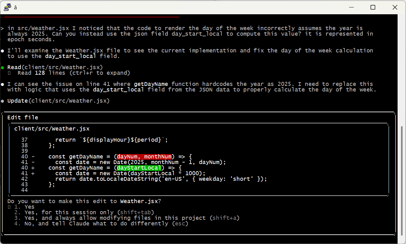
3. Don’t let the junior developer (AI) pick the framework

This one probably deserves its own post; the more I learn about coding with AI, the more interesting it is. But that’s not why we’re here today, so that’ll have to wait.

I love a good road trip. Lara and I drive between WA and CA a few times a year, and I’ve been lucky enough to do a few near cross-country routes over the last little while. There’s something about a freeway that I just love — leave your driveway, start moving, and you can go anywhere. Pure escapism.

But the one thing freeways are not good at is giving you a sense of place. The scenery can be beautiful, but the highway system itself is pretty generic (which is not to say I don’t love a good Love’s!). For years I’ve wanted to write an app to provide that missing context — and over the last couple of weeks I finally got it done with the help of my friend Claude Code.

Points” is not a routing app — it’s meant to run side-by-side with whatever you use for navigation, on a separate device. Its sole purpose is to “look around” your current position and identify cool stuff that you might not otherwise notice: natural features like mountains, rivers and beaches, historic sites and buildings, parks and tourist attractions, that kind of thing.

As you drive, every minute the right pane will update with a new point of interest. If you can’t wait a whole minute, click “Next” to see another one. Click the bell icon to have the device chime each time a new point is shown, so you can keep your eyes on the road. If you want to save one to look at more deeply later, click “Share” to save it away.

The coolest part is the AI integration — although I didn’t want to pay for the entire world, so you need to supply your own Claude API key to use it. For clarity, I never see your key; the app runs completely in the browser and the key is saved only on your device.

When you click “More”, the app asks Claude to generate a one- or two-paragraph description of the point of interest. The response is shown on-screen and read aloud automatically, again so you can keep your eyes on the road. I LOVE this feature — the AI picks out amazing fun facts for incredibly obscure points.

Anyways — I mentioned that I built the app with Claude Code, which was fantastic especially because some of the geolocation work was really gnarly. It was brilliant to be able to describe the behavior I wanted (e.g., “focus your search around the area where I will be in five minutes, based on current direction and speed of travel”) rather than deal with the radians and degrees and Earth’s curvature and all that insanity.

However, when presented with the job of building a web site, Claude really really loves React. And don’t get me wrong, I do too — it’s my go-to framework for building apps. It just turns out that it was absolutely the wrong tool for this job.

Other than the geo stuff, the app is pretty simple: show a map on the left with your current position, find points of interest and pop them in on the right. A few background timers keep track of the user’s location, make sure we keep a “queue” of points by calling Wikidata periodically, and swap in new content when appropriate.

The problem is that React has a very “opinionated” idea of state management — and while timers and global Javascript objects and such can work within this structure, it’s a bit of an awkward struggle. And I finally realized that I wasn’t even getting anything out of React in this case — Claude and I just used it out of habit.

Much like trying to install hose clamps deep inside a washing machine with needle-nose pliers, React was just the wrong tool for the job. In about twenty minutes, I rebuilt it as a simple, plain-old Javascript (ok, JQuery), HTML and CSS one-pager. Suddenly everything fit together perfectly, changes were easy, and the code made sense again.

Magic stuff, and lesson learned, once again. Maybe this time it’ll stick. Unlikely.

“Doing my own research”

To be clear, the title here is tongue-in-cheek. Real “research” involves carefully-designed and bias-controlled experiments, and there ain’t none of that below. My intended point is just that we’re all capable of digging deeper in ways that haven’t been the case before the advent of LLMs. Arming yourself with these tools is one way to fight the bullsh*t that is pushed at us every single hour of every single day.

A few days ago the Algorithm-capital-A pushed me a video about Bass Pro Shops and how they scam tax discounts by creating fake “museums” in their stores. Turns out that while the shock video version exaggerates the scope of the con, it’s basically true. Nice!

Anyways, what started as a casual attempt to test the veracity of this story ended up as something much more interesting. Yes kids, it’s another AI-positive story, this one hidden behind some observations on the American economy.

Subsidy Tracker

One of the articles about Bass included a link to Subsidy Tracker, a site that combs through public records to identify federal, state and local subsidies by company. This is really messy data; we’re lucky there are non-profits making it usable.  

Somehow I wandered from Bass over to the airline industry, where I found a ton of very recent federal grants —millions of dollars every month. Digging into these led me to the Essential Air Service program, and that started me down today’s rabbit hole. Bear with me for a second.

Essential Air Service

See, back in 1978 Jimmy Carter — yes, JIMMY CARTER — signed the Airline Deregulation Act, hoping to decrease fares and increase service by rolling back a bunch of controls on fares and routes. But the bill’s authors realized that without some new intervention, a deregulated airline industry would immediately drop service to smaller, less profitable locations like, say, my college home airport in Lebanon, NH.

They addressed this by creating the EAS and its list of “Essential Air Service Communities.” Airlines are paid real cash money by the federal government to provide regular service to these communities — to the tune of more than half a billion dollars in 2024. For example, Cape Air was paid $5.2M to ensure 54 people a day could fly one-way to or from West Leb. That’s about $2,400 per leg, even if they fly the plane empty!

And you know what? This is fine. Actually, it’s great. We, as a society, decided that we cared about maintaining integration of our rural communities with the rest of the country via passenger air. We also recognized that free market dynamics would not deliver this outcome, because the societal “cost” of not having service was borne outside of the immediate commercial players.  

Of course there are risks to this. Collective actions are complicated and always subject to bias and graft — they’re never “optimal.” Our protections are mandated transparency, civil education and a free press. The EAS probably needs some tweaks, but on balance it seems like a pretty good call.

Like it or not, this kind of market-socialism hybrid has been our model pretty much forever — and increasingly so as we’ve become more interdependent through the industrial and information ages.

OK, Cool, Right?

Not so fast, Milton. A huge, possibly majority fraction of our country simply does not understand this long-standing reality. The Reds have spent decades — starting with talk radio in the 80s and culminating with MAGA today — telling people that we live in a perfectly free market economy, and that perfect freedom is the primary reason for the success of our nation. It’s a two-part strategy:

  1. Emphatically label “bad” collective societal action as “communist.” (health care, minimum wage, food and unemployment benefits, UBI, …)
  2. Ignore, bury and obfuscate the “good” action so the public doesn’t notice the hypocrisy. (corporate subsidies, military adventures, incumbent-benefitting pork, …)

The EAS is a great example of this. By definition the vast majority of EAS communities are in rural areas — places that likely supported Trump in the last election. But I’m pretty sure that if you asked residents in those communities if the government was playing to fly empty planes to and from their homes, they’d say (1) no way, and/but (2) we don’t want to give up our airport.

Ask a Simple Question

At this point in the story, I realized I should check my own bias. I mean, of course rural voters went for Trump, but it’s possible that EAS communities were somehow an outlier. So I started poking around for some data that would help me answer that question.

Little asks like this seem so simple! But as anybody who has ever tried to report on real-world data can tell you (say, for example, the DOGE wizards that “concluded” millions of dead people were drawing social security) it’s actually super-hard. First you have to find data — and for a lot of questions, that just doesn’t exist (see my comment at the top about real research), or it’s in an awkward or inconvenient form for analysis. In this case, however, it was pretty easy:

  1. The Dept of Transportation publishes a current list of EAS communities. It’s a PDF, but that’s easy to extract into a CSV file with columns for city and state.
  2. The Harvard Dataverse, another great resource that I hope survives our current funding climate, publishes county-level election data (file citation).

Progress! Often all you need from here is a little basic Excel magic (see here for some tips on that). Unfortunately for us, we hit our first stumbling block: election data is reported at the county level, while the EAS communities are cities. Mapping between those will take a little more data, but luckily that’s available too, compiled from government sources and released under a Creative Commons license: simplemaps US Zip Codes database.

Extract city, state and county columns from this file, match up the city/state with the EAS data, walk that through county to the election data, and Bob’s Your Uncle!

Finally, the AI Part

Well sure, it’s pretty simple in theory. But most of the country doesn’t have the skills to actually write this code. I mean, I’ve spent a career doing this sort of thing, but even so I’m not likely to invest the effort on a random weekend news-scrolling curiosity.

This is where foundational AI models can really change the game for everyone. It’s not without pitfalls, but take a look at what Claude Code was able to do with this prompt:

I’d like to generate a csv file that shows how each county that is considered an eligible community in the Essential Air Service program voted for president in 2024. Please use node and javascript for this script.

Data on EAS eligible communities is in the file eas.tsv. Data that translates city/state to county is in the file uszips.csv. Data that contains county-level presidential elections results is in the file countypres_2000-2024.csv.

You’ll need to read each city/state combination out of eas.tsv, then use uszips.csv to translate that into one or more county/state combinations.

With this information, look up the 2024 election results for those counties, sum up the votes if there are multiple counties, and output a row with the name of the candidate that received the most votes.

If you are unable to translate a city/state to county/state, or if that county/state is not found in the presidential election results, use “unknown” as the name of the winning candidate.

The output should have three columns: the original city/state from the EAS data and then then name of the winning candidate.

Please double-check your work and do not take shortcuts such as estimation or extrapolation. I want to be sure that the data you output represents direct matches only — if the data isn’t clear just say “unknown” and that’s ok.

I put a lot of detail in that prompt because (a) I’d already done the work to figure out data sources; and (b) I wanted to be very clear that the model should be conservative. First try: Winner-Winner-Chicken-Dinner!

More than Mechanical

A machine that writes code to crosswalk a bunch of files is pretty neat, opening up a deeper level of analysis to huge swaths of the population. But it gets really cool when you look under the covers. Review the entire conversation for yourself using this link.

The model wrote code, tested it, and iterated a bunch of times to discover and account for unique quirks in the data. It was a lot! Again, this will sound very familiar to anyone who has tried to do even moderately complex cross-source data analysis:

  1. One file had full state names while the other had abbreviations. Create a lookup table.
  2. The “mode” column is inconsistent. Most counties use “TOTAL VOTES” to represent totals, but some counties leave this blank, others use other terms like “TOTAL VOTES CAST” and others don’t have total rows at all so they need to be created by summing other modes. Normalize the values and created an algorithm that picks the most representative rows.
  3. Some city names were slightly different across files. E.g., “Hot Springs” vs “Hot Springs National Park.” Use partial matching to address.
  4. Spacing and casing differences. Strip spaces and lowercase everything before matching.
  5. Additional differences in punctuation and abbreviation. Use a normalization table.

All of these were found without further prompting or intervention. And as the cherry on top, the model even realized that the two Puerto Rican EAS communities weren’t in the election data because Puerto Ricans can’t vote for president.

Of course, given the state of LLMs today I still wouldn’t just trust the output without reviewing the code and doing some spot checks. In this case at least — did that, and it passed with flying colors.

TLDR, my assumption about Trump voters is backed up by the data. Not earth shattering perhaps, but anything that makes the world a little more fact-based is a Very Good Thing. And most importantly, thanks to LLMs, this kind of research is available to all of us at any time. People love to talk about “brain rot” from AI — but we do that with every innovation. Gen X peeps, remember the uproar about calculators (55378008)? Use it well and it is transformational.

Anyways, if you’re starting your online screed with “I haven’t checked but I bet….” well, shame on you.

OK, but what about Cost and Energy?

It’s very popular to dismiss AI solutions due to their allegedly egregious energy use. The work I did here used 54,116 “tokens” — where a token is a unit of work kind of like a word but not quite. There isn’t a ton of data out there as to how much energy is used during inference, but a broad range between .001 and .01 Watt-hours per 1,000 tokens is cited pretty regularly.

Double that to cover infrastructure costs like cooling, split it down the middle and we can make a crazy rough estimate of .54Wh for the work in this post. That’s about the same as running two Google searches, or running a 10W light bulb for three and a half minutes. To me, this is a shockingly efficient use of energy, even if our guess is off by two or three times.

Ah you say, you can’t just look at inference — model training costs are astronomical. And that is true! But production models typically remain in use for around six to eighteen months before being superseded. Over that timeframe a model will be used for many billions of inferences; training costs quickly amortize to basically zero.

And none of this considers the innovation curve that is already happening to push costs down. Just as with traditional computing power, market forces (ha, get it?) are going to do their thing. This isn’t to say we shouldn’t be worried about AI in general — there’s a ton that could go wrong. But energy use isn’t going to be the problem.

OK, as usual I’ve gone way longer on this than anyone is going to read. But it’s endlessly fascinating to be here during this moment of innovation. It’s just unfortunate that it happens to overlap with with existential threats to our American experiment. That part sucks.

Developing An Intuition for AI

AI is changing the world. Yes we are in a bubble and current claims are overblown and countless stupid companies are being started and a ton of investment capital is being thrown away. But don’t let anyone tell you (even if it feels good) that it’s all smoke, mimicry and plagiarism. They are incorrect.

There’s no substitute for direct experience — sit down and try it for yourself. You’ll quickly begin to develop an intuition for what it can and can’t do well. You’ll find amazing insights and unsettling failures, and learn how to direct it towards positive outcomes. The people that understand this will thrive on the other side.

To get you rolling, here are two quick, real-world anecdotes from earlier this week — and a few thoughts about why they went down the way they did.

1. Let’s Go Narrowboating!

For years I’ve been fascinated with the UK’s extensive canal network and the narrowboats that travel them. Lara and I are planning to meet some friends in the Cotswolds next year, and I’m trying to convince them that we need to rent a boat and spend a few days on the water.

Of course, the sum total of my experience with narrowboating comes from watching Pru and Timothy on TV, so where to start? These days it’s AI, of course. I started with this very exploratory opening salvo (including the heartbreaking typo literally on word #1!):

I’m need help planning a trip. My wife and I are 56 and would like to spend about three days exploring the Kennet & Avon Canal in a rented narrowboat. We’ve never been on a narrowboat or the canals before so we are beginners! We’d like a peaceful, quiet trip with a few locks but not too many. We’d like to have the option of staying in hotels at night, or at least mooring in villages with nice restaurants and pubs. Can you help me get started?

Here’s a record of the full conversation. Along the way the model made two errors of consistency, each of which could have been disastrous: (1) it would have stranded the boat at the end of the trip because it didn’t consider having to return it; (2) it both warned me not to travel the Caen Hill locks and then recommended a mooring point that would have required doing so.

But the final result, created soup to nuts in just over twenty minutes, is a remarkably useful and comprehensive itinerary: 4-Day Narrowboat Holiday Guide for Beginners. Good enough to rival the most helpful travel agent.

2. Let’s Build a Web App!

Life on Whidbey Island is dominated by weather, tides and ferries. I’ve got a bunch of apps and sites I use to monitor this stuff, and for a long time I’ve wanted to put together a little mobile-friendly web site to unify them all.

This isn’t particularly complicated. My personal weather station and the NOAA tide stations have APIs, and I’ve previously hacked up the WSDOT ferries site so I can pull images. There’s even a REST API that can monitor water levels in our community tank. The only hangup is the user experience — I despise, and am not particularly good at, building usable, nice-to-look at HTML/CSS interfaces.

I was skeptical, but what the heck — let’s ask Claude Code to give it a try. I set up my project, told Claude to figure out how it worked (generating this artifact, kind of amazing in and of itself), and then made this request, again with some embarrassing typos:

The file src/Tides.jsx is set up to fetch a json url representing a high and low tides for today and the following four days; right now it just displays that json text in the component div. I would like to render this information in a way that fits into the “card” display of the site.

Please write javascript that will create an HTML representation of the information that contains a simple graph of high and low tides over the period, with a vertical line marking the current time. The graph should show a smooth curve between highs and lows using the rule of twelfths (please indicate if you do not know what this is).

Below the graph should be a table of each high and low from earliest to latest.

An example of the javascript is in /tmp/tides.json.

The display should fit into the card that contains the content without expanding its width. It should render well on desktop and mobile browsers.

Please give it a try. Please only edit the file src/Tides.jsx so it’s easy to keep track of your work.

Here’s the complete set of interactions I used to create and fine-tune the tides HTML. There was a small bug rendering the horizontal axis to my specification, but most of the back-and-forth is me changing my mind about how to render the chart and table. It even figured out that “src/Tides.jsx” was the wrong relative path, and edited the correct file without saying anything. Really, really impressive.

The final result, saved to my phone’s home screen and already used a ton: Witter Beach Commnity Web Site

A Few Takeaways

Brilliant, Expert Synthesis

The best travel agents have always been those who really, deeply understand:

  • The client. Who are they, what are their preferences, how much do they want to do in a day? Do they have any specific physical limitations? Do they want things scheduled to the minute or are they free spirits? How do they react when language is a barrier? What do they want to learn? Is it OK if their tour guide is a hugger?
  • The locale. Which museums are worth it, and how much time do you really need? What restaurants are an easy walk even at night? Which guides love to talk about wars, or sex, or food, or sport? When do you really want AC and when is it an option? Which side of the hotel is quieter and which has the best views?

This is stuff that’s really hard to pull out of even the best guidebooks, especially in combination with human idiosyncrasies — everyone is a different in some weird way. The best agents put all of this together into a coherent whole that just works.

Front-end web code is the same way — you need to understand not just the data you’re trying to render and how the user wants to see it, but also the incredibly arcane details of rendering HTML and CSS across different browsers and different devices.

This is where AI shines. It knows an incredible amount of “stuff” — more by far than any human that’s ever lived. It has extracted little nuggets out of reviews and support sites and other nooks and crannies that are extremely niche and hidden. It can hold a ton of these variables together, all and once, and mix and match and sort and connect them with a specification or request.

Any time you’d seek out an expert that knows “the secrets” and is willing to listen to what you really want — AI is going to be your best friend.

Trust but Verify

The popular press loves to point out “catastrophic” AI failings, a great example being the mistake of both telling me to stay away from Caen Hill and sending me through it. But it’s actually pretty easy to avoid things like this if you use careful phrasing (which I did not). For example, “Please double-check that your recommendations are consistent, that stops and landmarks line up with the route you’ve selected.”

Also, note my instruction to Claude that it should tell me if it doesn’t know the “rule of twelfths;” AI wants to please and needs reminders to stay in line. I use phrasing like this a lot when doing research: for example, “Please only provide data based on concrete information for which you can provide citations. Do you best to avoid bias or incomplete data sets and do not make up anything you don’t actually know to be correct.”

And of course, check the work yourself! Even the most senior human developers get a review before sending code to production; it’s no different with AI. When I asked Claude to code up the weather display, it created a bug by assuming it would always be 2025 — an issue that would have been invisible (for a few months at least) without manual review.

Embrace the Conversation

I find it most effective to simply talk to AI like I’d speak to a human. Set up tasks with details, examples and boundaries — just enough precision to minimize ambiguity while allowing space for learning, initiative and creativity.

I also simply cannot help but add “please” and “thank you” and “great job” and “my bad” into the conversation. That may seem a bit weird, but the agent is doing work for me, and I appreciate it, so why not acknowledge it? I actually think it leads to better outcomes, too. Maybe that’s all in my head, or maybe I just give better instructions in that mode. Either way I’m sticking with it.

Modularize and Limit Complexity

Looking back at the Caen Hill problem, it’s pretty clear what went wrong. Claude found that Denzies was a good stopping point based on distance and had great moorage, hotels and restaurants. On another thread it remembered that we were narrowboat beginners and should avoid tougher sections like Caen Hill. The failure was in missing the connection between these two factors — we couldn’t both avoid the locks and stop in Denzies.

Reminding the model to pay attention to these conflicts helps a ton. But there are still practical limits on how much they can handle at one time. A few weeks ago I tried playing with this by describing a relatively complex app. I purposely tried to do it all in one shot, something that is not recommended by anyone. 😉 The spec is here if you’d like to take a look.

As predicted, it was an abject failure. The model tried to break the problem up into pieces, but it was fundamentally unable to satisfy all the constraints at once. It would ignore requirements and lie about it, then break other stuff when it was caught out … just a mess.

At the end of the day, models can become overwhelmed — just like people. I’m sure the state of the art will keep evolving (“agentic” AI may be one step on that path), but for now the onus is still on humans to organize problems into tasks the machines can do.

A Miraculous World

I think that’s enough for one post. I just can’t encourage folks enough to spend time with these models and get a real, hands-on, hype-free sense of how they work, their strengths and their weaknesses. Don’t get sucked into the simplistic narratives of the popular press; on both “sides” of the AI issue they’re more about fitting the technology to their ideology than real understanding.

The reality is amazing and beautiful. And scary. And it’s here.